While some see curved walls as Frank Dittenhafer’s signature, he doesn’t, saying it comes from the fundamental creative process of making the space both unique and special.

Penn State York Lee R. Glatfelter Library

It’s come to be known as his signature, some say, akin to an artist signing a painting.
But Frank Dittenhafer, II, FAIA, LEED AP, President of Murphy & Dittenhafer Architects, says that’s not why curved walls end up in spaces and buildings he designs.
“If a curved element fits the space, if it engages people visually, tactilely, and experientially in a positive way, then it goes in the design,” he says. “The curved surface has to be part of the successful engagement of the people who will use the space and go beyond just function in a sensory way that helps people connect over time.”
How it got started
Dittenhafer never started out with the idea of incorporating a curved element into many of his buildings.
“I don’t say everything can only be constructed just one way. Often buildings are built at right angles, so there’s a bit of an unexpected nature to a curved wall,” he explains. “It comes from a natural and unscripted design process I bring to projects.”
Still, just to be different or unexpected doesn’t justify the shape.
“I won’t force a curved element. It must be functional in the space,” Dittenhafer insists.
Susan P. Byrnes Health Education Center
Making service bays into classrooms
One example is the Byrnes Health Education Center in downtown York.
Located in a former auto dealership, Dittenhafer was challenged when moving beyond the front showroom.
“There were service bays where we wanted to put classrooms for teaching about health subjects,” he recalls of this project more than 20 years ago. “The users were going to be children. So, we had to make it fun and engaging so the kids liked to be there.”
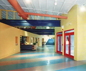
The answer was a gently curving orange wall with steel beams flying over it, openings through it for stairs, ramps and doors, and health-related displays.
“That’s how I connected one end of the long linear building with the other,” he says, “and the curved, brightly colored wall became the organizing signature element that worked with the spaces and the programs presented there.”
Boonsboro Community Library
Form follows function
How a space is used and how people get around in it often leads to the curved element.
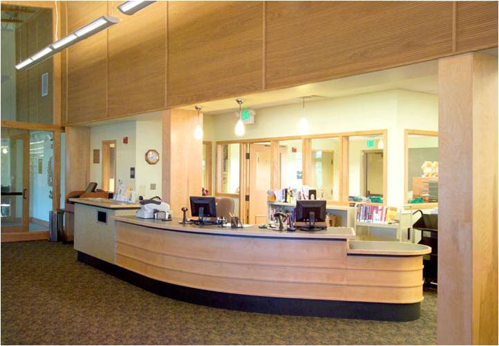
“We designed a curved circulation desk at the new Boonsboro library,” Dittenhafer notes. “Visitors can come close to this, but it also allows the limited staff working behind the desk to look in different directions and easily monitor the entire space.”
When someone described some of his curved surfaces as sinuous, Dittenhafer agreed, saying in these cases the best way to get people from point A to point B was not a straight line.
“I do it with a compound curve, following the natural flow of how people walk by these walls.”
The soul of the project
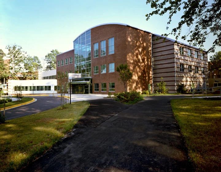
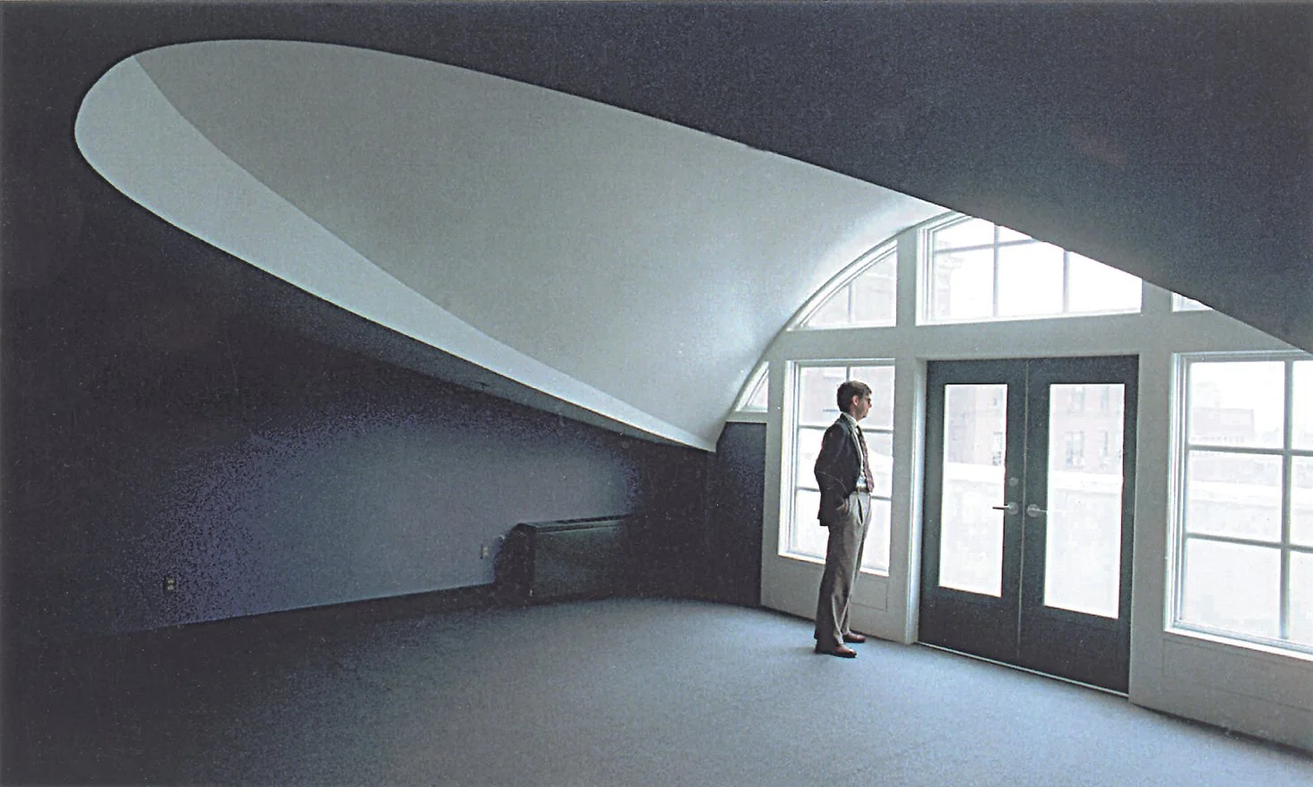
In some cases, the curved shape defines the building, such as at the renovated Lanham Hall on the campus of Prince George’s Community College in Maryland.
“We re-did this three-story building and added an elliptical lecture hall, and we included places around this for students to sit,” Dittenhafer says. “This helped shape a new outdoor courtyard space as well.”
Dittenhafer states bluntly this design took a bad building and made it a destination.
Like us on Facebook!
“Students come here now and take selfies,” he marvels.
Dittenhafer followed the desires of the University of Baltimore’s new president in designing a recital hall with a curved form and placing it on the building’s top floor.
“This hall has perfect acoustics, and the site lines are great. The president added the arts and music programs to this urban campus - and we wanted to place these figuratively high,” he says. “The recital hall on the top floor of the new 5 story building celebrates the presence of The Arts and with amazing City views when listening to music or the spoken word.”
It has to be special
While some see the curved element as Dittenhafer’s signature, he doesn’t, saying it comes from the fundamental creative process of making the space both unique and special.
“People associate this curved element with me, but it has to serve the people who will use that building or space,” he says. “I focus on how people circulate through the area, where the curved wall leads, or what is in the curved walls – and what is it connecting?. It’s more than just the form.”
“If the curved wall makes the space softer or more sinuous or gives it an organic shape and less orthogonal form, then people connect with it,” he says, emphasizing again why he includes this design element.
Dittenhafer wants his curved shapes to be noticed, to stand out as unique and special. That’s why you’ll only see one “curved wall” (or shape) in a Dittenhafer design.
“Everything can’t be unique or special,” he says, “because then nothing is.”
To round out our 40th-year celebrations, enjoy 10 more impactful and diverse Architecture projects designed by M&D. These projects, most of which have received design awards, confirm the variety in design (from scale to usage) that we continue to be involved in today.
Murphy & Dittenhafer Architects is working hard and collaborating with the community on an urban planning study for South George Street in York City.
“Historic preservation has always been a hallmark of ours for our 40-year history,” says M&D President Frank Dittenhafer II. These 10 projects exemplify our passion for this work.
It’s the 40th year of Murphy & Dittenhafer Architects, so Frank Dittenhafer II, President, is taking the time to highlight some of our most influential projects over the decades.
We’re celebrating 40 years of influence in Pennsylvania and Maryland. With that, we couldn’t help but reflect on some of the most impactful projects from our history.
Harford Community College’s expanded new construction Chesapeake Welcome Center is a lesson in Architectural identity
At Murphy & Dittenhafer Architects, we feel lucky to have such awesome employees who create meaningful and impressive work. Meet the four team members we welcomed in 2024.
The ribbon-cutting ceremony at the new Department of Legislative Services (DLS) office building in Annapolis honored a truly iconic point in time for the state of Maryland.
As Murphy & Dittenhafer architects approaches 25 years in our building, we can’t help but look at how far the space has come.
Murphy & Dittenhafer Architects took on the Architecture, Interior Design, & Overall Project Management for the new Bedford Elementary School, and the outcome is impactful.
The memorial’s groundbreaking took place in June, and the dedication is set to take place on November 11, 2024, or Veterans Day.
President of Murphy & Dittenhafer Architects, Frank Dittenhafer II, spoke about the company’s contribution to York-area revitalization at the Pennsylvania Downtown Center’s Premier Revitalization Conference in June 2024. Here are the highlights.
The Pullo Center welcomed a range of student musicians in its 1,016-seat theater with full production capabilities.
“Interior designs being integral from the beginning of a project capitalize on things that make it special in the long run.”
Digital animations help Murphy & Dittenhafer Architects and clients see designs in a new light.
Frank Dittenhafer and his firm work alongside the nonprofit to fulfill the local landscape from various perspectives.
From Farquhar Park to south of the Codorus Creek, Murphy & Dittenhafer Architects help revamp York’s Penn Street.
Designs for LaVale Library, Intergenerational Center, and Beth Tfiloh Sanctuary show the value of third places.
The Annapolis Department of Legislative Services Building is under construction, reflecting the state capital’s Georgian aesthetic with modern amenities.
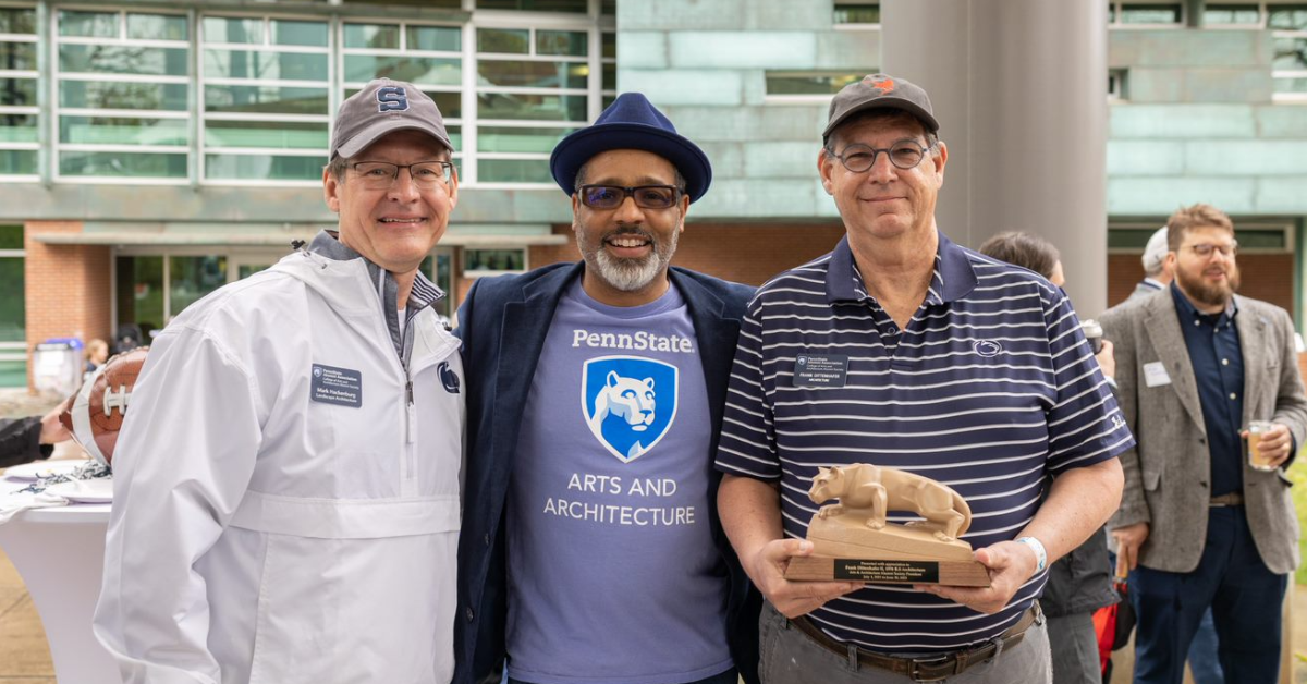
For the past two years, the co-founder and president of Murphy & Dittenhafer Architects has led the university’s College of Arts and Architecture Alumni Society.
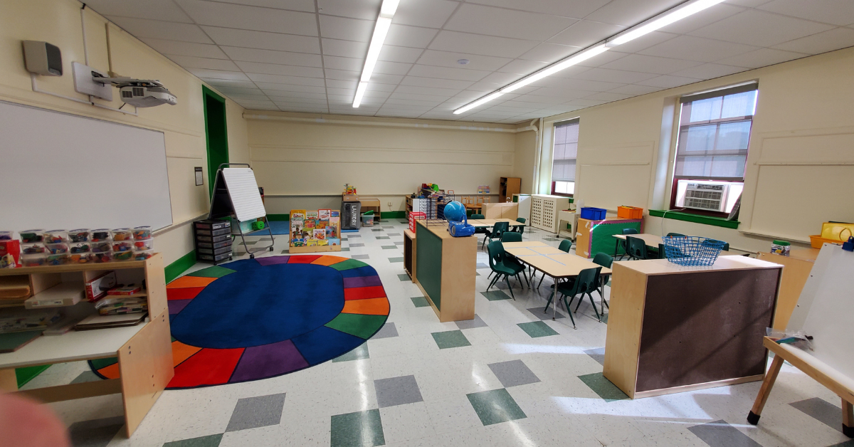
The firm recently worked with St. Vincent de Paul of Baltimore to renovate an old elementary school for a Head Start pre-k program.
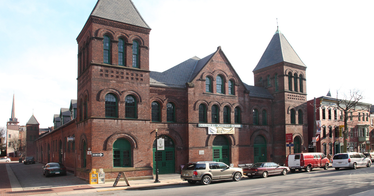
The market house, an 1888 Romanesque Revival brick structure designed by local Architect John A. Dempwolf, long has stood out as one of York’s premier examples of Architecture. Architect Frank Dittenhafer is passing the legacy of serving on its board to Architectural Designer Harper Brockway.
At Murphy & Dittenhafer Architects, there is a deep-rooted belief in the power of combining history and adaptive reuse with creativity.
University of Maryland Global Campus explores modernizing its administration building, which serves staffers and students enrolled in virtual classes.
The Wilkens and Essex precincts of Baltimore County are receiving solutions-based ideas for renovating or reconstructing their police stations.



















Here’s 10 unbuilt projects with designs we adore for all kinds of reasons.