While certain construction materials can seem ordinary, Murphy & Dittenhafer Architects find opportunities to ‘wow’ in readily available items.

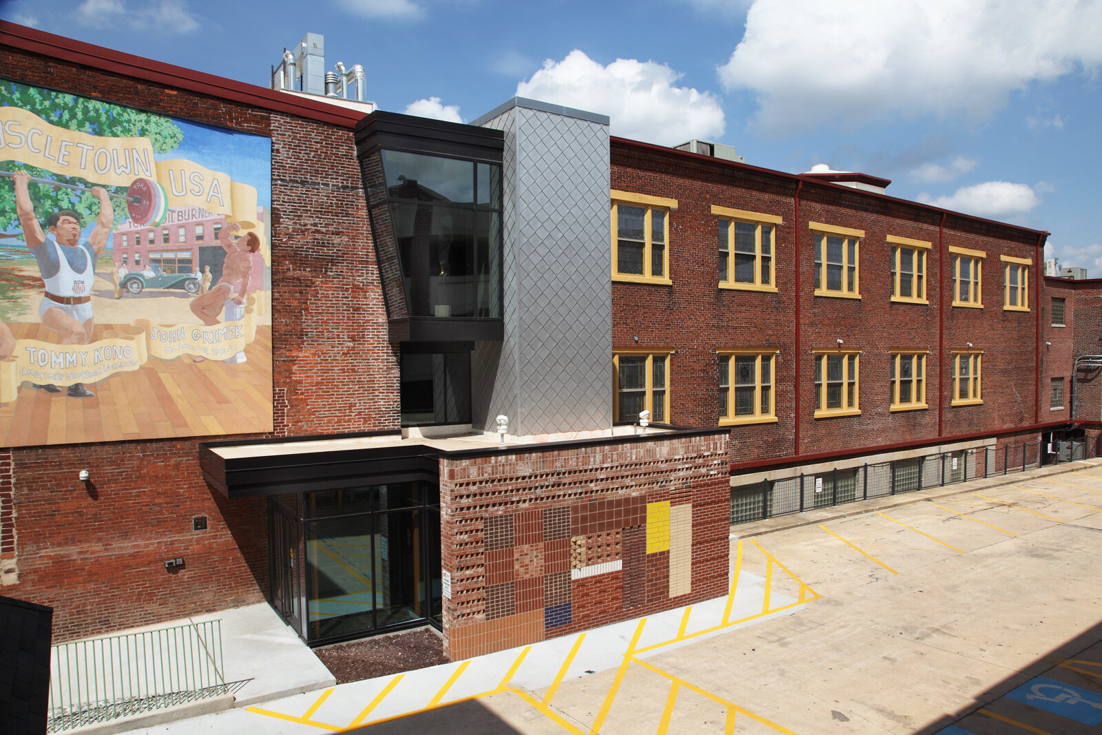
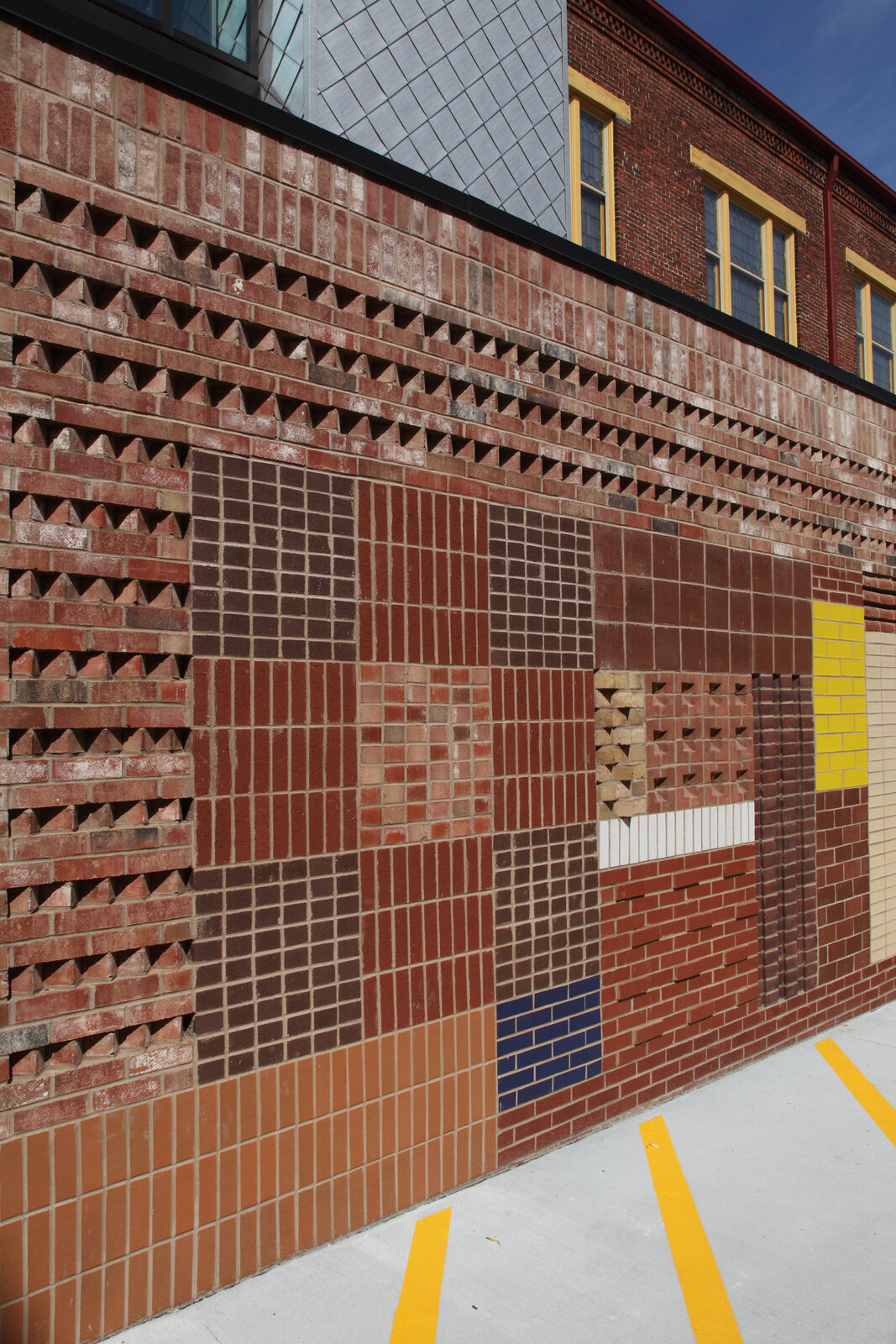
M&D used different types of bricks and concrete blocks, from glazed to a variety of textures, to create a unique wall design for the Marketview Arts building in downtown York.
What might seem like a normal brick or stone to the average person is a material that holds beautiful opportunities to Frank Dittenhafer. These readily available “off the shelf” items are often overlooked as simplistic, he says, but they can become components that add just the right touch to a project.
As President of Murphy & Dittenhafer Architects, Dittenhafer has worked with countless clients who have a variety of goals when it comes to creating or remodeling their spaces. Architects at the firm take the utmost care in understanding who will use the space and how people should feel when they step into a building, but there are many other attributes to a successful project. Often, that includes meeting a deadline and working within a budget.
Off the shelf materials allow Architects to get construction materials sooner while also keeping costs in mind, without having to seek custom fabrications. Beyond cost and time, these materials can add the perfect touch without compromising design.
“Often, projects can be full of unnecessary complexities, with structural aspects that are required to obtain some overly expressive final constructed result,” Dittenhafer says. “I’m more interested in avoiding those kinds of architectural gymnastics.”
The approach at Murphy & Dittenhafer Architects is focused more on celebrating the ordinary, where things that might otherwise be overlooked can shine or become a focal point.
“I’ve always had that philosophical design perspective to the point where I’ve embraced it,” Dittenhafer says. “Maybe it’s because I think there are even more possibilities when you look at simple approaches to design.”
Looking at things differently
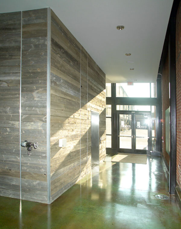
The enclosure around an elevator may seem like an easily overlooked design opportunity, but it was a chance for Murphy & Dittenhafer Architects to do something creative with ordinary materials.
While walking through the yard at York Building Products, examining the different concrete blocks, Dittenhafer was struck with the backside of a red, split-faced block. There, he found an interesting pattern with grooves and indentations that were part of the manufacturing process.
He realized there was no reason why the backside of the block couldn’t become the outward facing part of the elevator shaft enclosure, visible to those who drove by the building but also exposed in the elevator lobby.
“It turned out to be this beautiful expression of an ordinary material,” Dittenhafer says. “You just had to think of it differently.”
Like us on Facebook!
Like the split-faced stone, Dittenhafer has found brick to be another item that’s often overlooked as ordinary but holds a world of possibility if it’s used correctly.
Simply rotating the placement of the brick by 45 degrees or using recessed brick, Murphy & Dittenhafer Architects has found visually interesting options for this material that doesn’t become labor intensive. The shadows and reliefs that are a result of those minor adjustments add a dynamic visual.
It can be found in the Margaret E. Moul Home’s chapel, where the turned brick casts beautiful shadows as a way of appropriately and tastefully giving a sense of expression and identity.
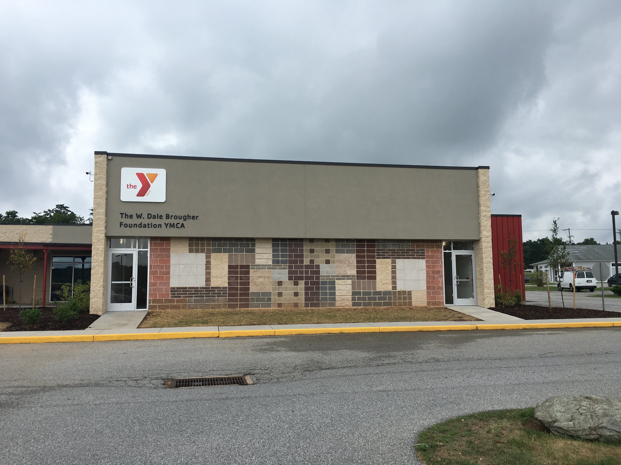
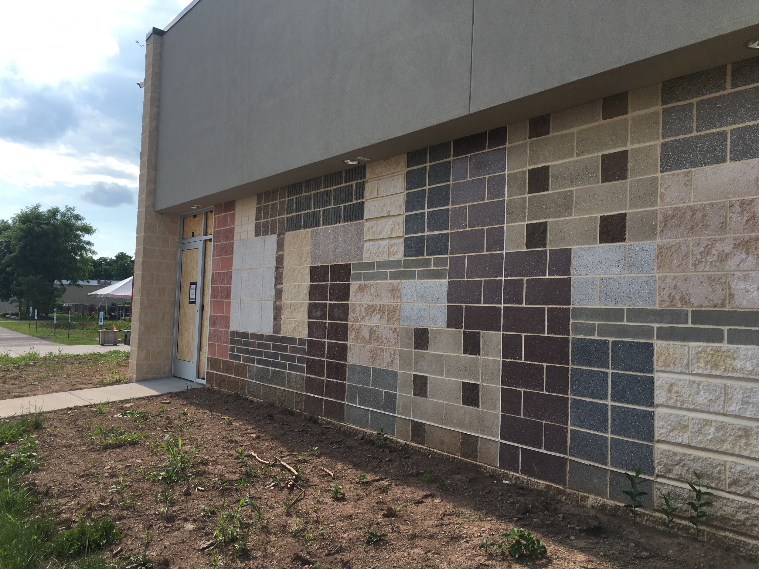
Unique use of brick materials also can be seen in a newly designed wall at the Southern branch of the YMCA and at Marketview Arts, where different types of bricks and concrete blocks, from glazed to a variety of textures, were used in creating unique wall designs.
“Instead of looking for what’s perceived as a ‘higher level’ material, I want to take these common materials and highlight the authentic, inherently lovely opportunities they provide,” Dittenhafer says. “A lot can be done with some creativity by pushing the boundary further with typical materials that are unique and appropriate, rather than falsely trying to create some bizarre visual expression.”
Celebrating the material
In many of these practices, Murphy & Dittenhafer Architects is celebrating the material, and allowing the nature of the brick, stone, wood, or even natural daylight to be the inspiring component of a space.
“There’s often a drive to create something new or invent something in this world of design,” Dittenhafer says. “There are ways to do that, and I admire the sculptural work that exists. But, I find myself drawn to the design philosophy that highlights the common items that can easily be overlooked. By doing that, we’re being original.”
Murphy & Dittenhafer Architects is working hard and collaborating with the community on an urban planning study for South George Street in York City.
“Historic preservation has always been a hallmark of ours for our 40-year history,” says M&D President Frank Dittenhafer II. These 10 projects exemplify our passion for this work.
It’s the 40th year of Murphy & Dittenhafer Architects, so Frank Dittenhafer II, President, is taking the time to highlight some of our most influential projects over the decades.
We’re celebrating 40 years of influence in Pennsylvania and Maryland. With that, we couldn’t help but reflect on some of the most impactful projects from our history.
Harford Community College’s expanded new construction Chesapeake Welcome Center is a lesson in Architectural identity
At Murphy & Dittenhafer Architects, we feel lucky to have such awesome employees who create meaningful and impressive work. Meet the four team members we welcomed in 2024.
The ribbon-cutting ceremony at the new Department of Legislative Services (DLS) office building in Annapolis honored a truly iconic point in time for the state of Maryland.
As Murphy & Dittenhafer architects approaches 25 years in our building, we can’t help but look at how far the space has come.
Murphy & Dittenhafer Architects took on the Architecture, Interior Design, & Overall Project Management for the new Bedford Elementary School, and the outcome is impactful.
The memorial’s groundbreaking took place in June, and the dedication is set to take place on November 11, 2024, or Veterans Day.
President of Murphy & Dittenhafer Architects, Frank Dittenhafer II, spoke about the company’s contribution to York-area revitalization at the Pennsylvania Downtown Center’s Premier Revitalization Conference in June 2024. Here are the highlights.
The Pullo Center welcomed a range of student musicians in its 1,016-seat theater with full production capabilities.
“Interior designs being integral from the beginning of a project capitalize on things that make it special in the long run.”
Digital animations help Murphy & Dittenhafer Architects and clients see designs in a new light.
Frank Dittenhafer and his firm work alongside the nonprofit to fulfill the local landscape from various perspectives.
From Farquhar Park to south of the Codorus Creek, Murphy & Dittenhafer Architects help revamp York’s Penn Street.
Designs for LaVale Library, Intergenerational Center, and Beth Tfiloh Sanctuary show the value of third places.
The Annapolis Department of Legislative Services Building is under construction, reflecting the state capital’s Georgian aesthetic with modern amenities.
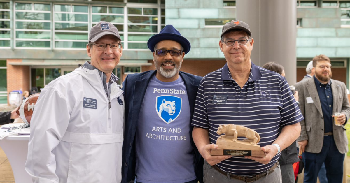
For the past two years, the co-founder and president of Murphy & Dittenhafer Architects has led the university’s College of Arts and Architecture Alumni Society.
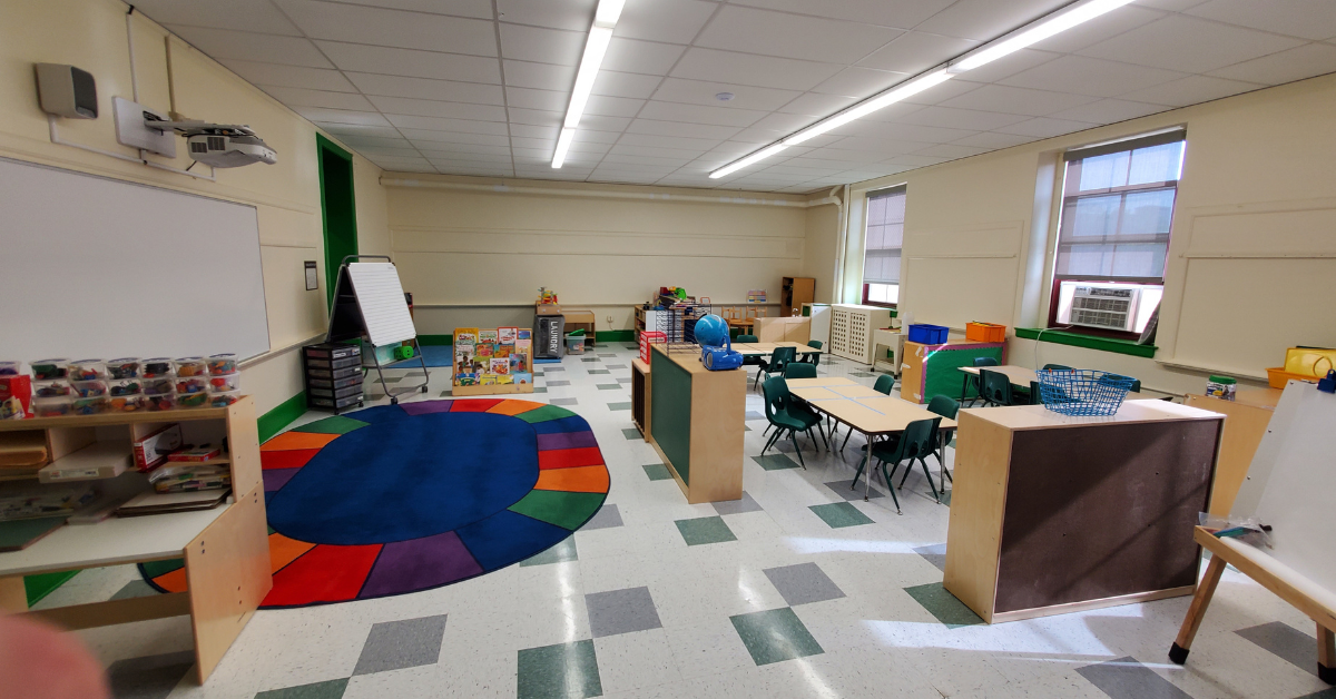
The firm recently worked with St. Vincent de Paul of Baltimore to renovate an old elementary school for a Head Start pre-k program.
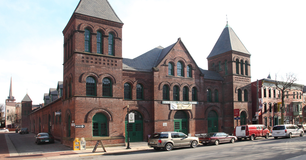
The market house, an 1888 Romanesque Revival brick structure designed by local Architect John A. Dempwolf, long has stood out as one of York’s premier examples of Architecture. Architect Frank Dittenhafer is passing the legacy of serving on its board to Architectural Designer Harper Brockway.
At Murphy & Dittenhafer Architects, there is a deep-rooted belief in the power of combining history and adaptive reuse with creativity.
University of Maryland Global Campus explores modernizing its administration building, which serves staffers and students enrolled in virtual classes.
The Wilkens and Essex precincts of Baltimore County are receiving solutions-based ideas for renovating or reconstructing their police stations.
The firm has earned the designation annually since 2016 in recognition of its commitment to supporting newer professionals in the field.

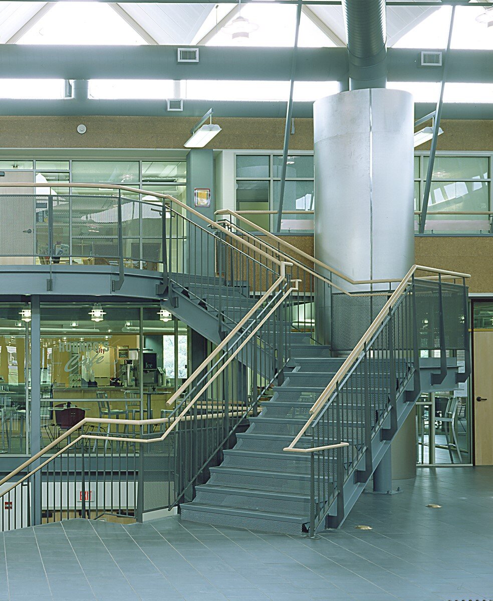
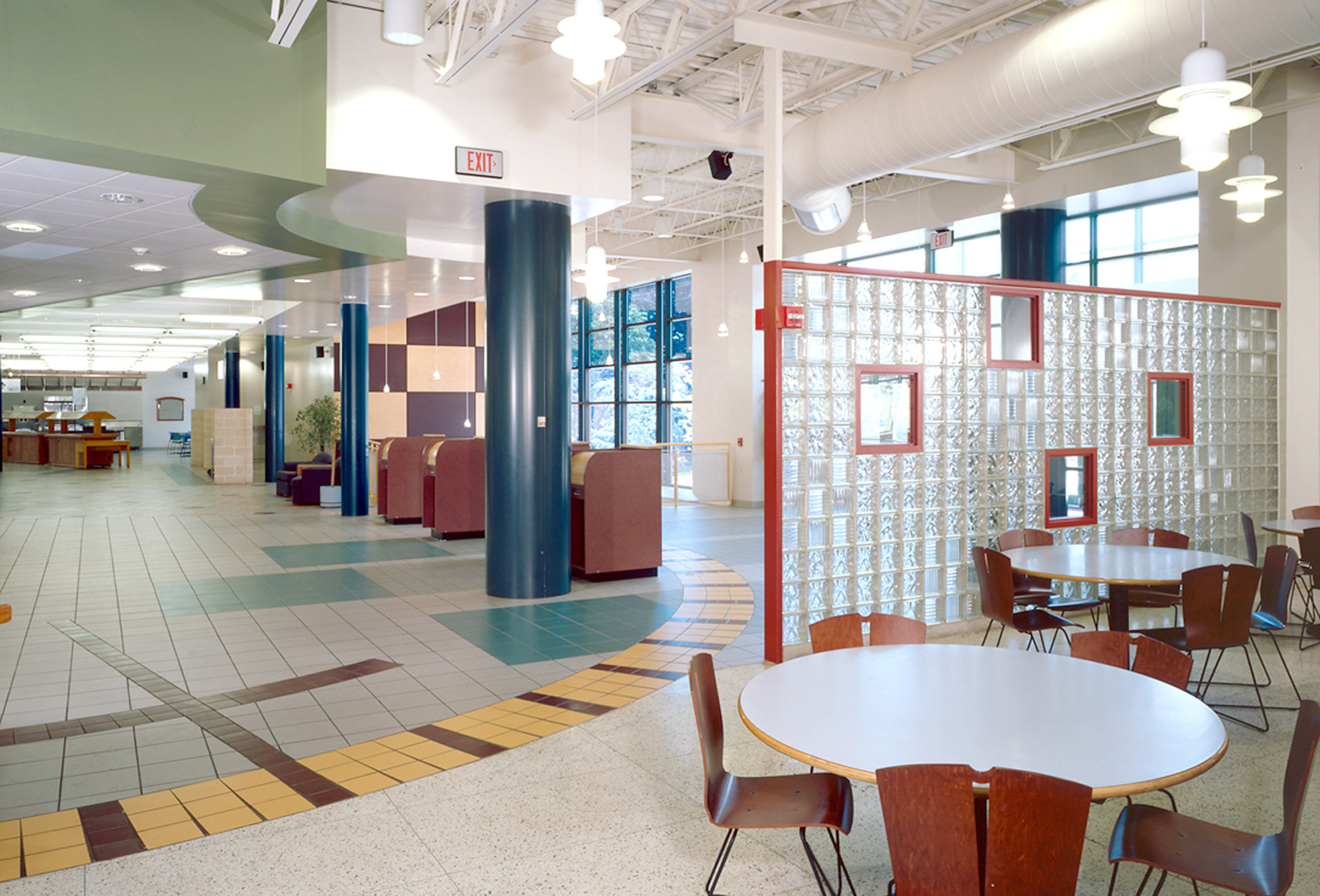

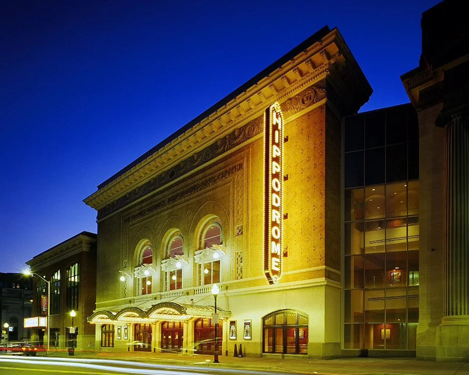
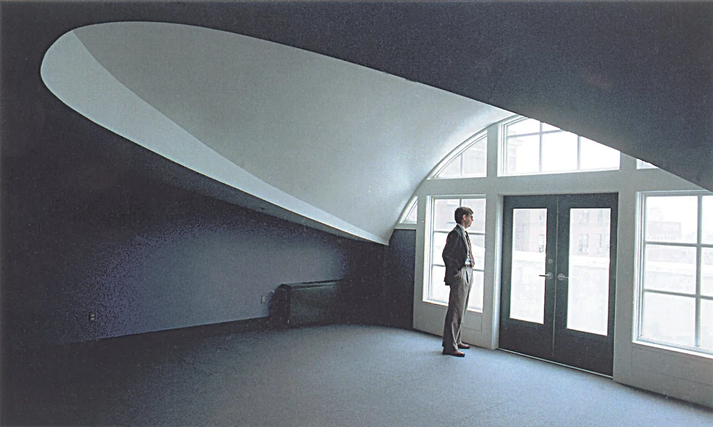





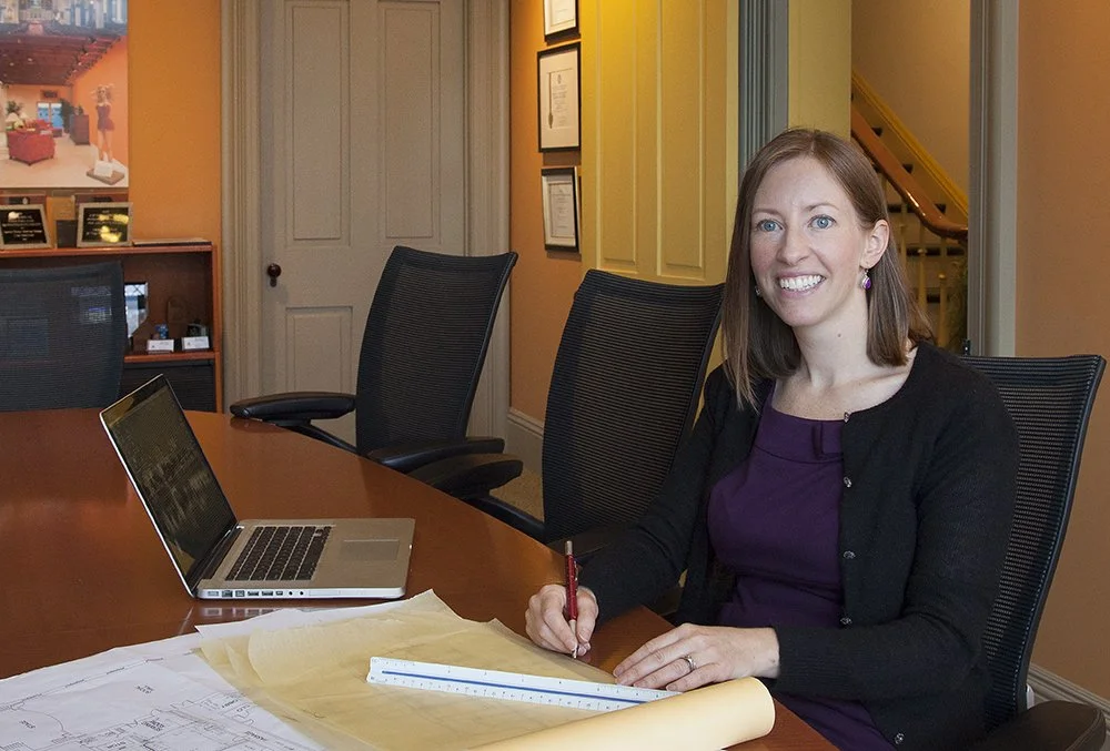


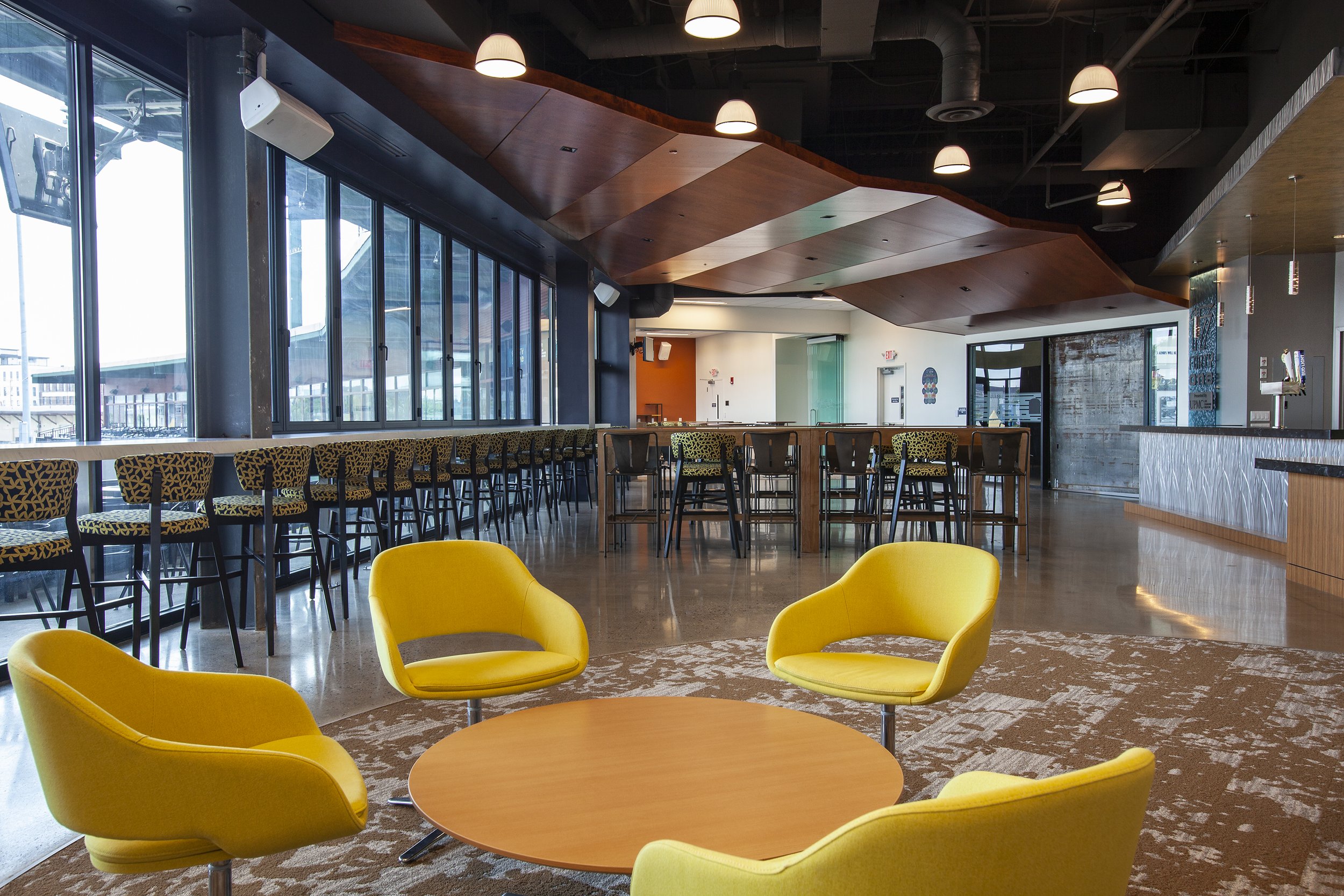


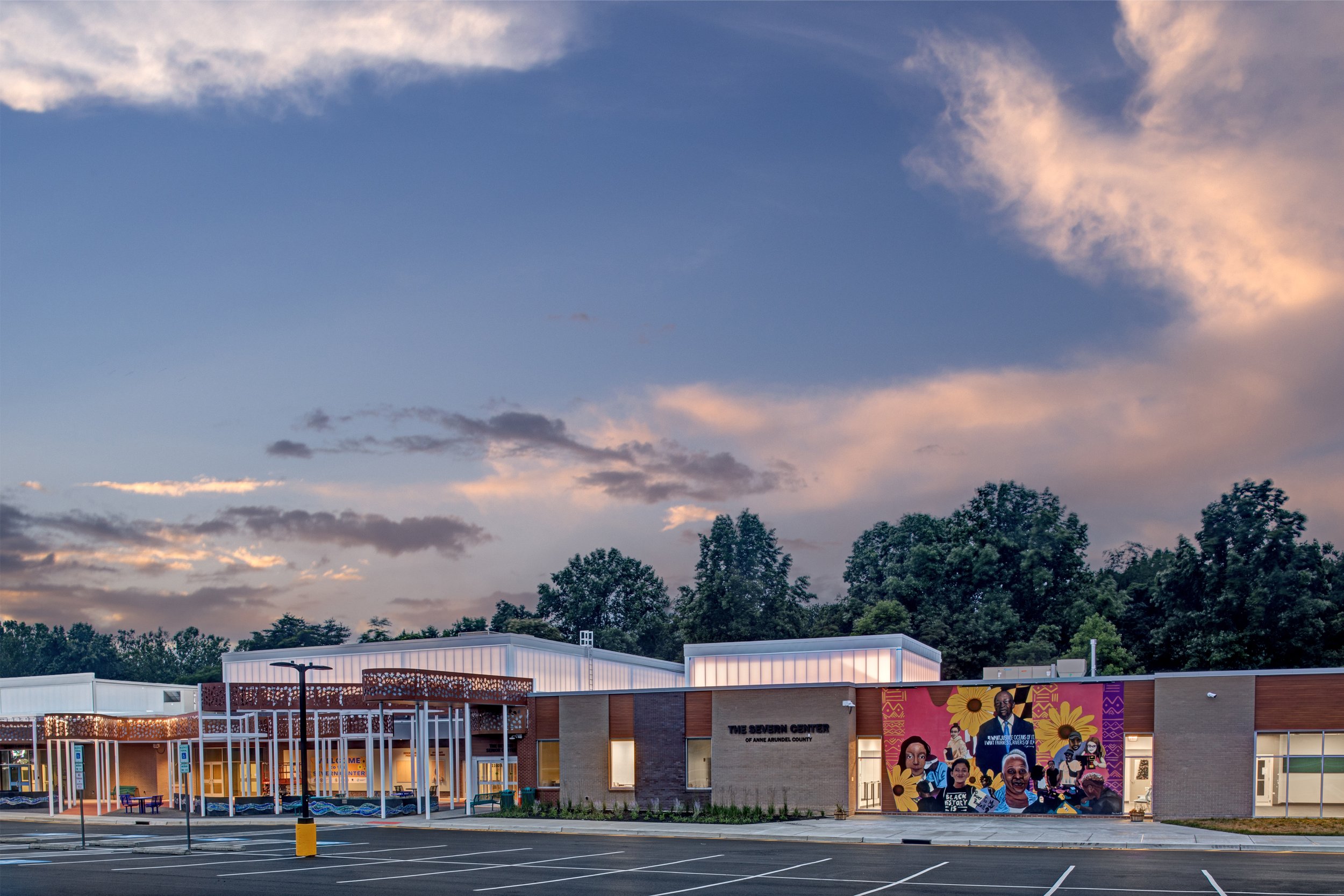




To round out our 40th-year celebrations, enjoy 10 more impactful and diverse Architecture projects designed by M&D. These projects, most of which have received design awards, confirm the variety in design (from scale to usage) that we continue to be involved in today.