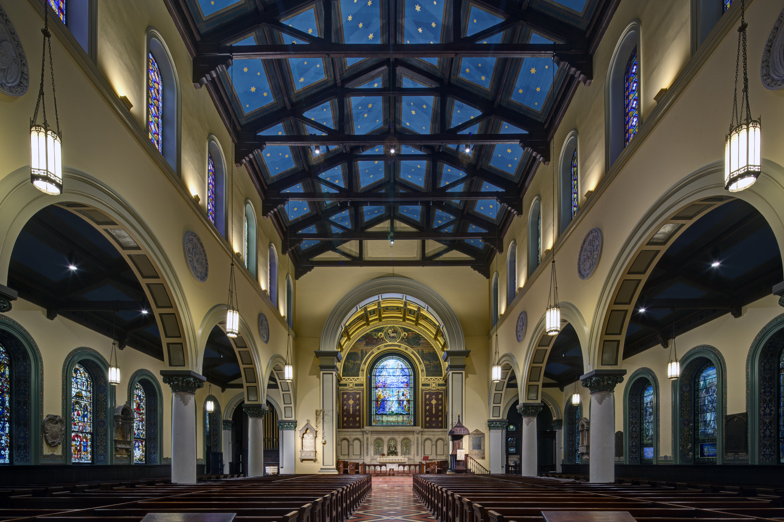
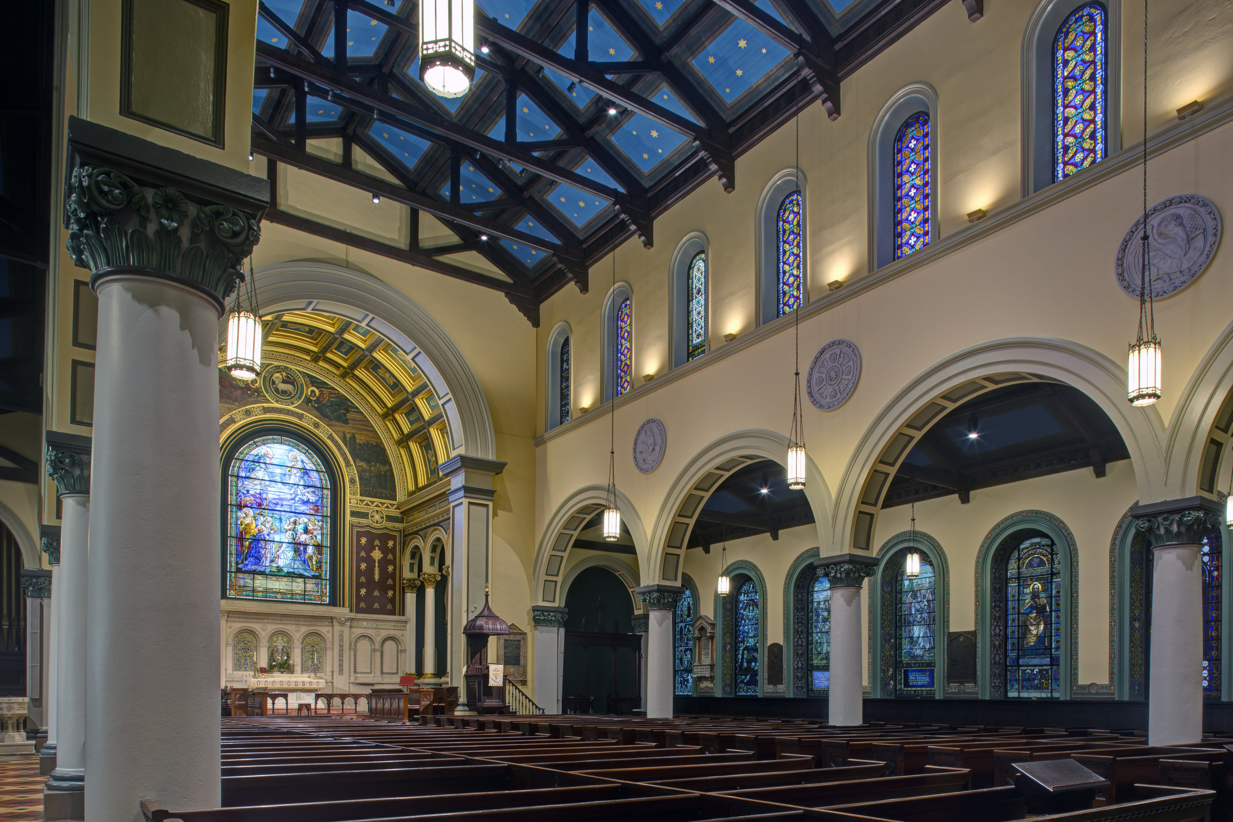
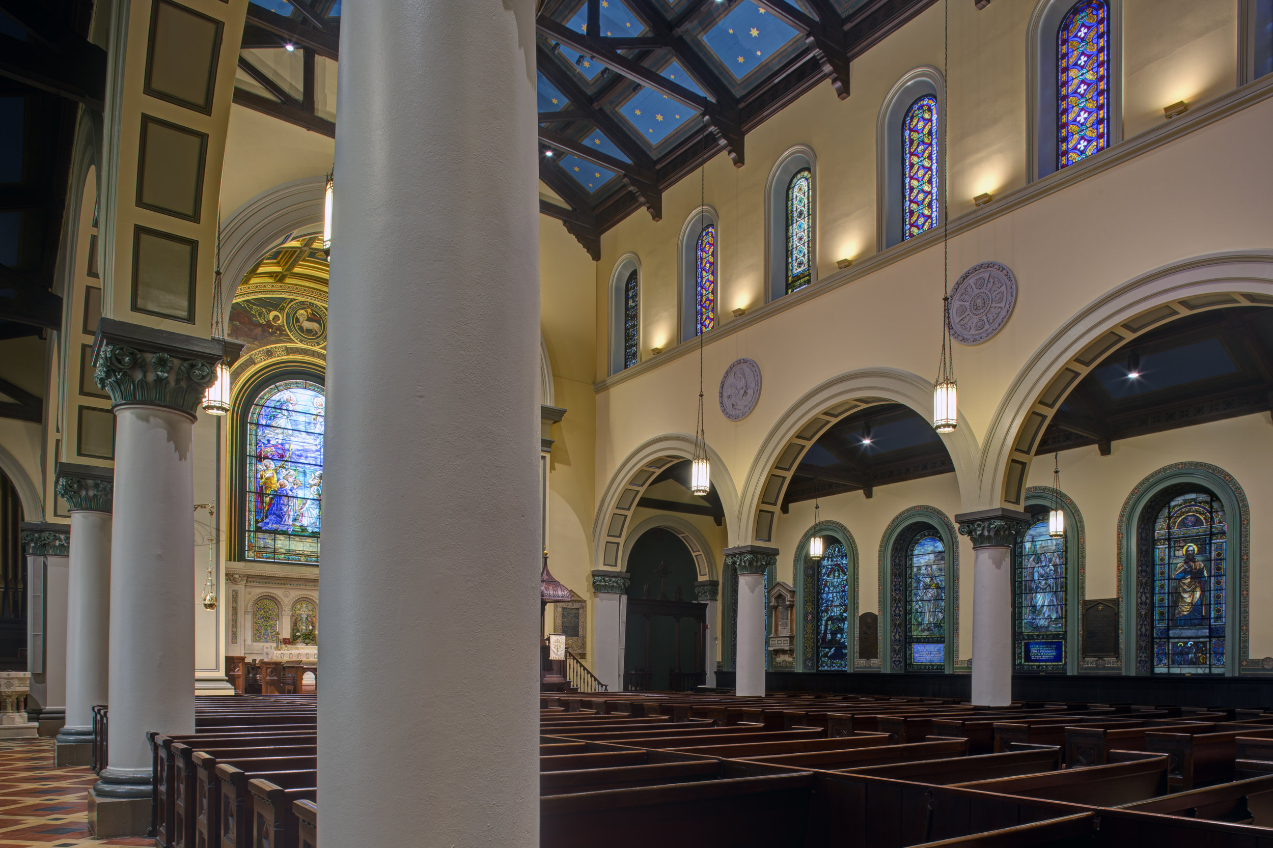
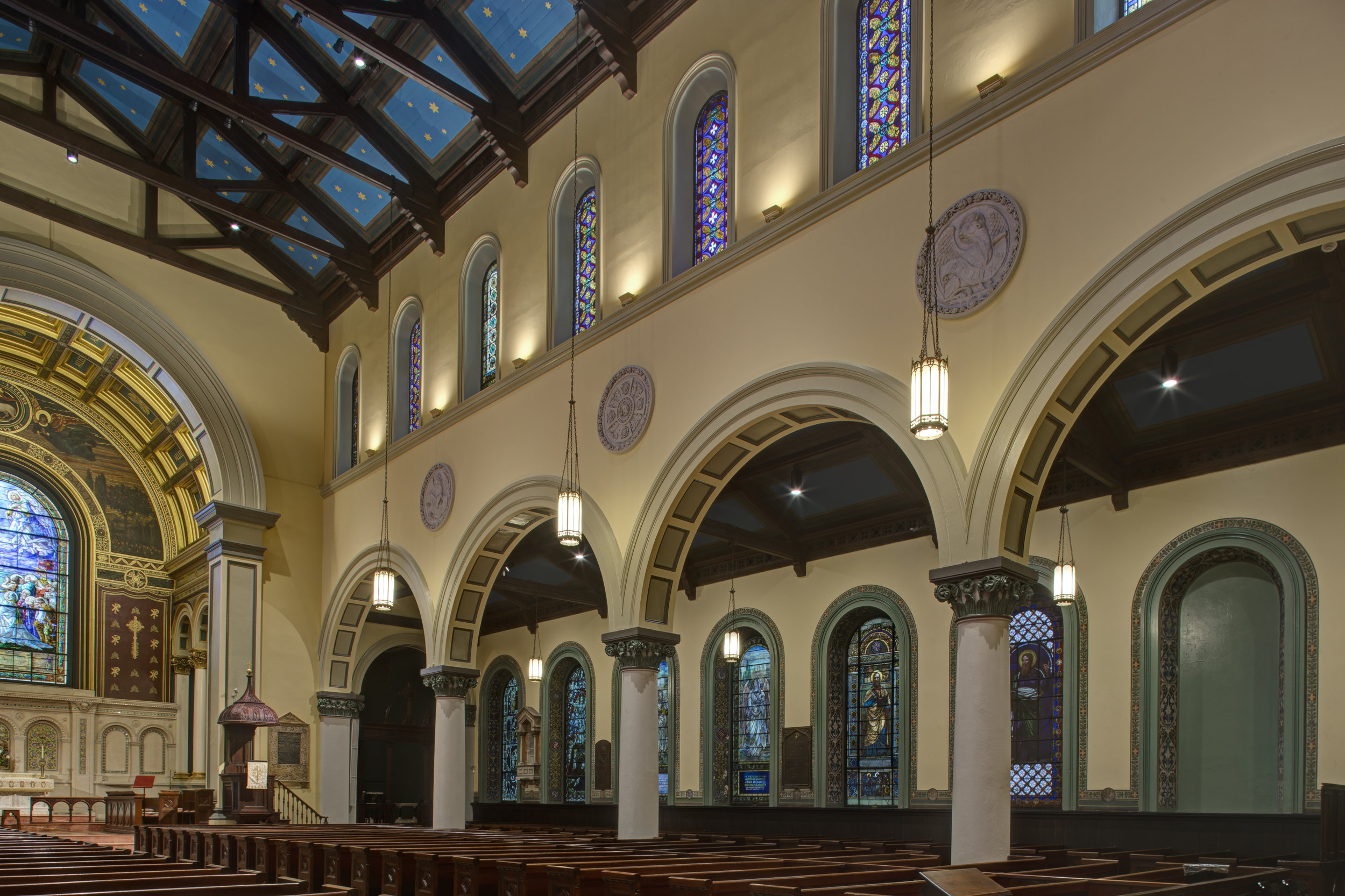
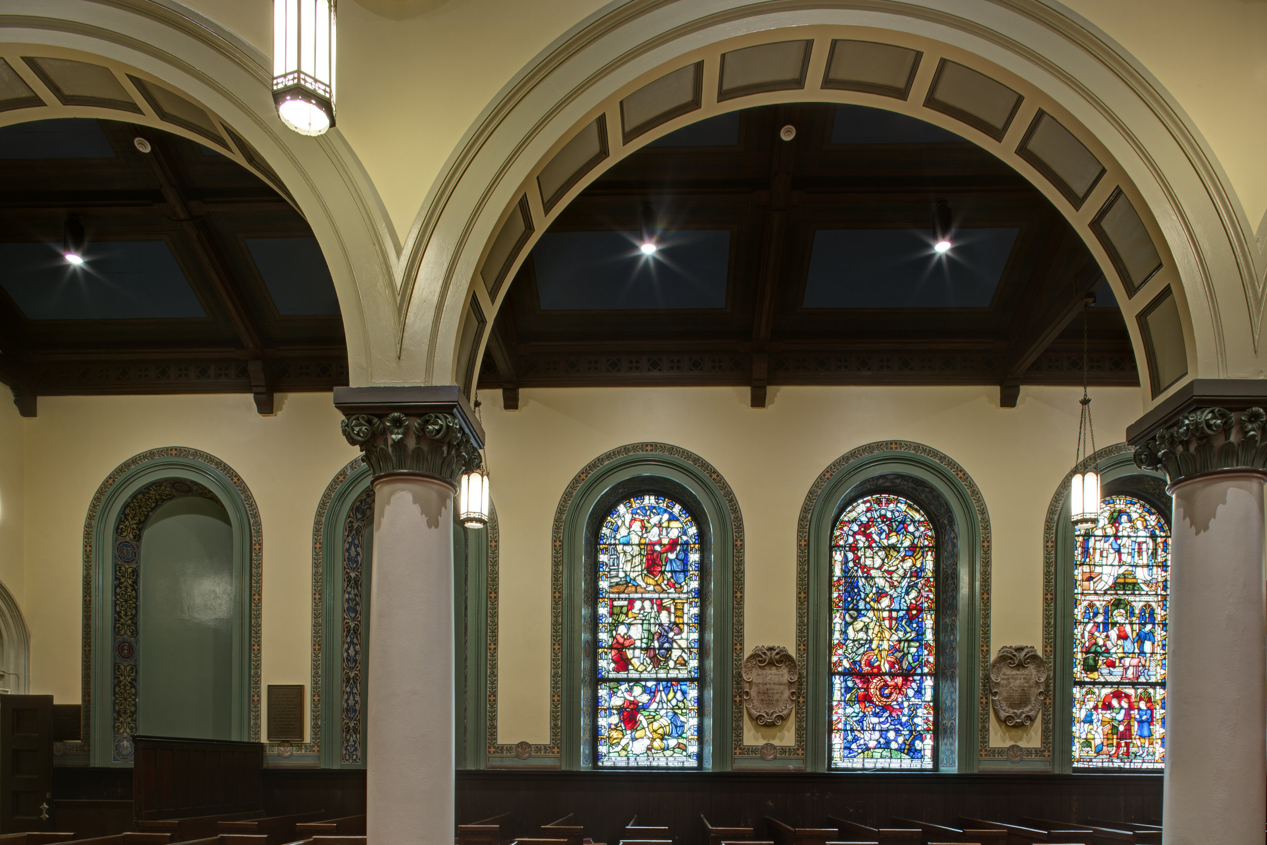
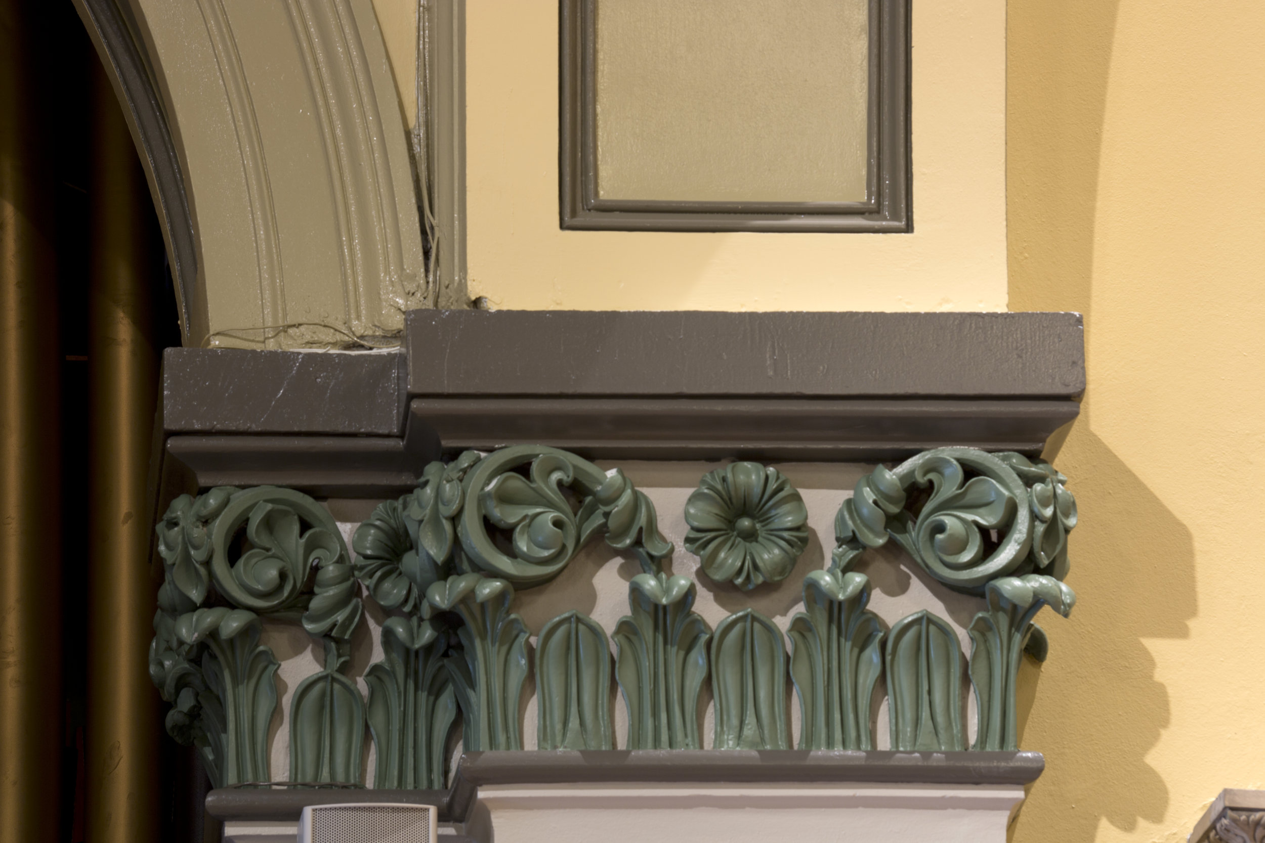
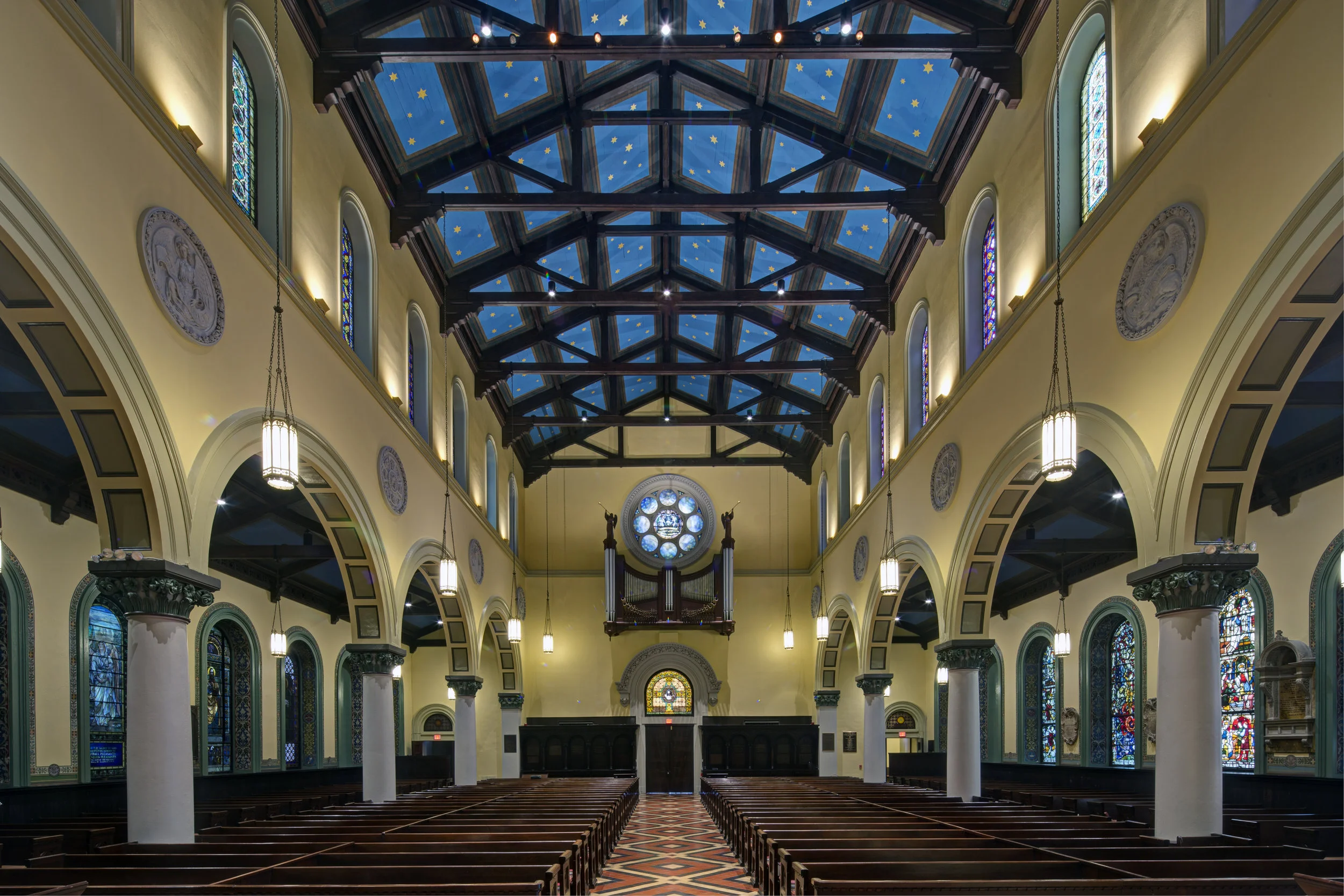
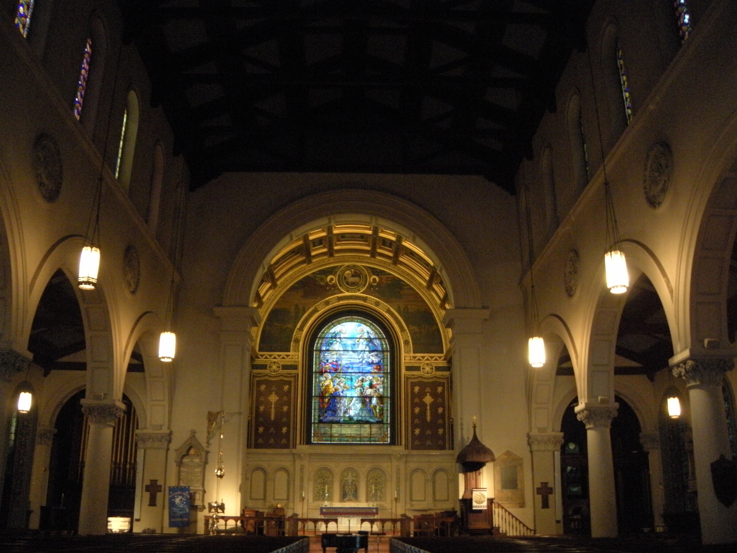
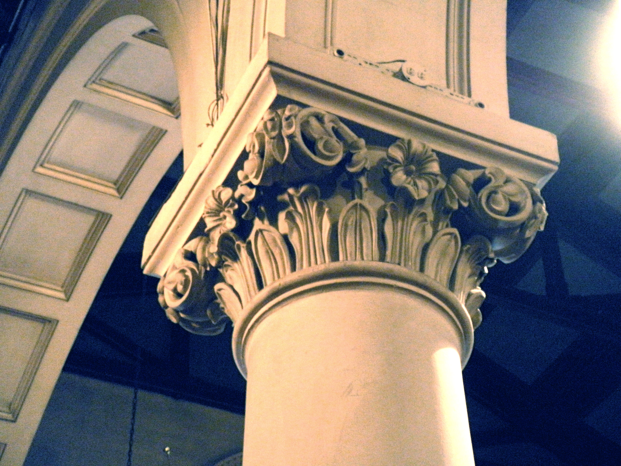
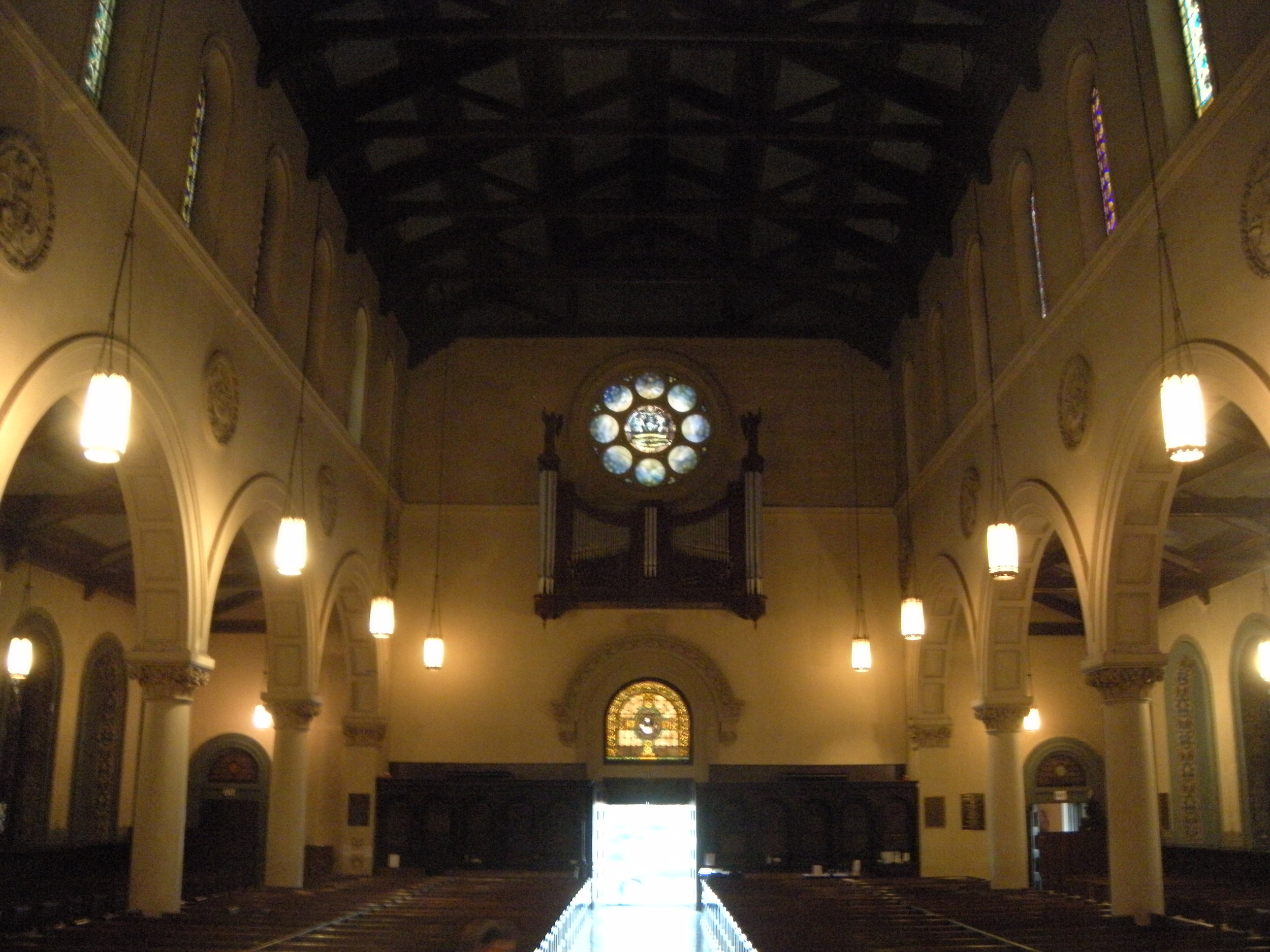
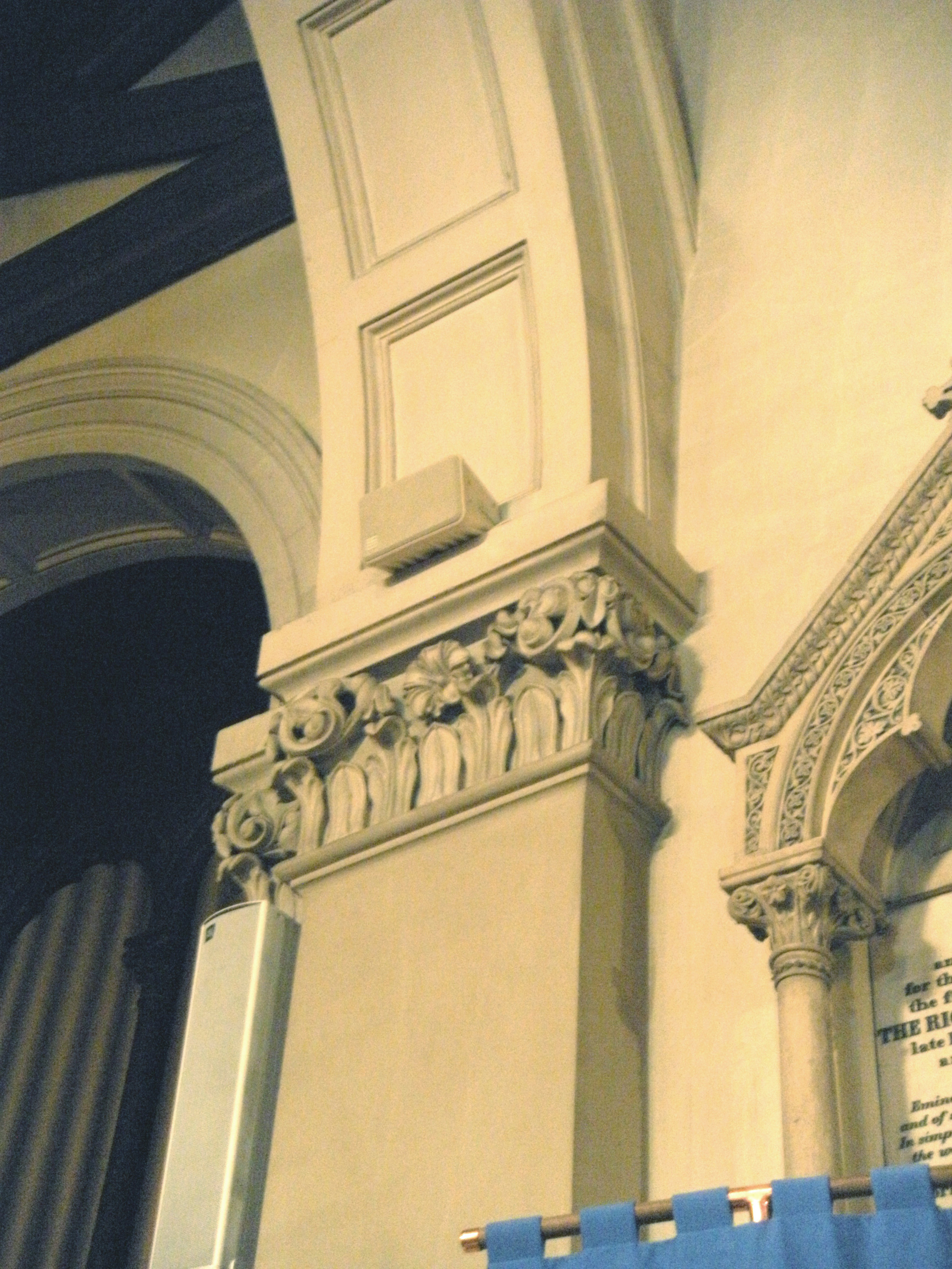
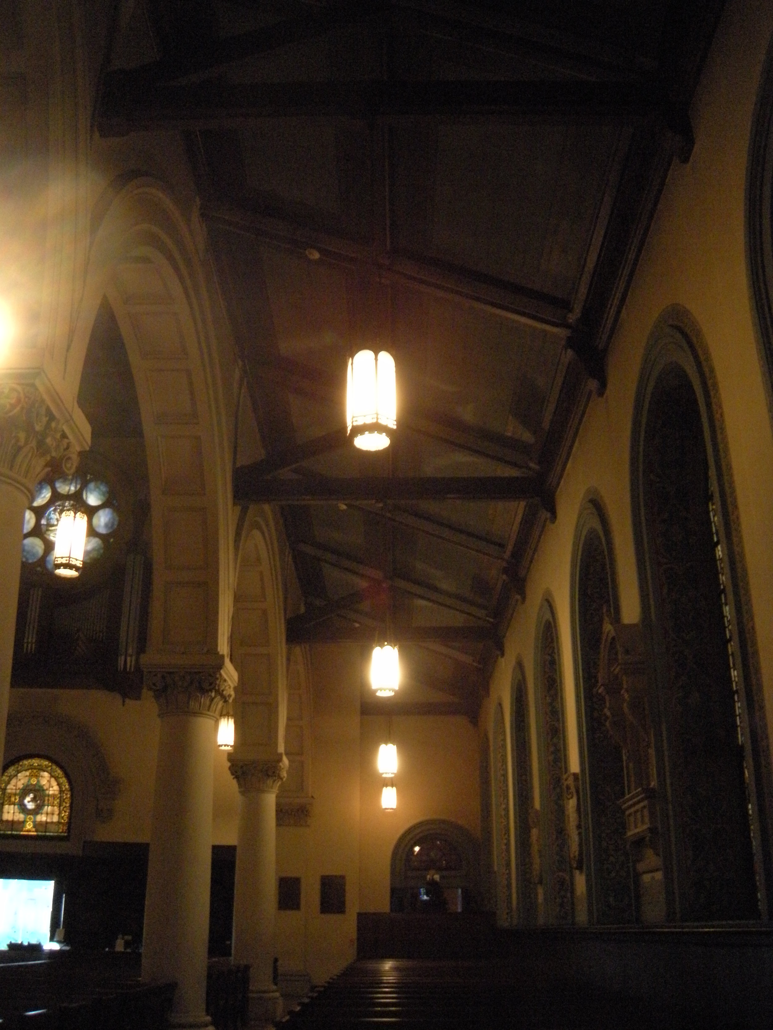
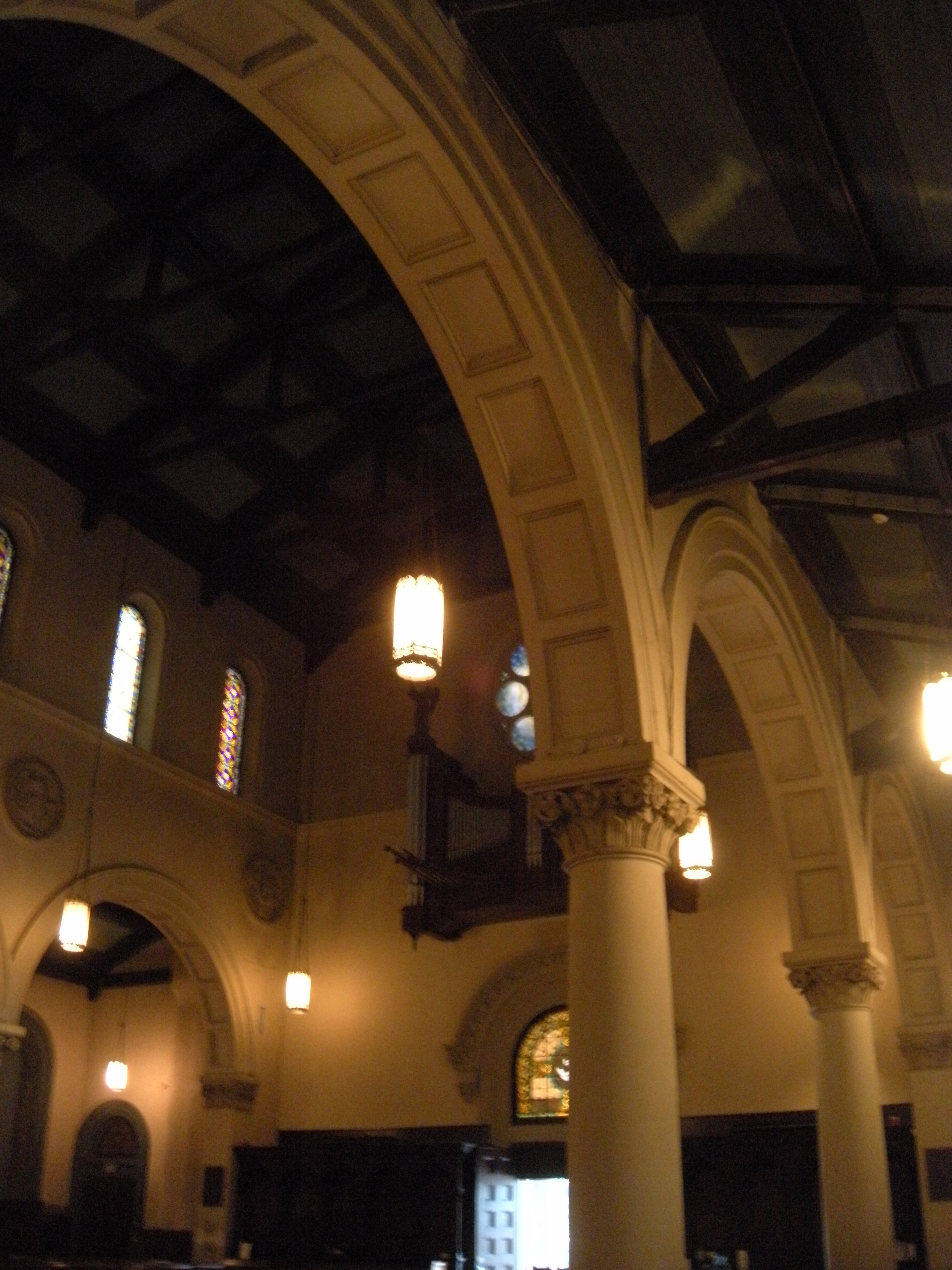
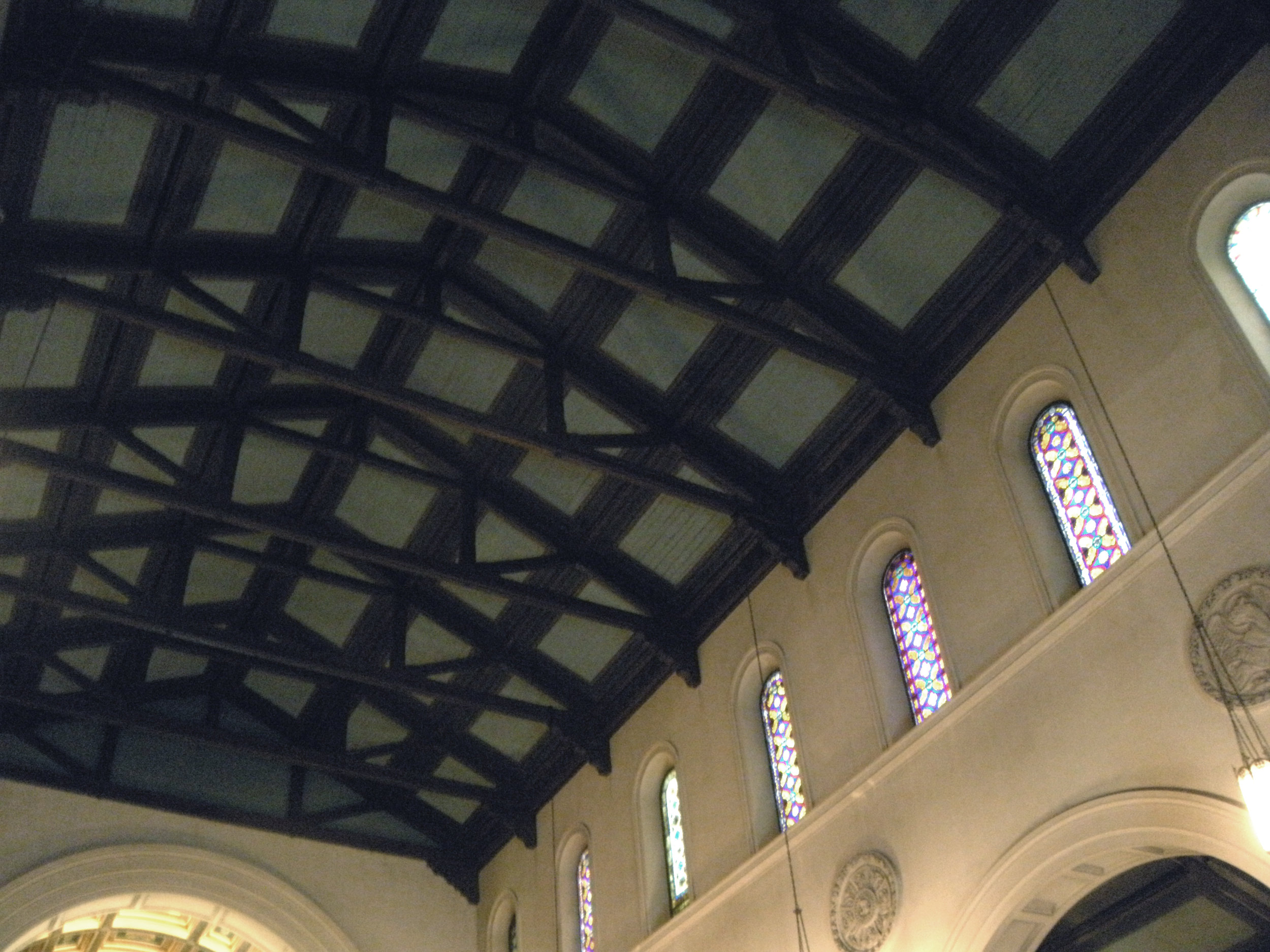
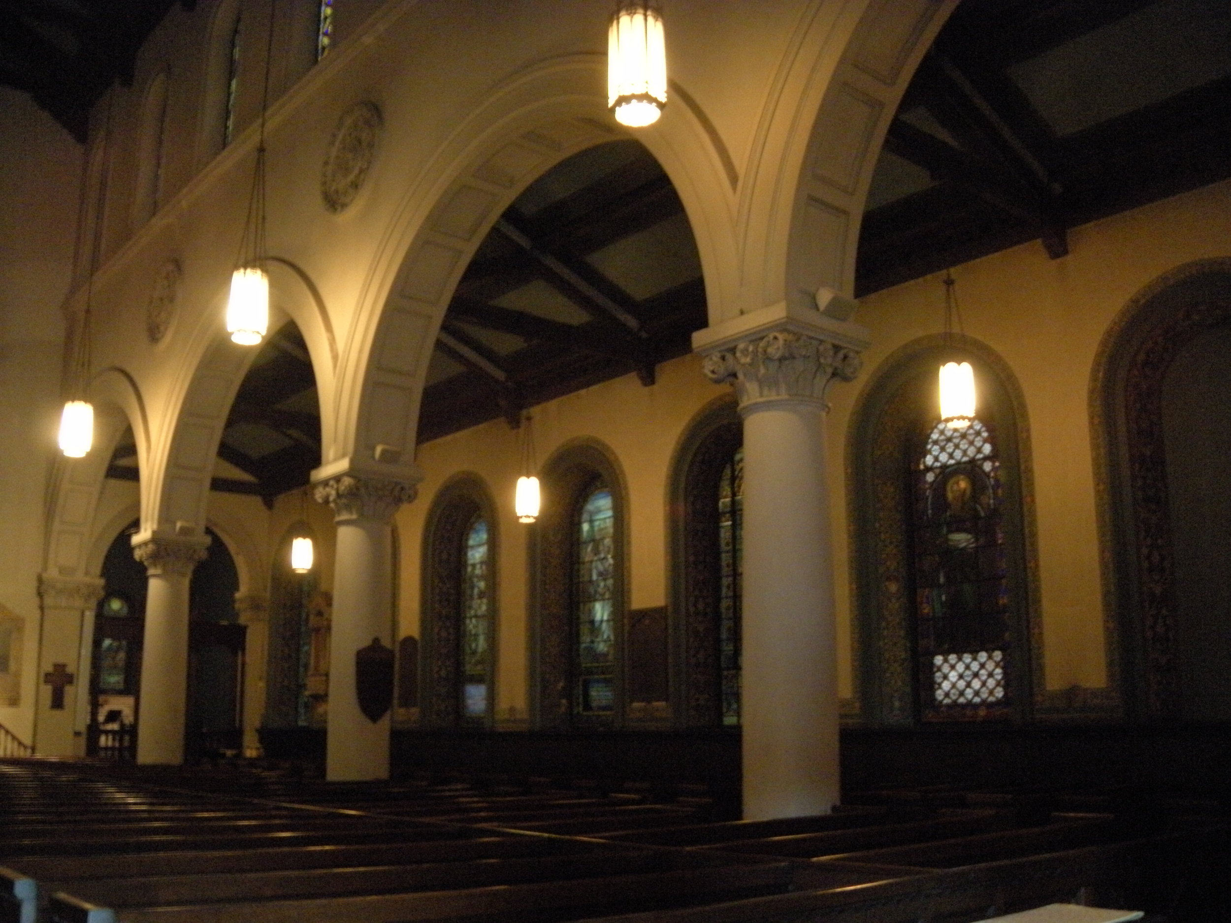
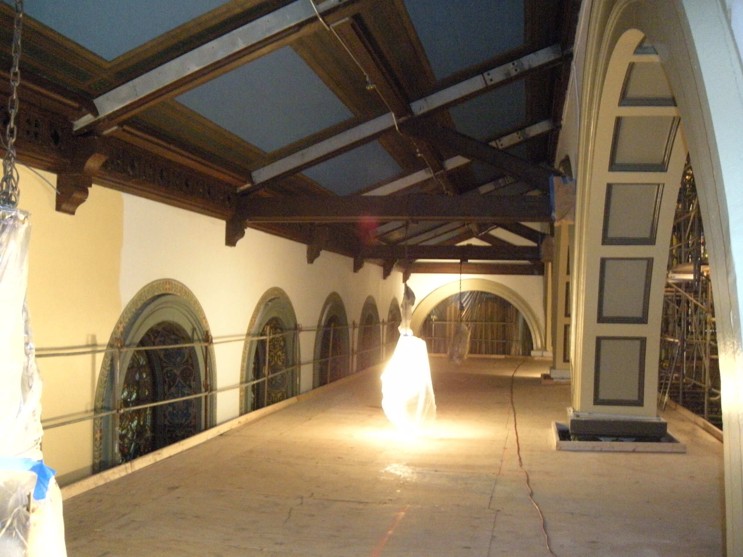
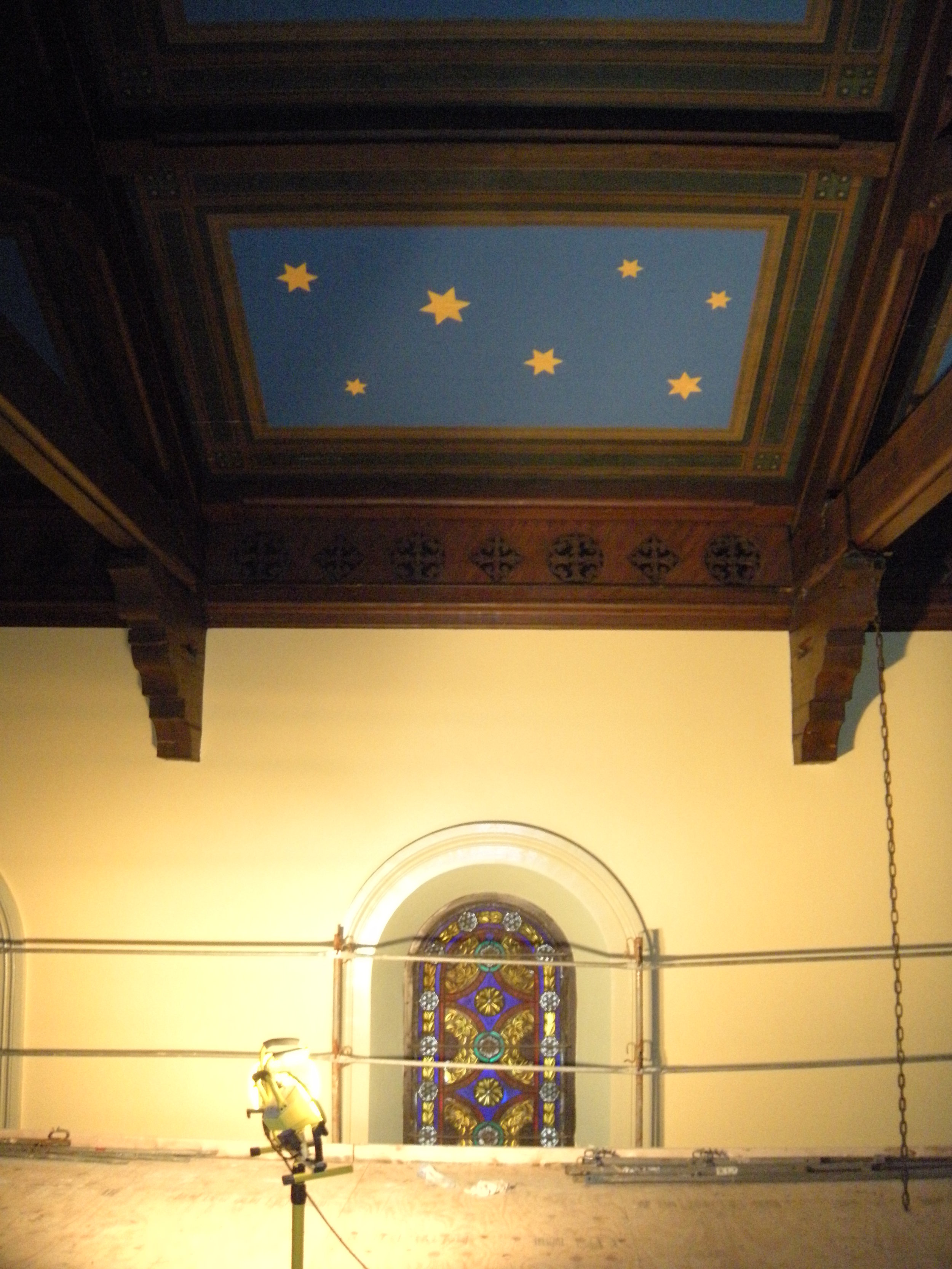
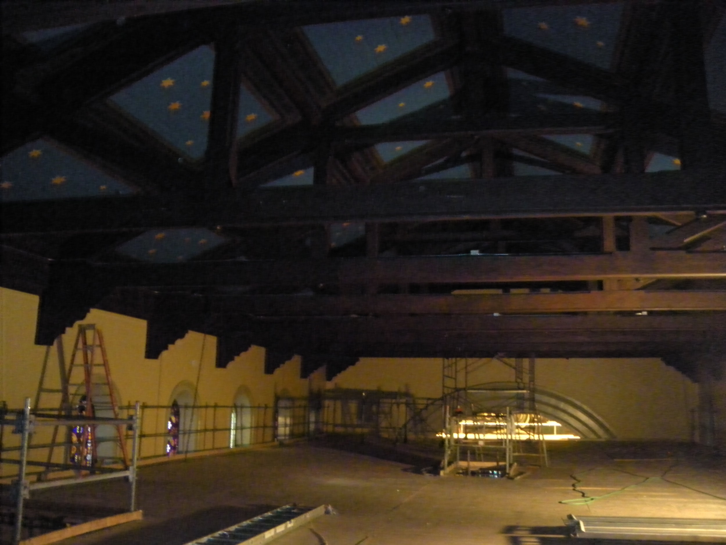
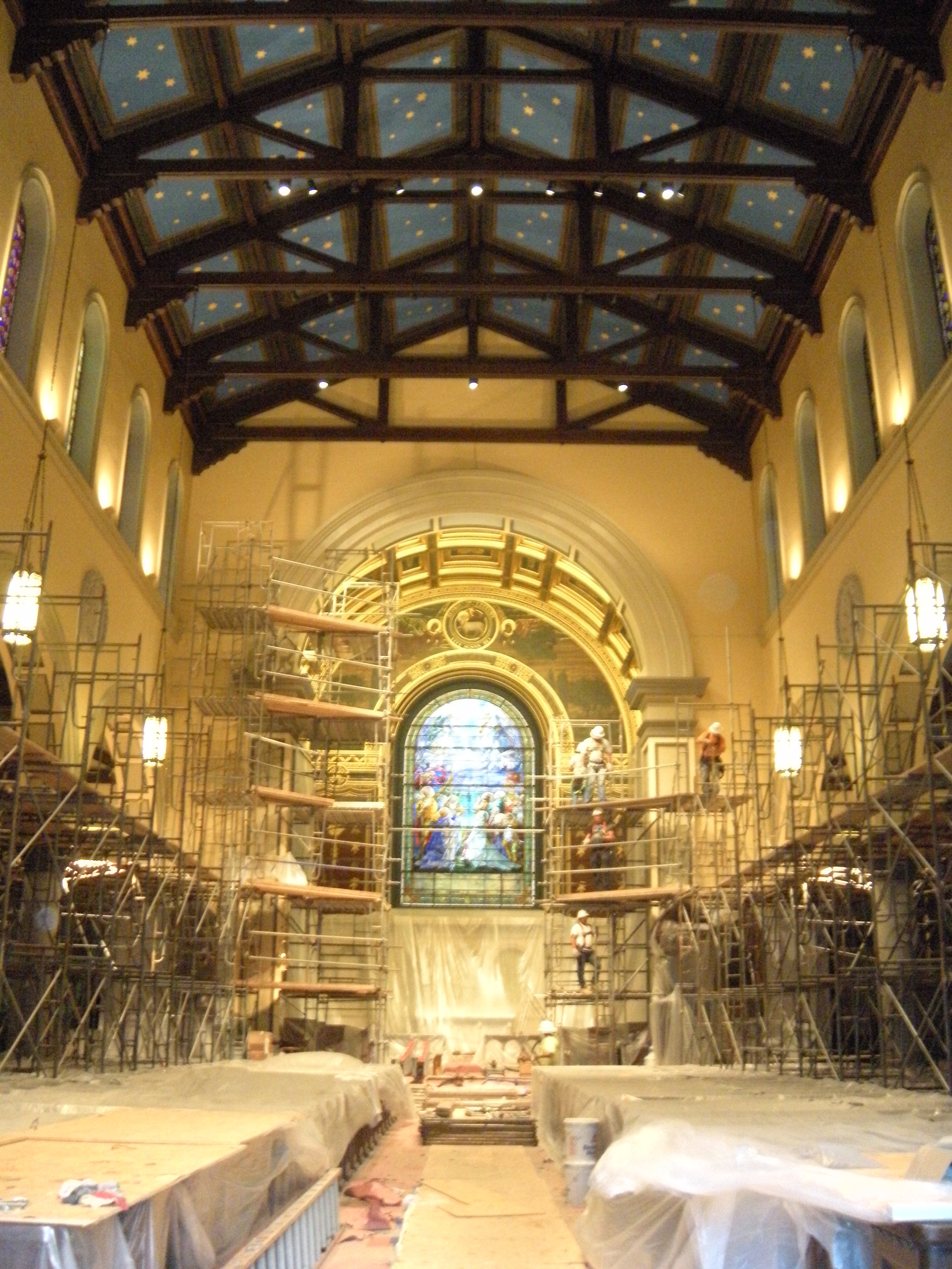
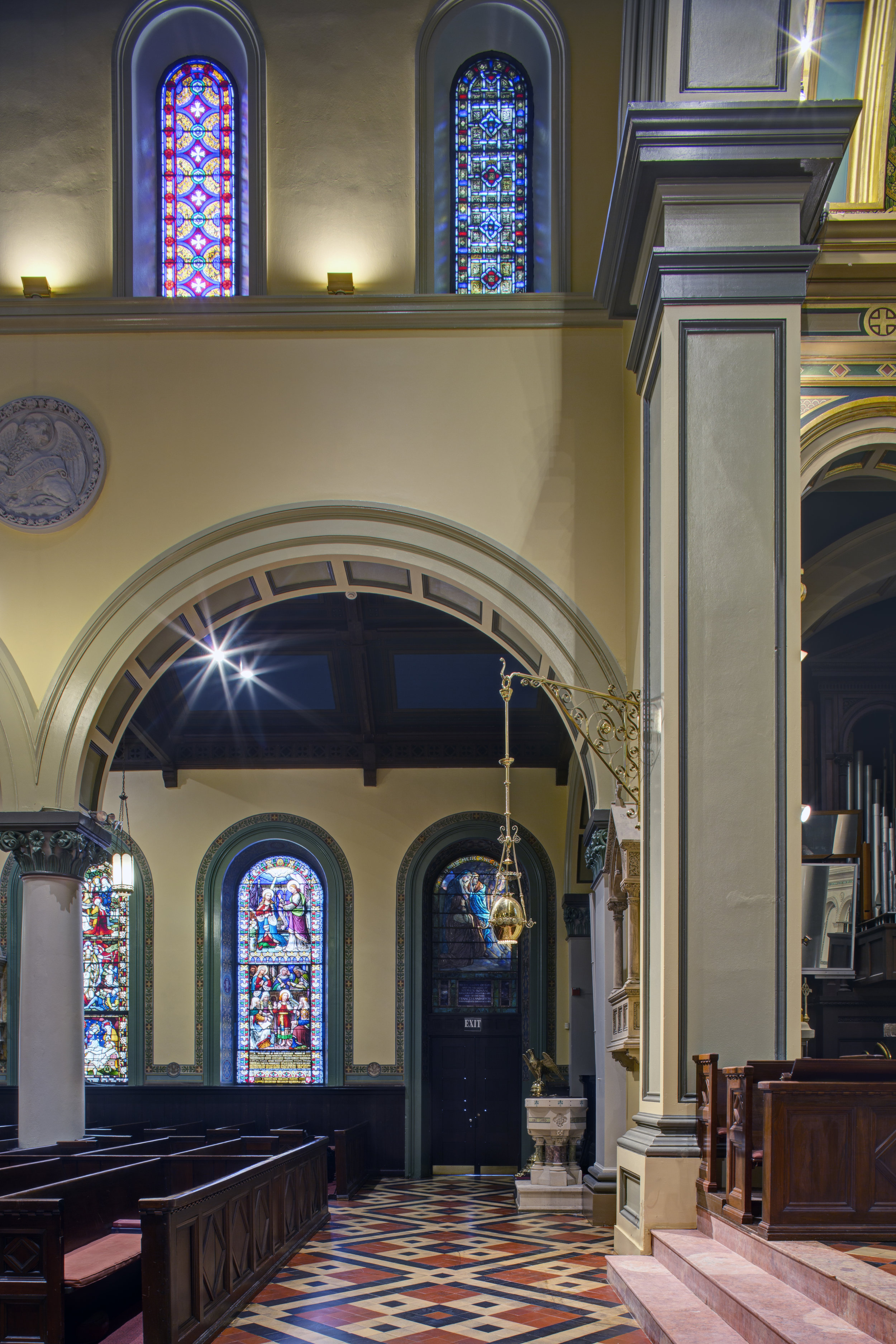
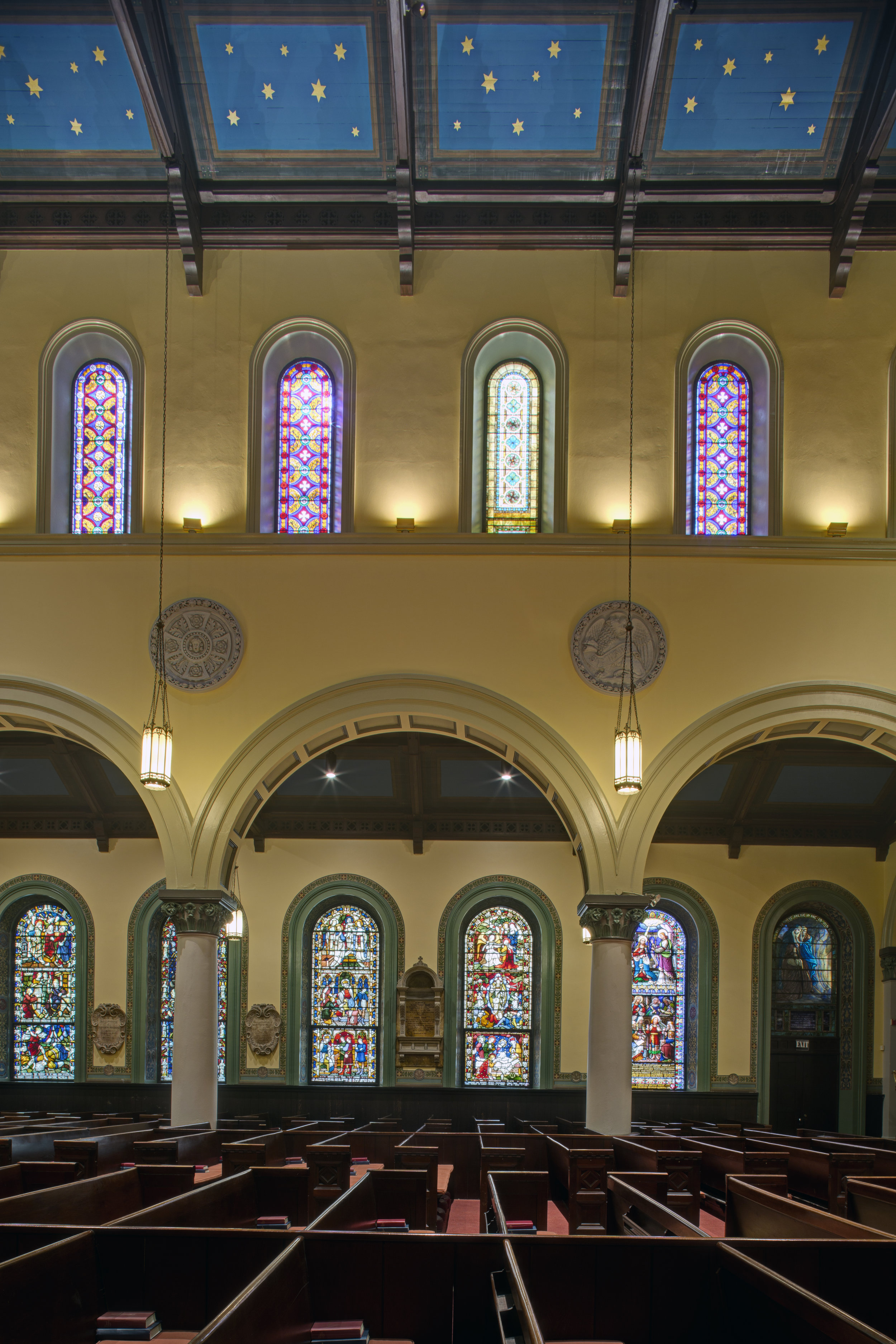
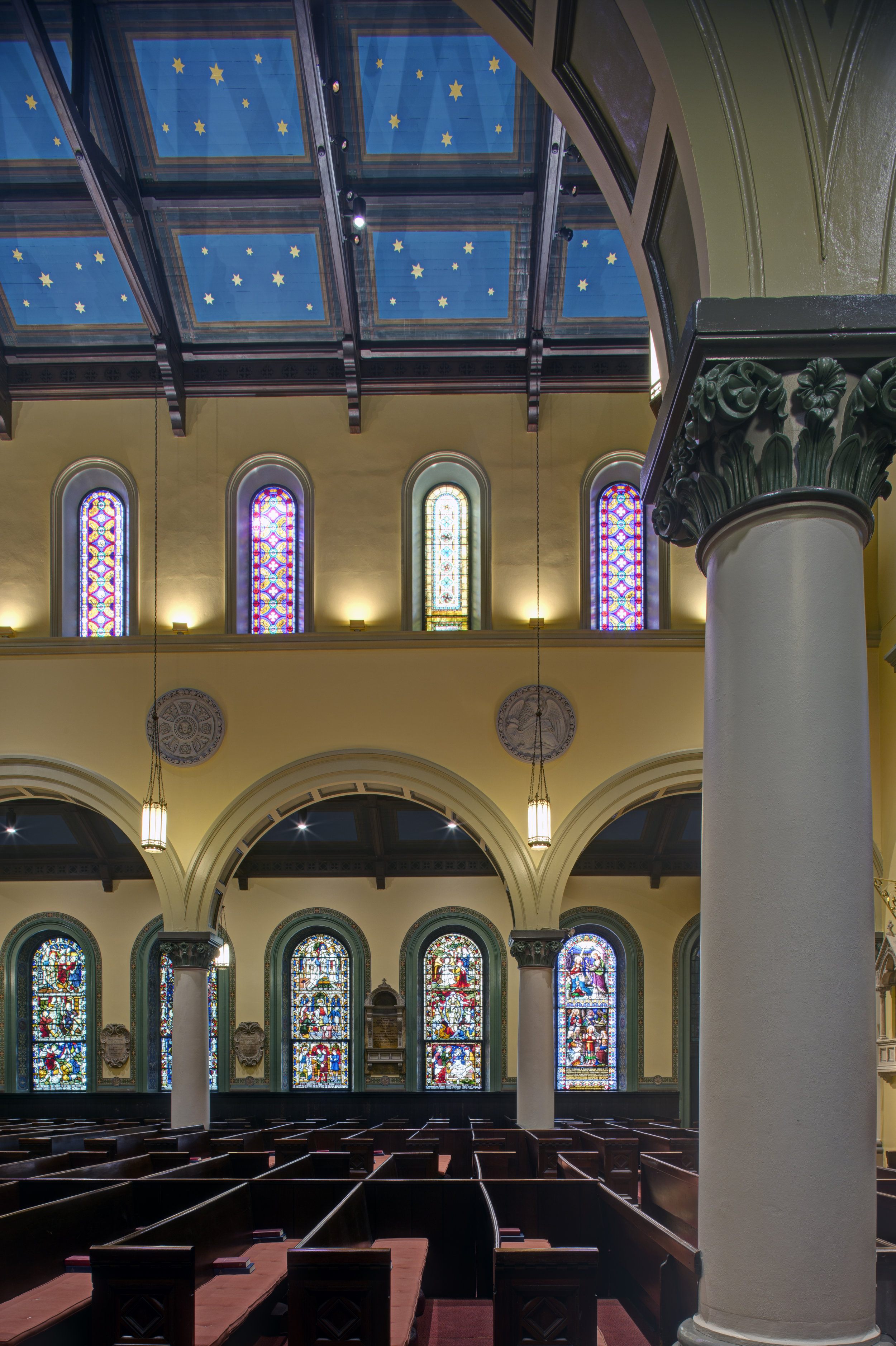
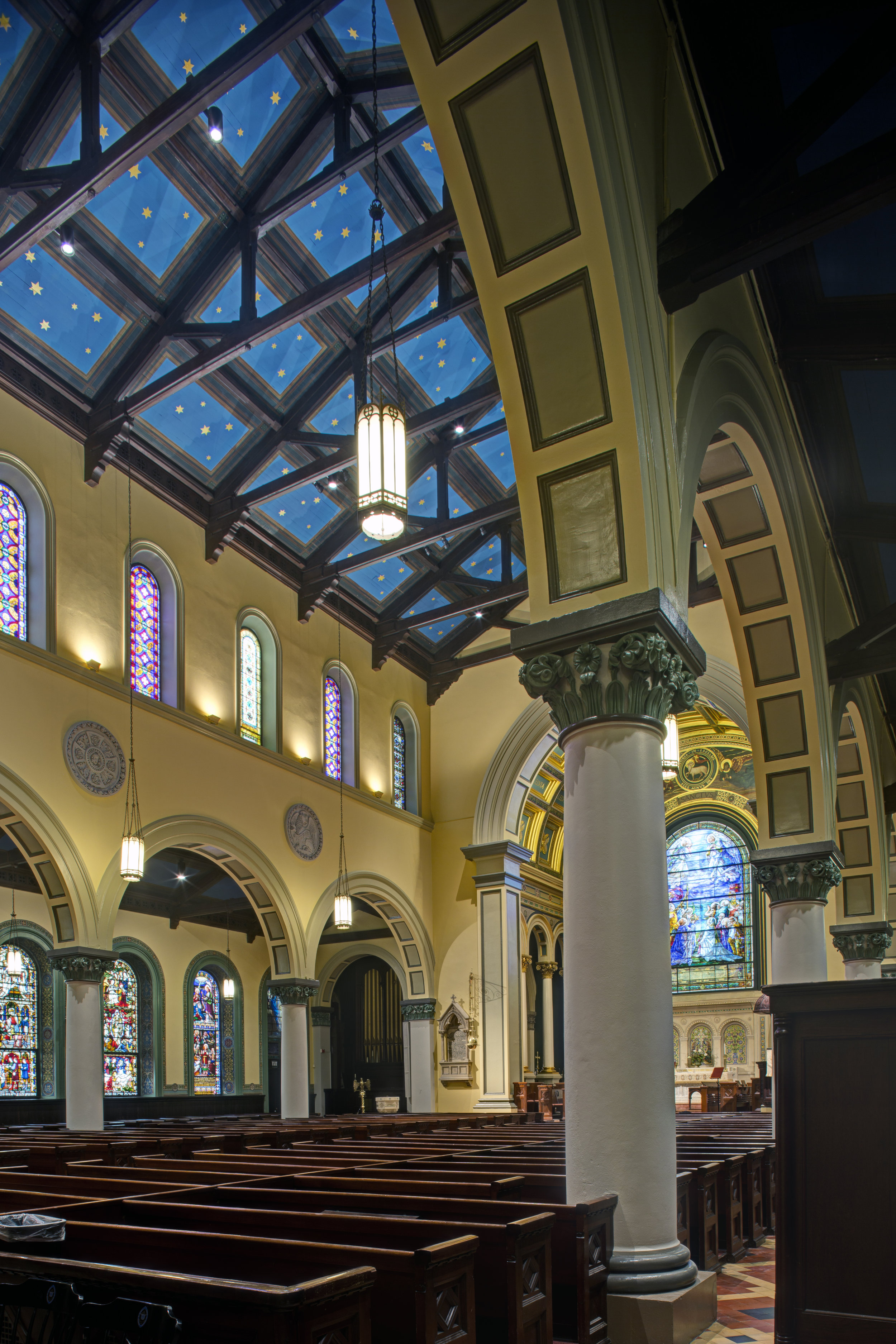
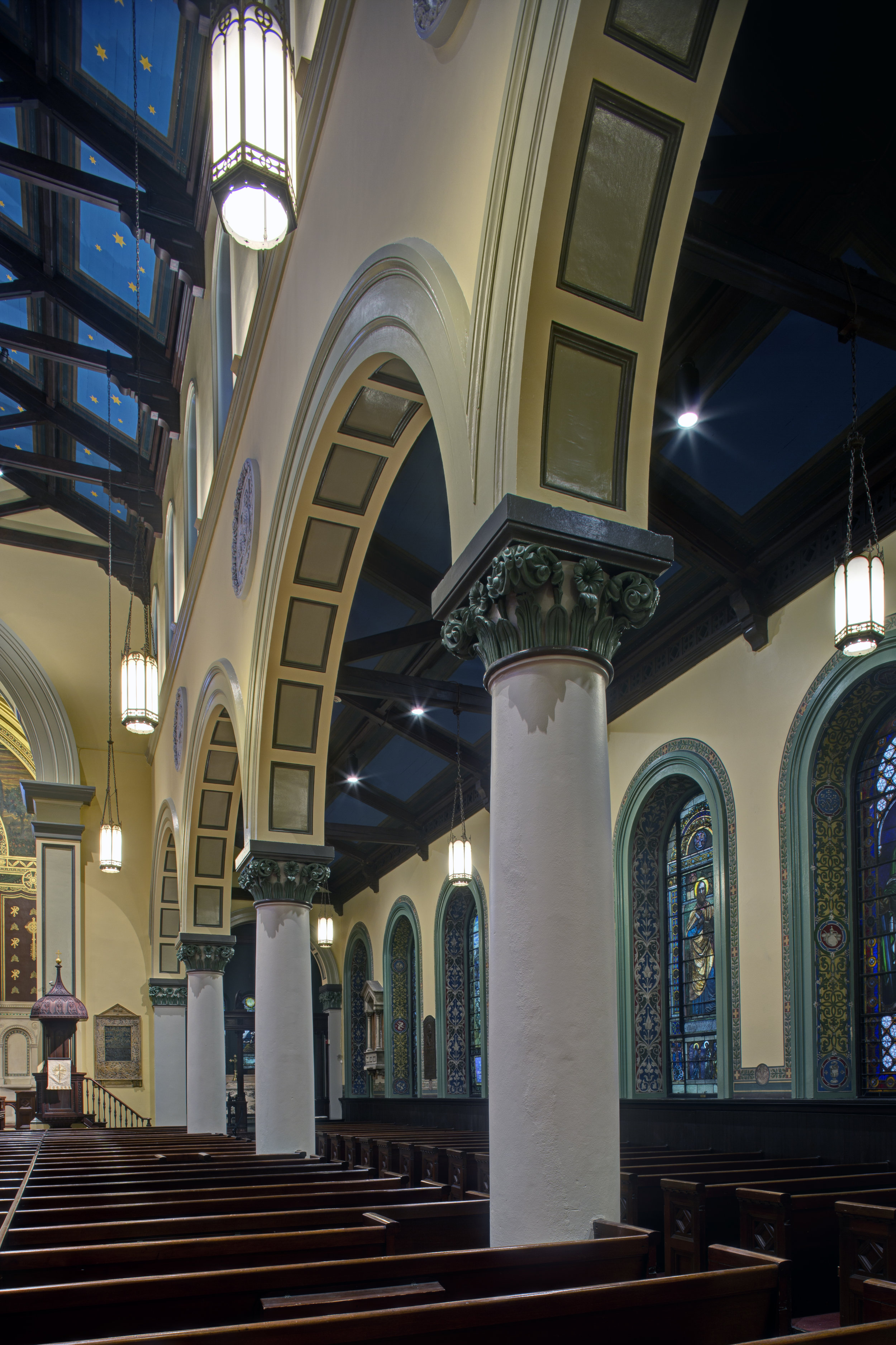
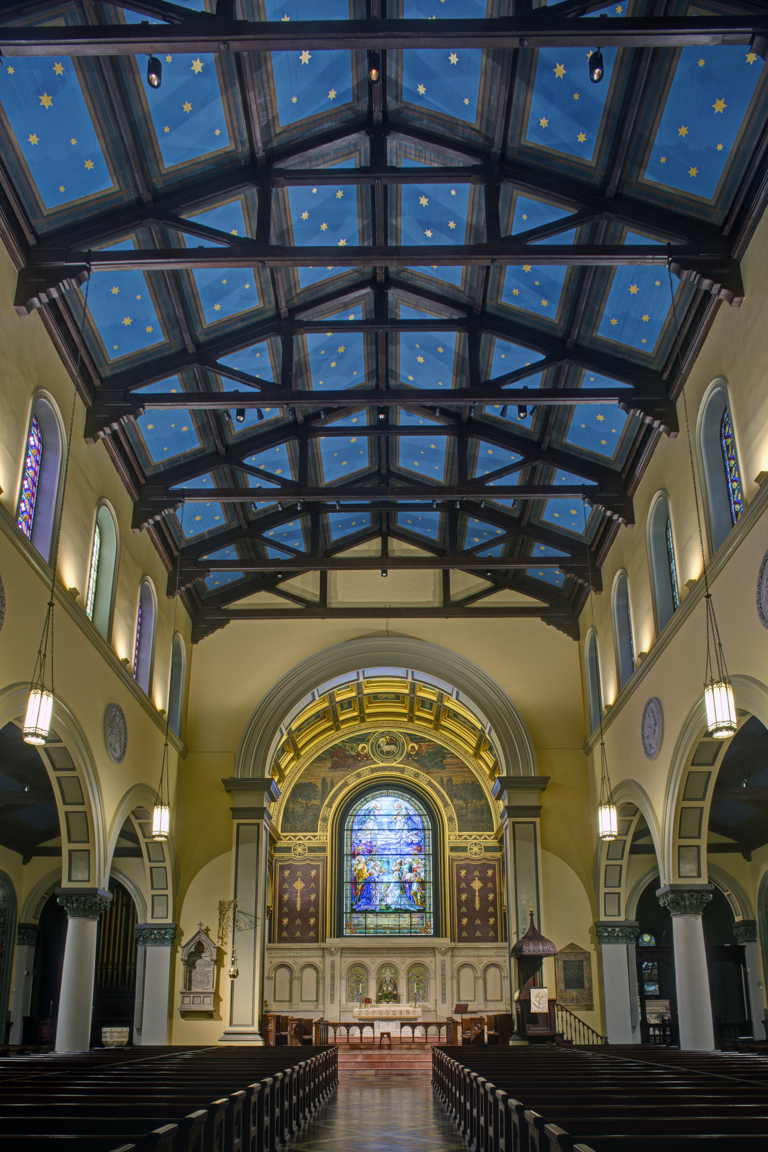
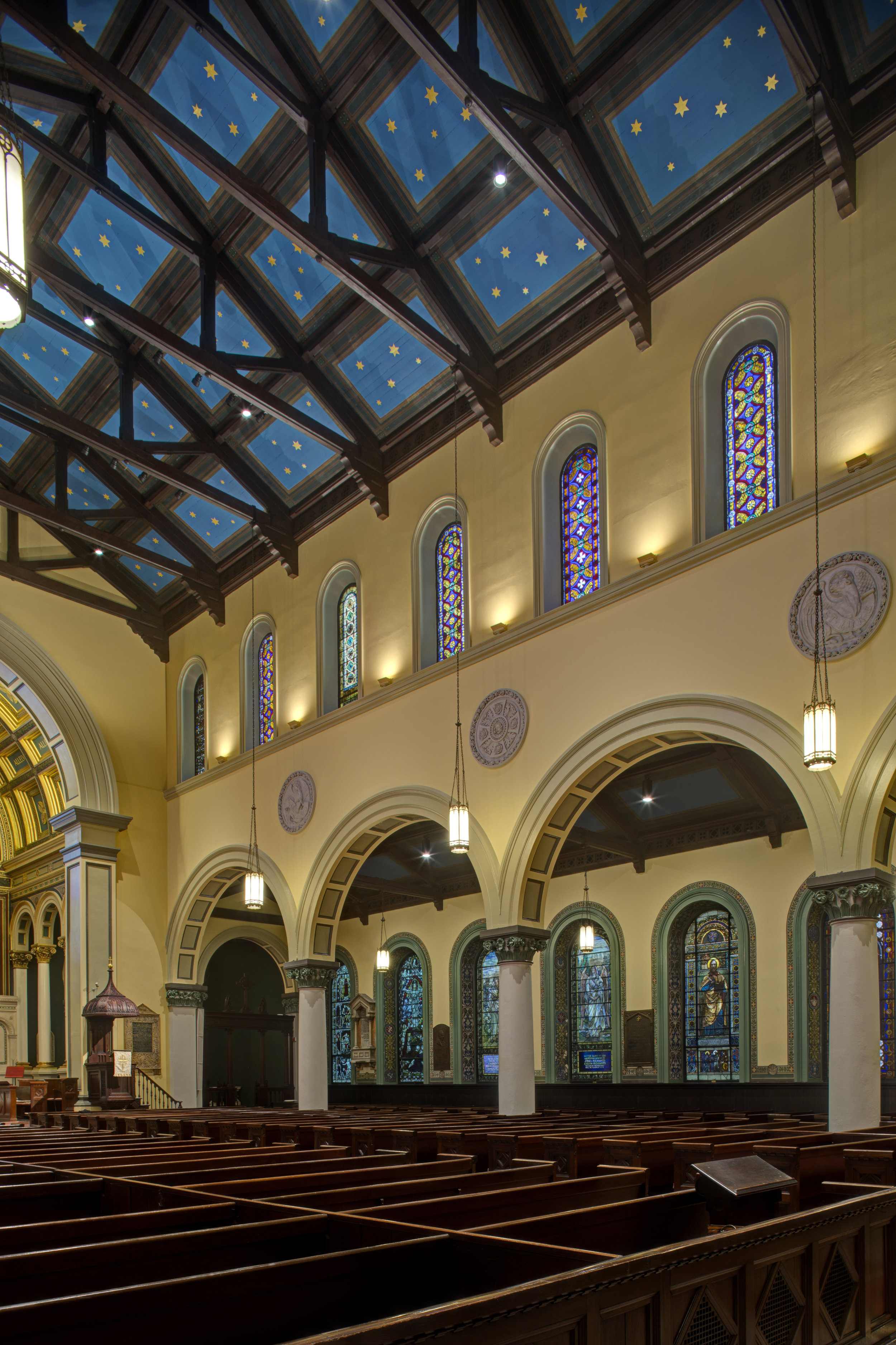
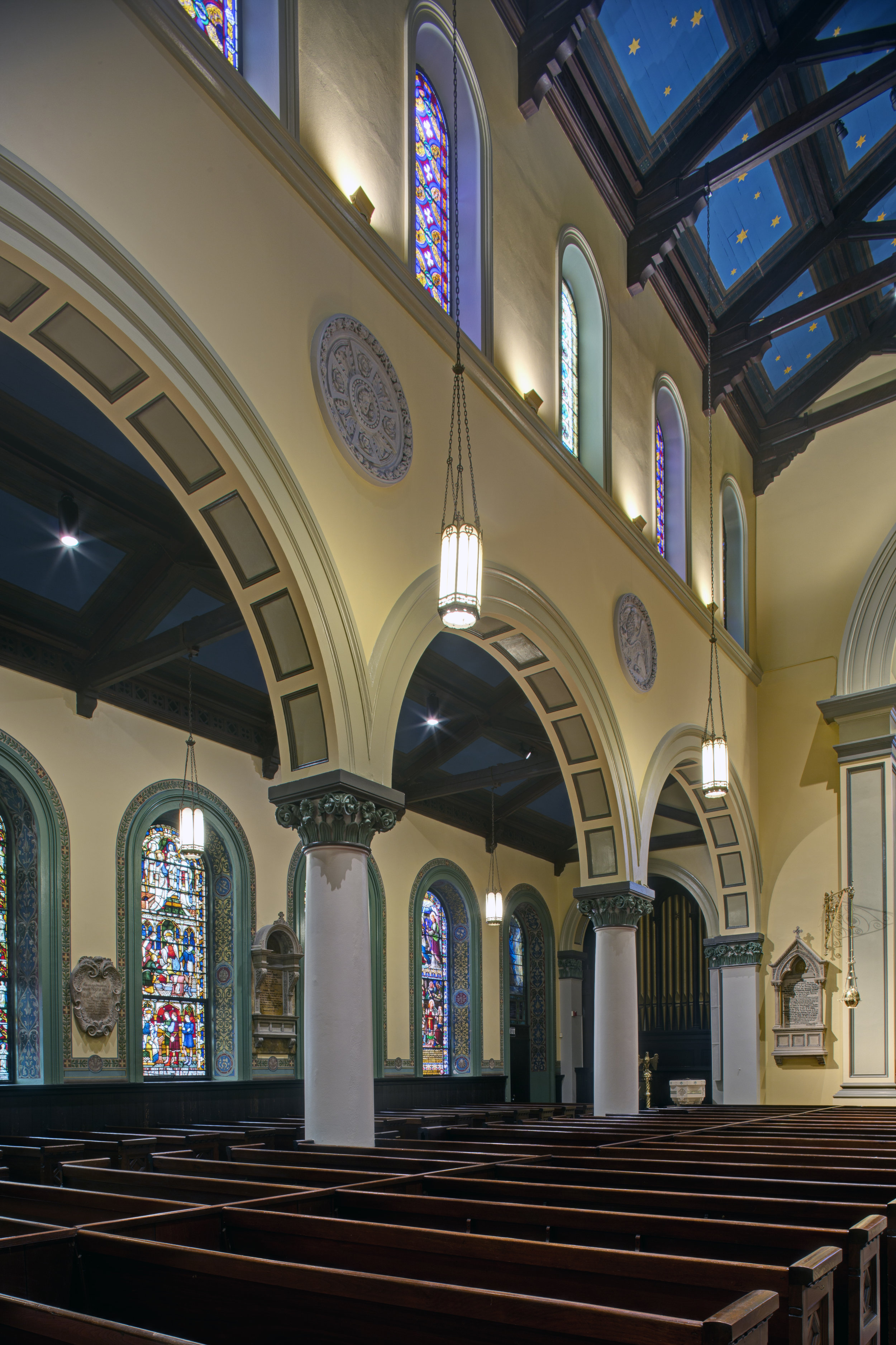
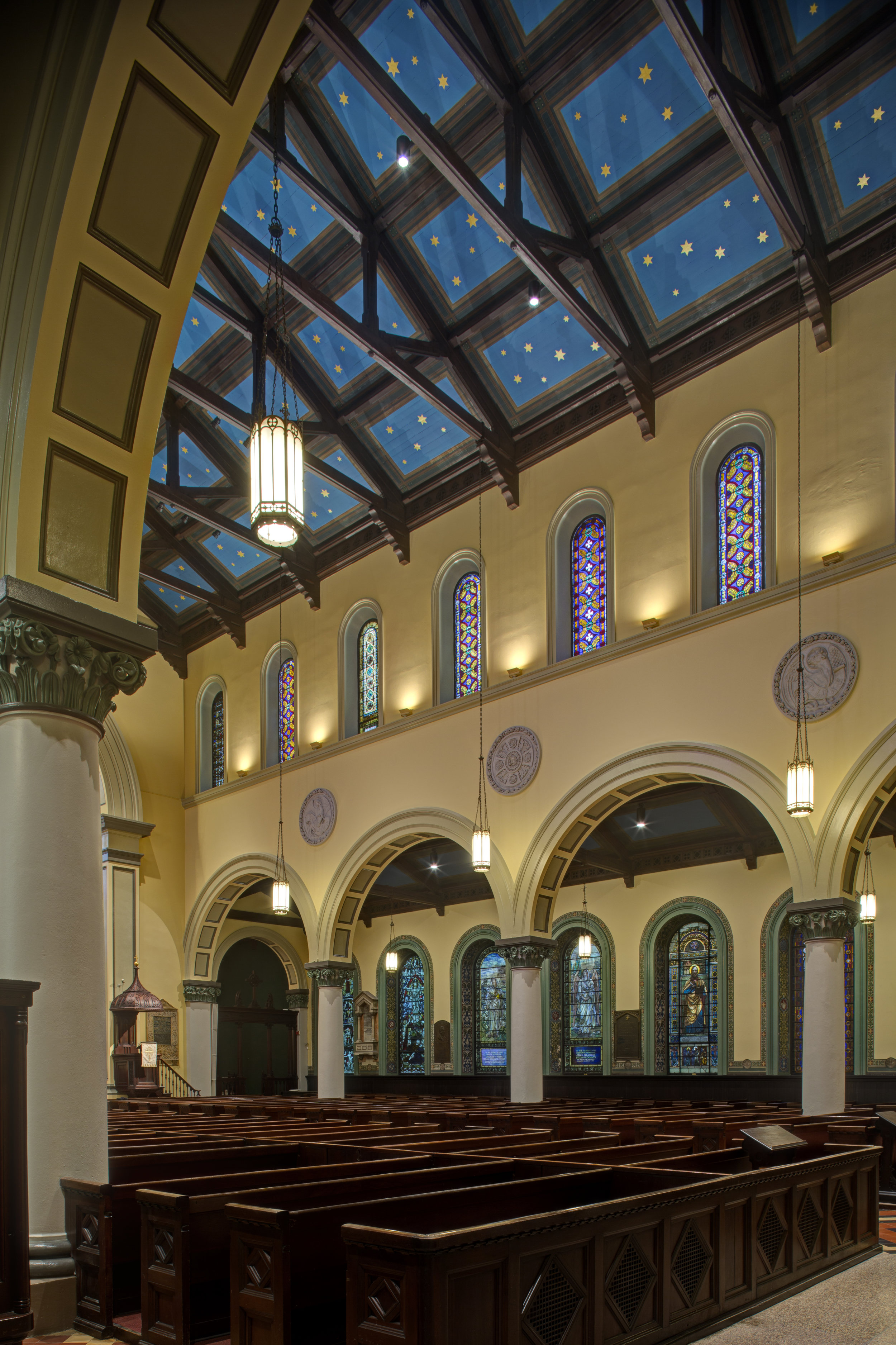
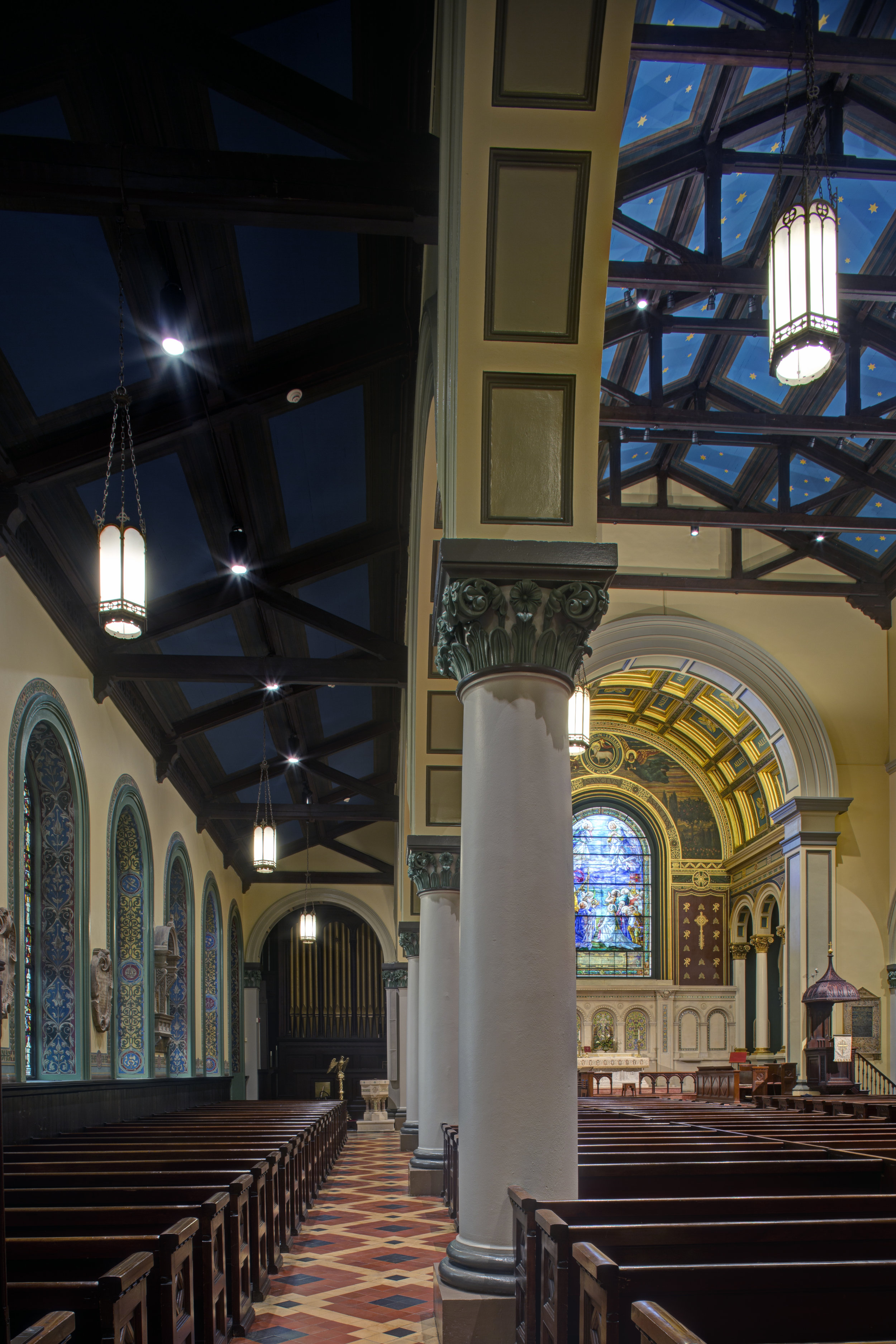
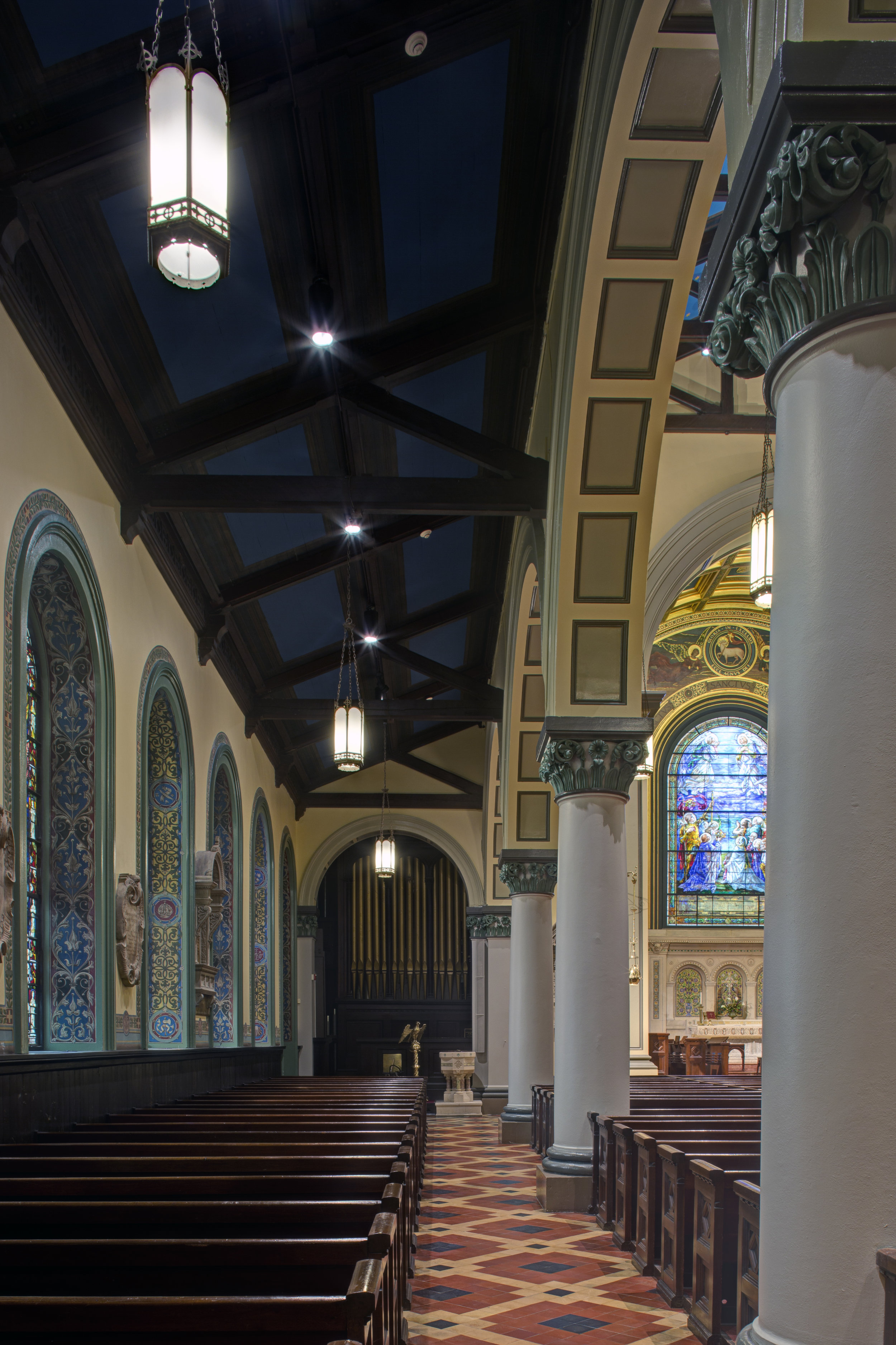
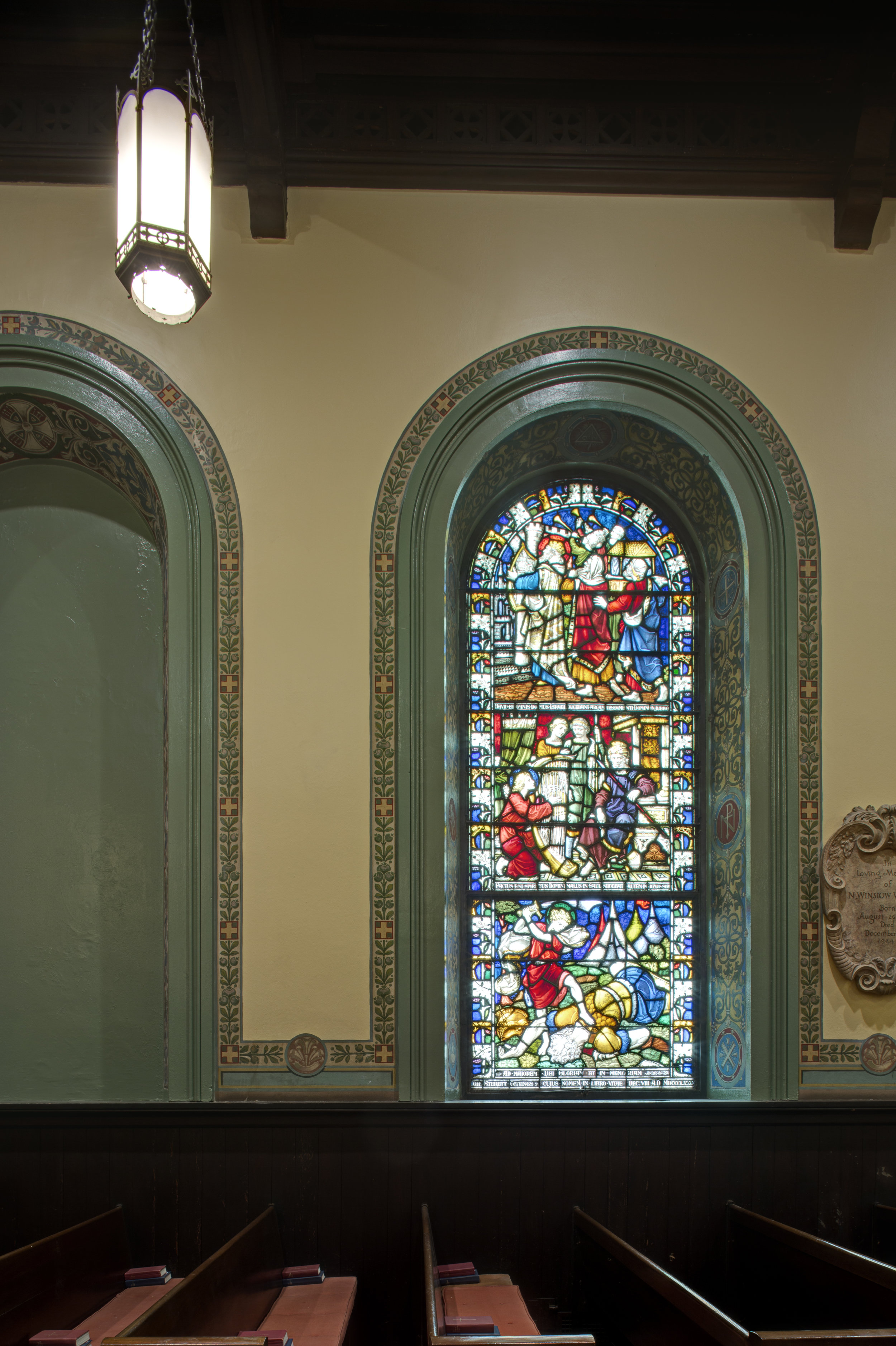
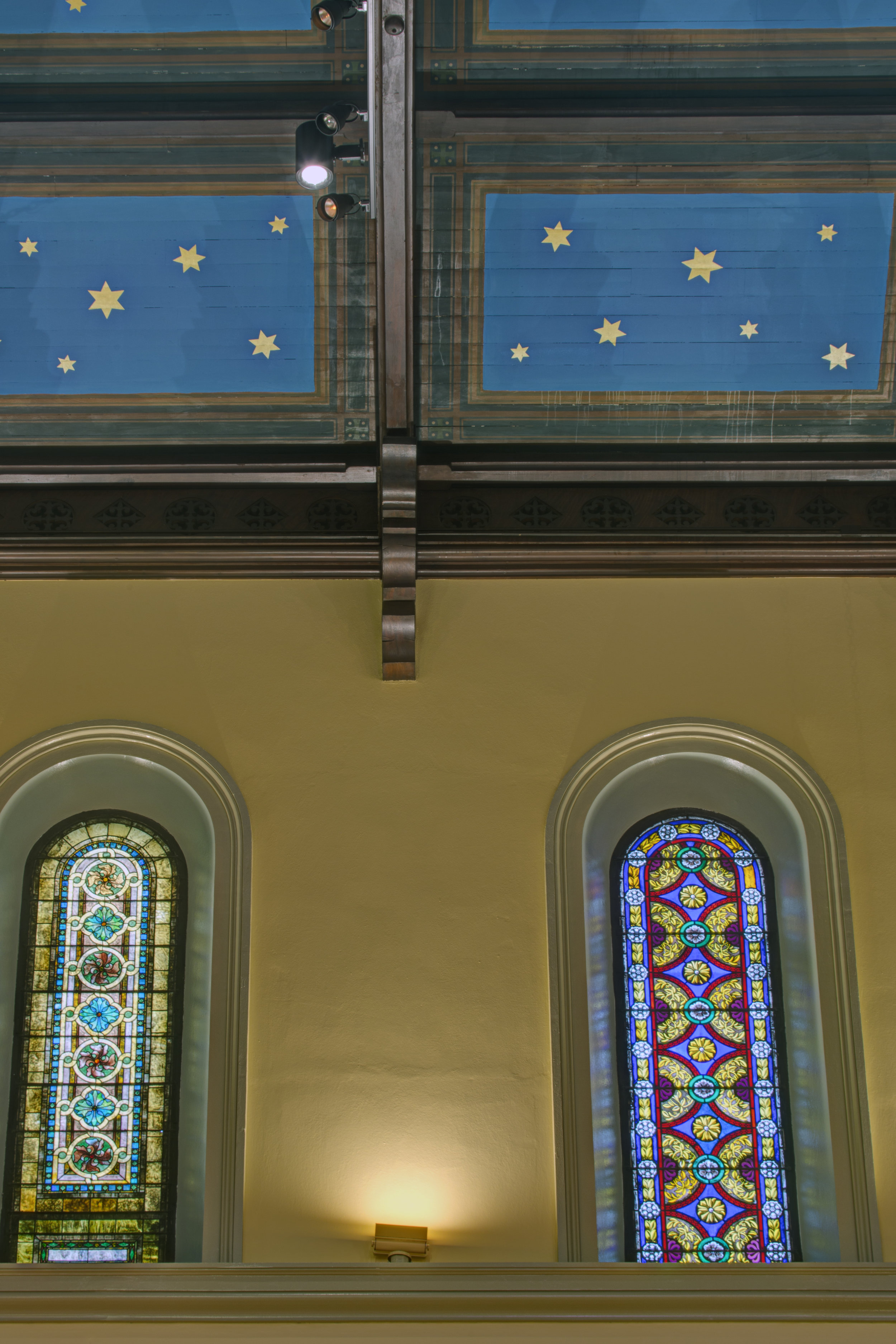
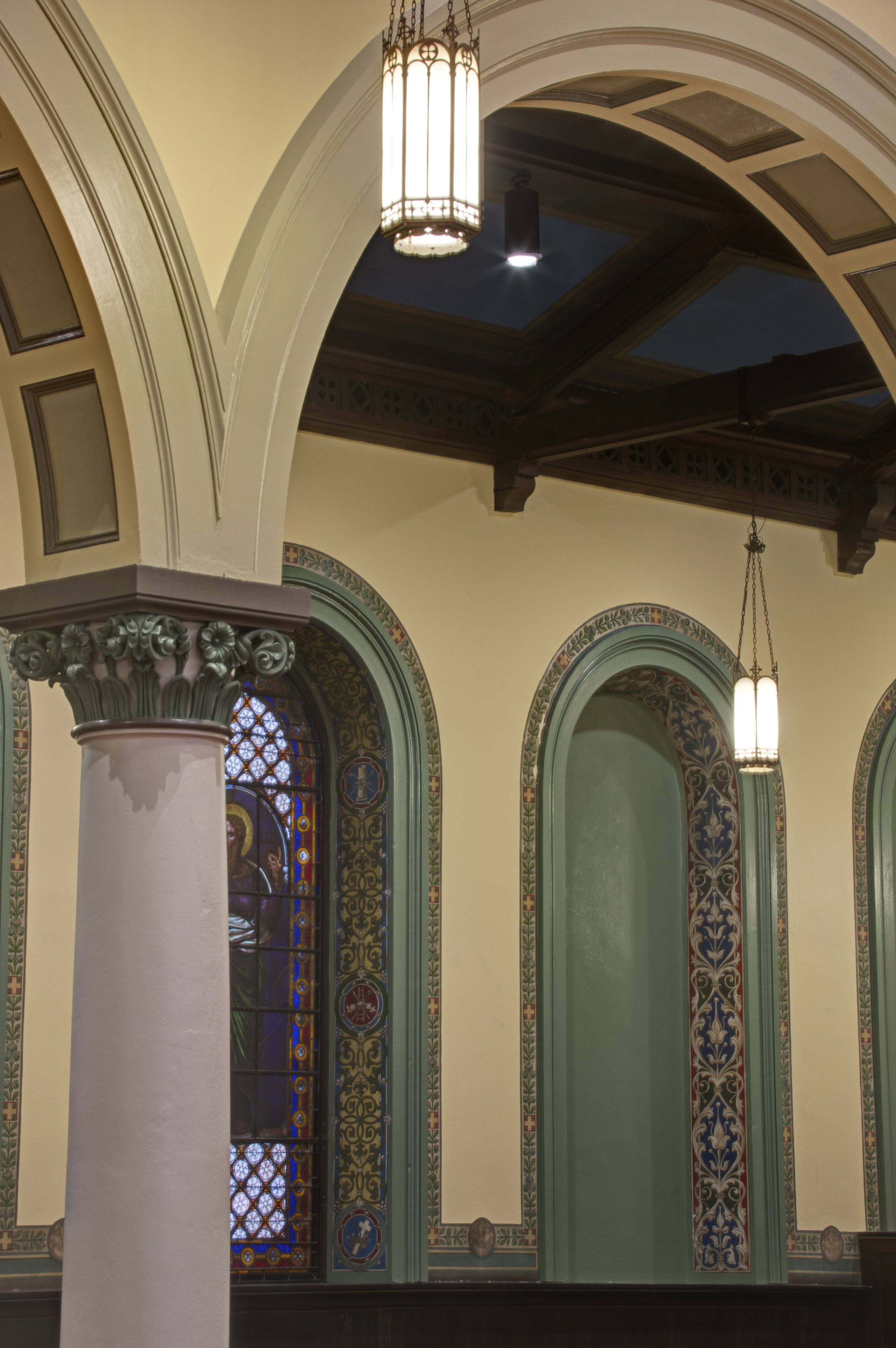
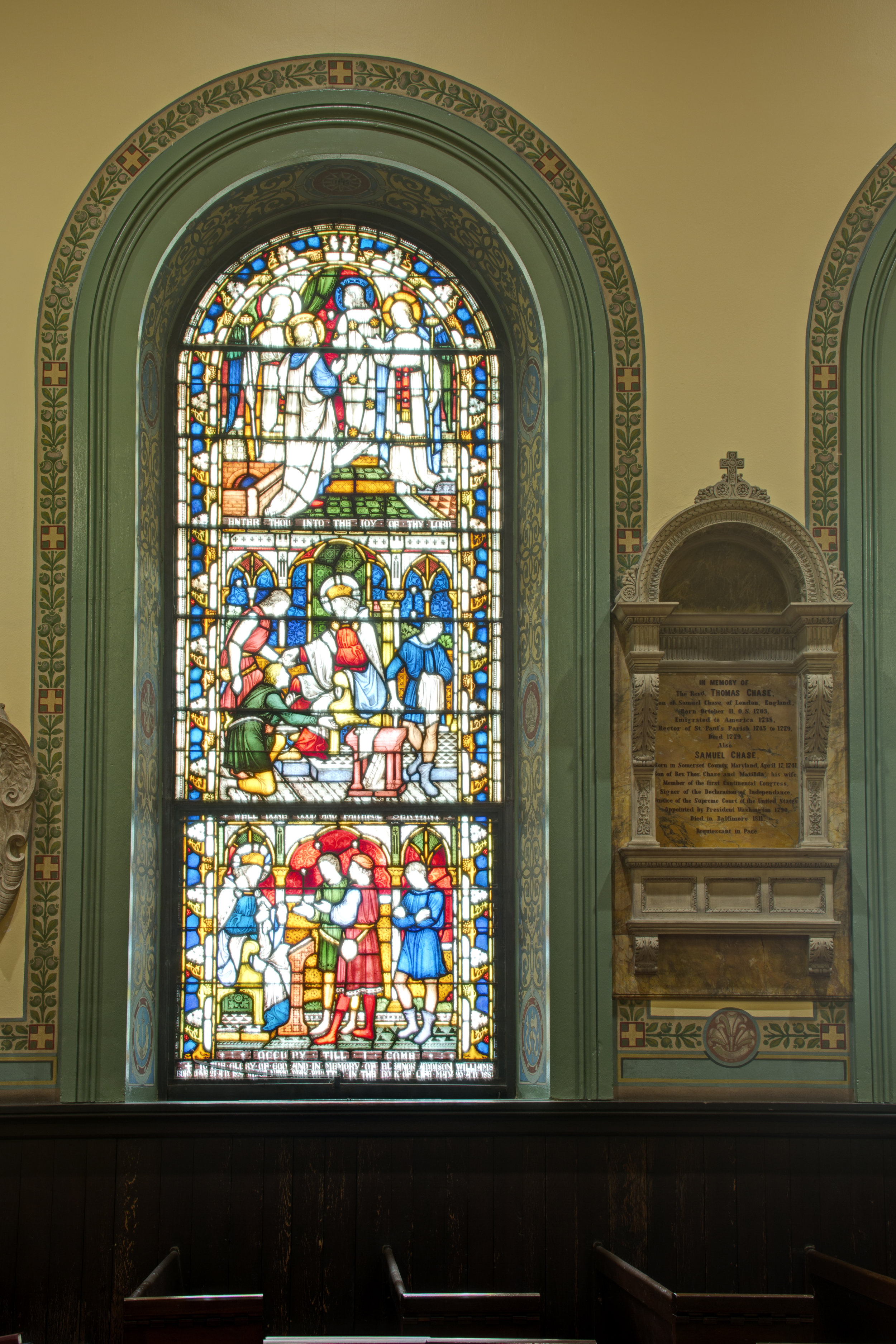
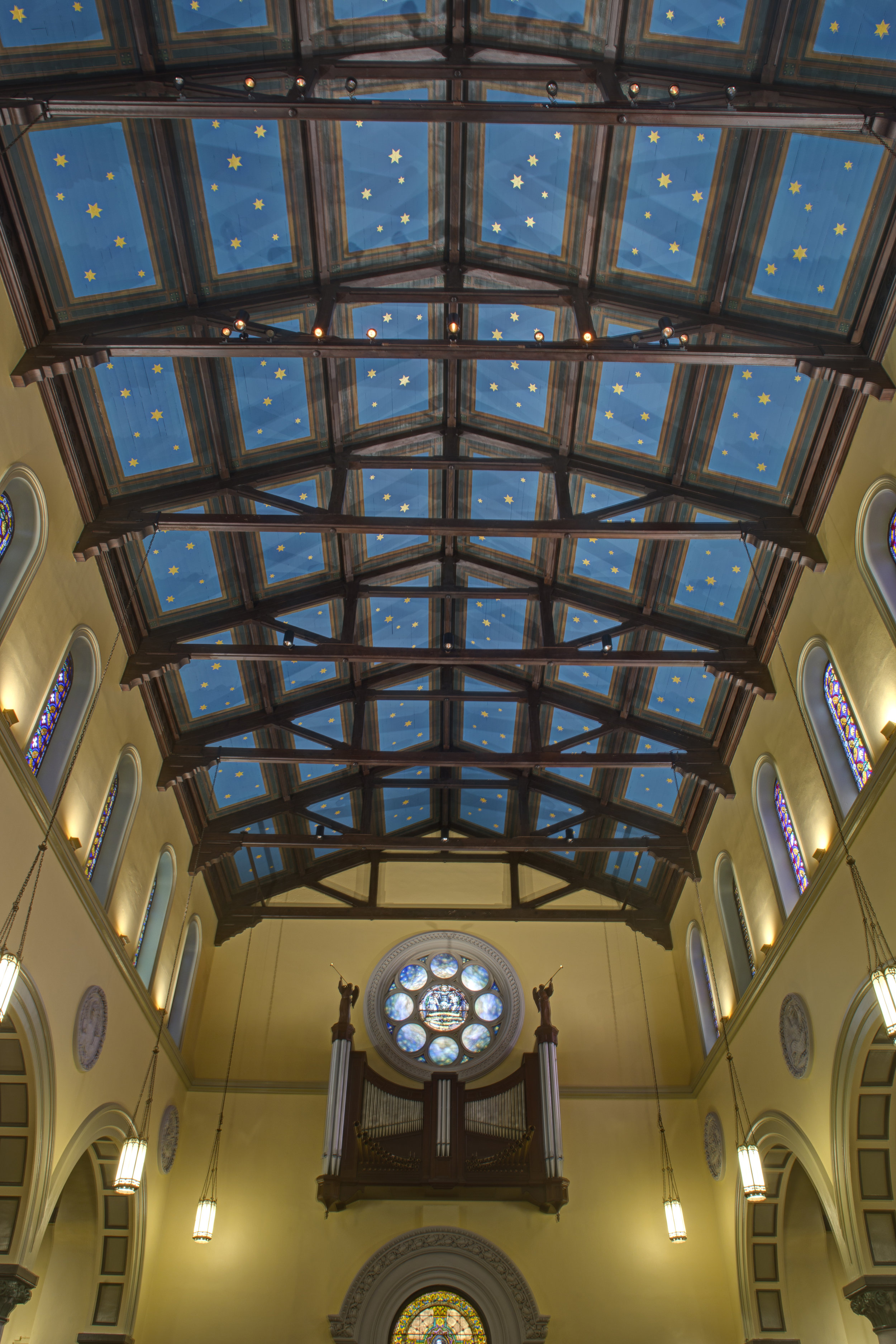
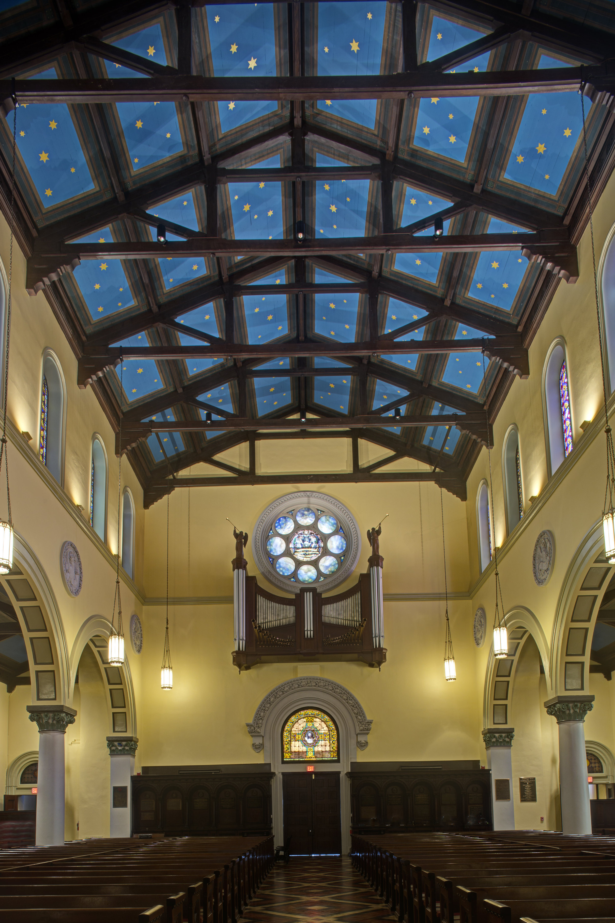
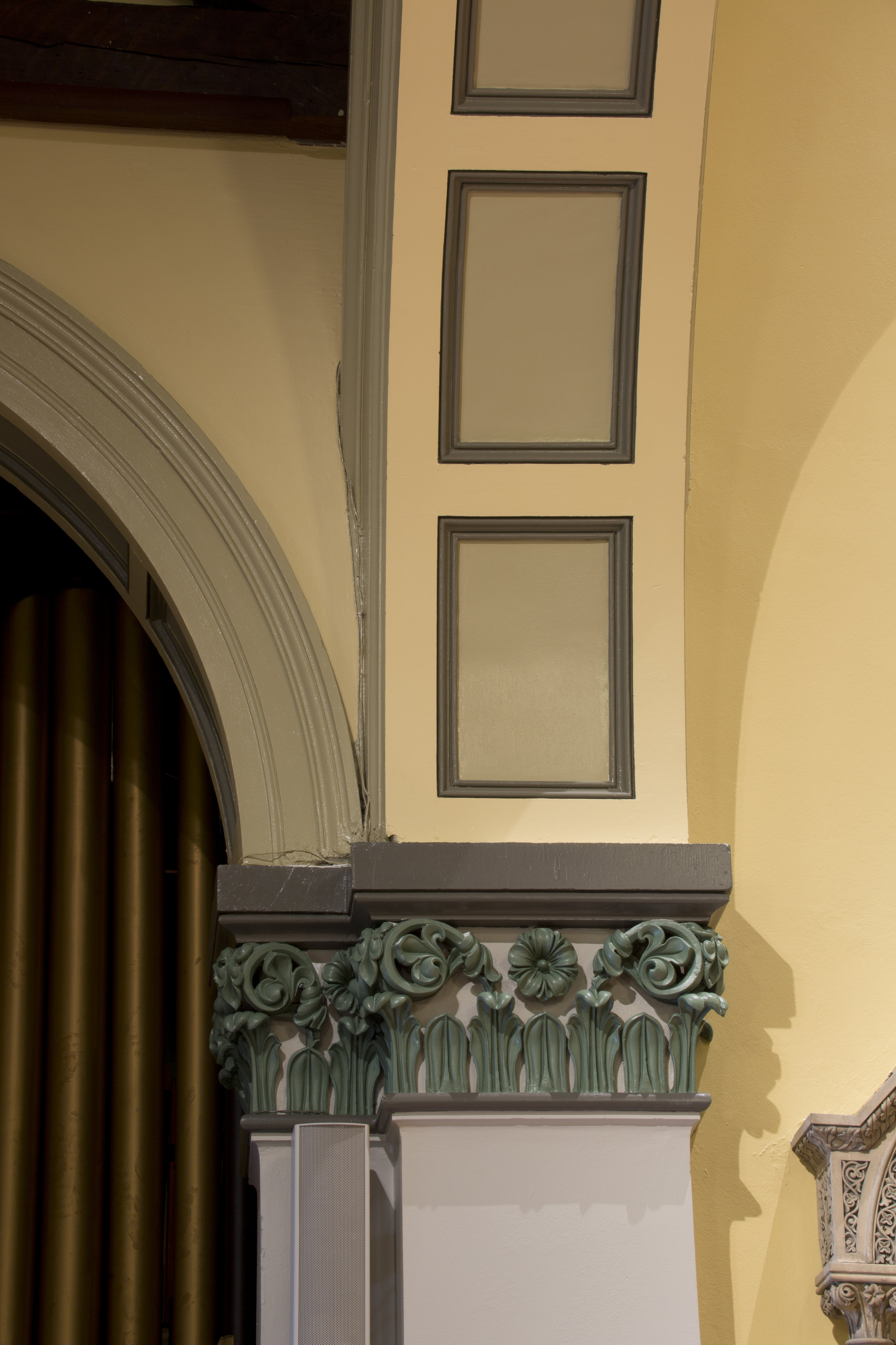
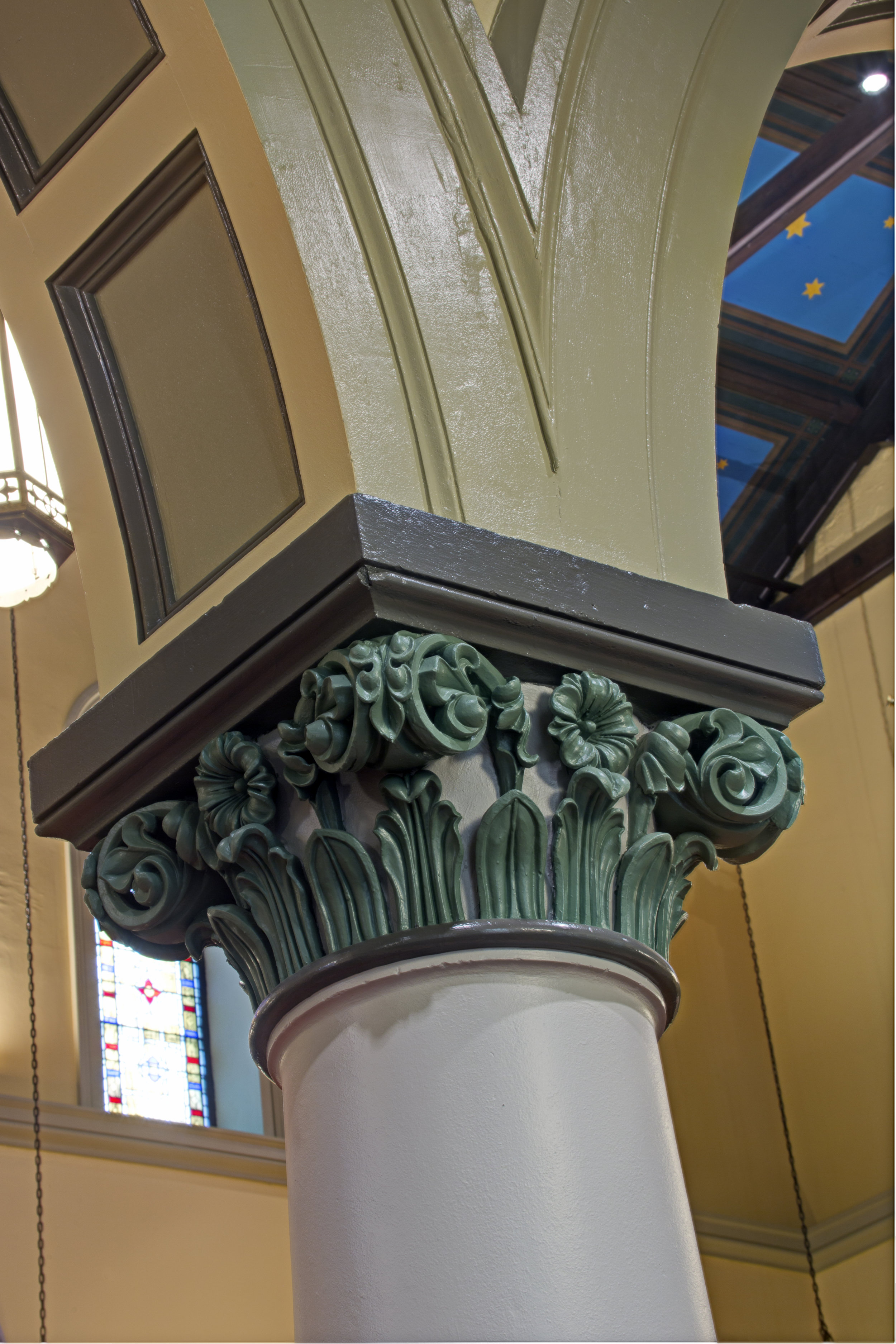
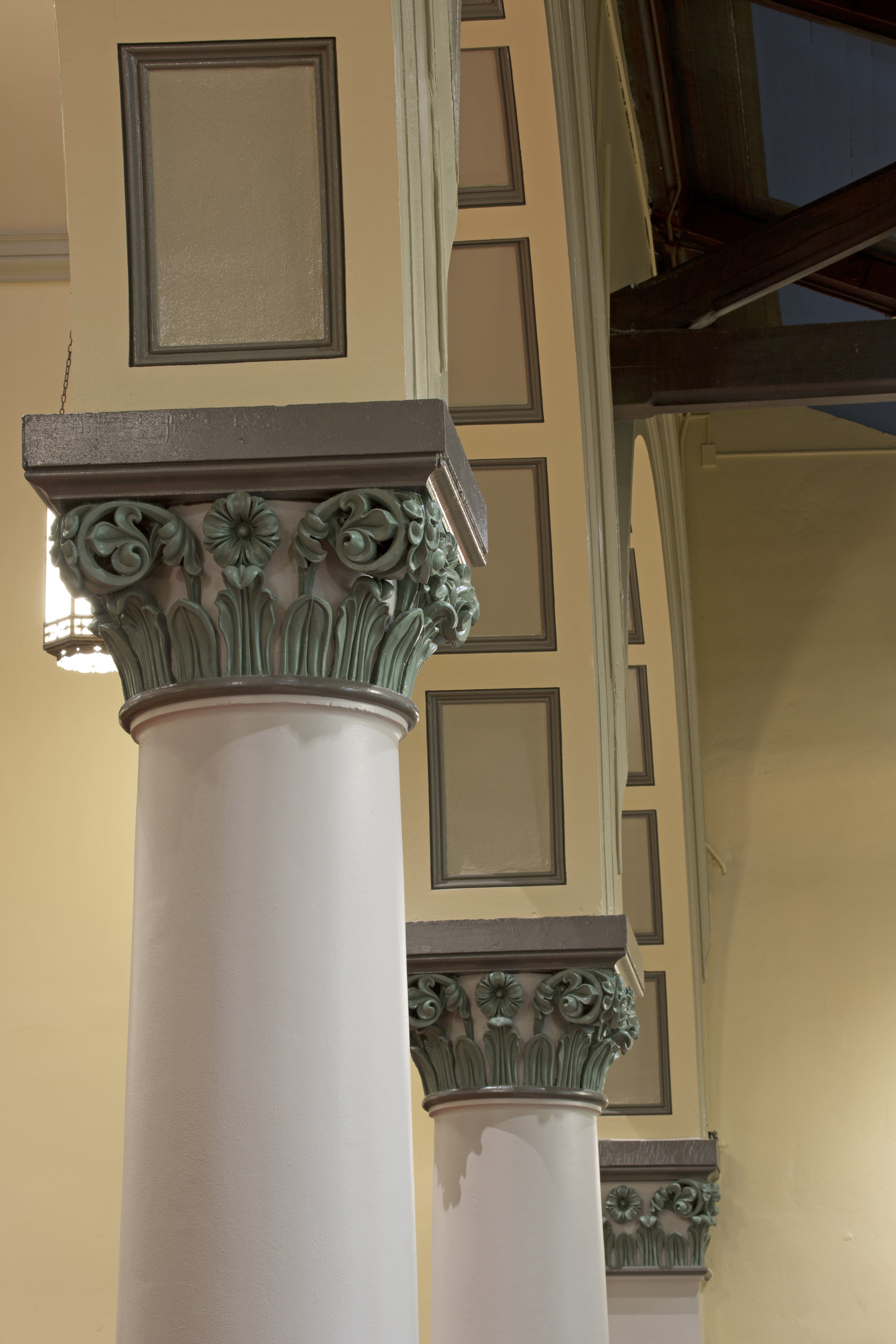
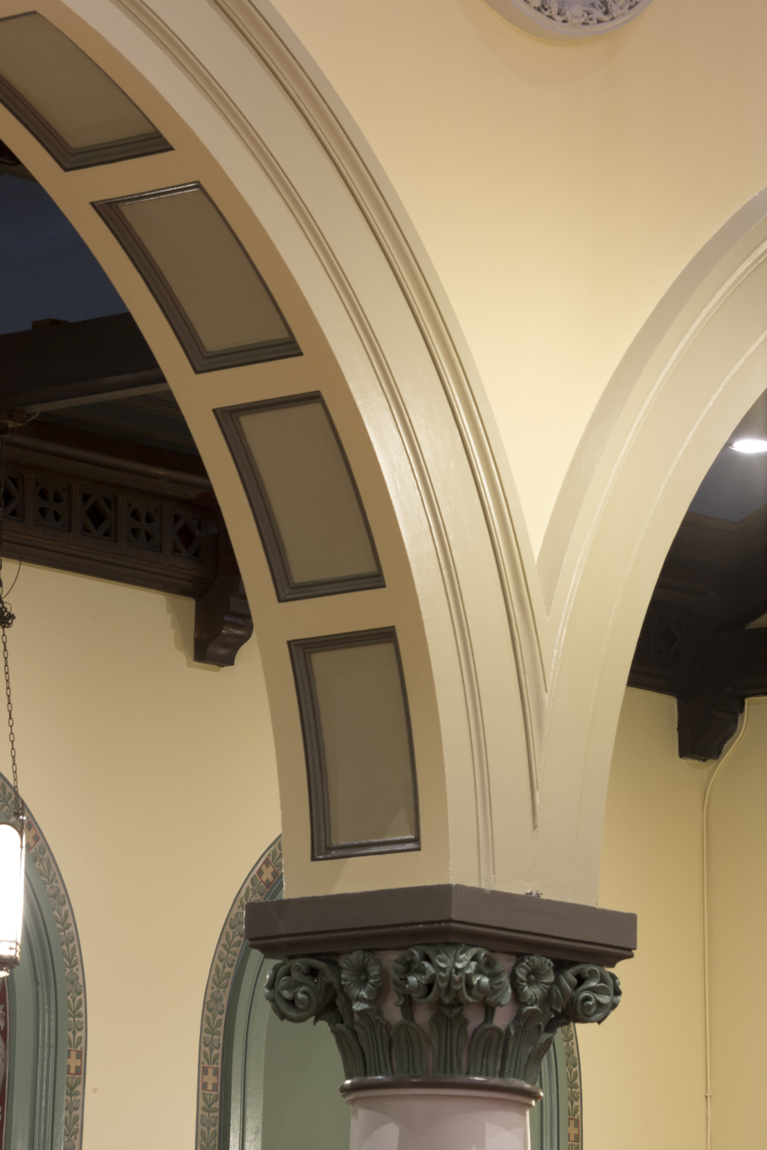
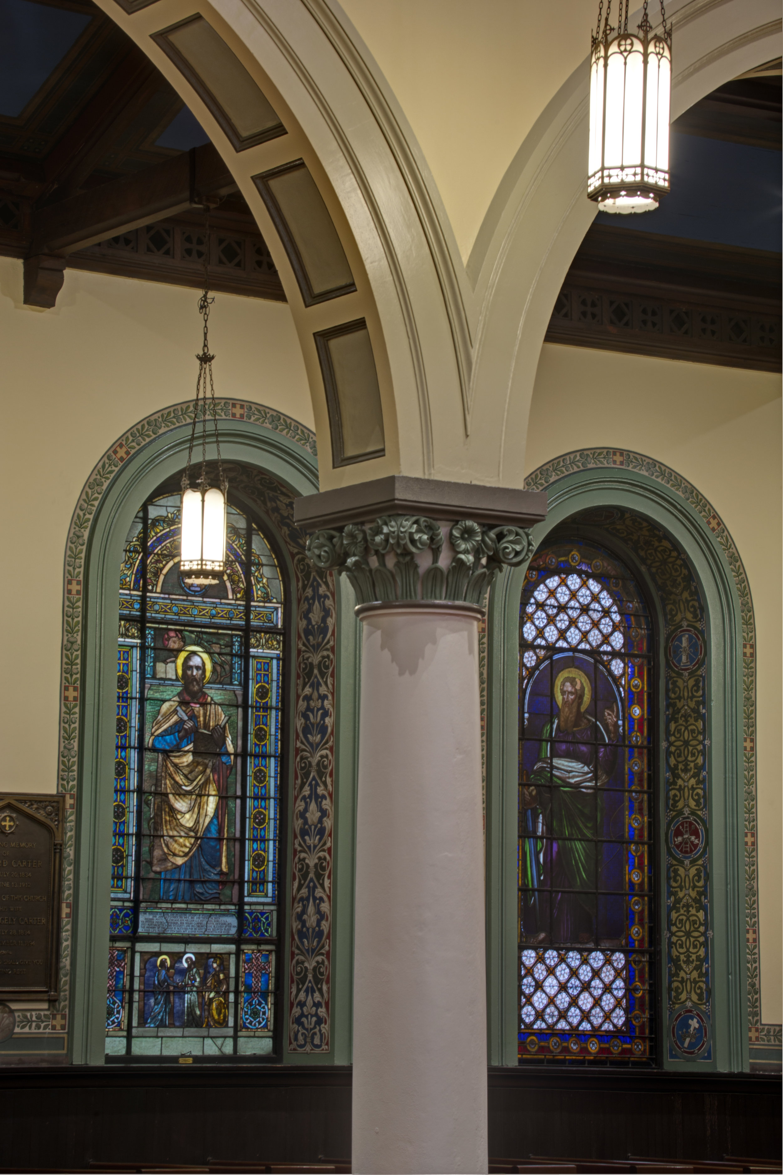
The photos above show St. Paul’s Episcopal Church after its renovation.
If Congress has taught us anything, it’s that coming to a consensus isn’t always easy.
The congregation at St. Paul’s Episcopal Church in the heart of Baltimore can empathize. When it came to deciding how to refresh the outdated baby blue paint scheme on the sanctuary’s ceiling, there was a lot of discussion.
Ten years’ worth of discussion, in fact.
Affectionately known as Old St. Paul’s, the parish was founded in 1692 as a mission church of the Diocese of London; it moved to its present location in Baltimore in 1729, and the current church building was constructed in 1856.
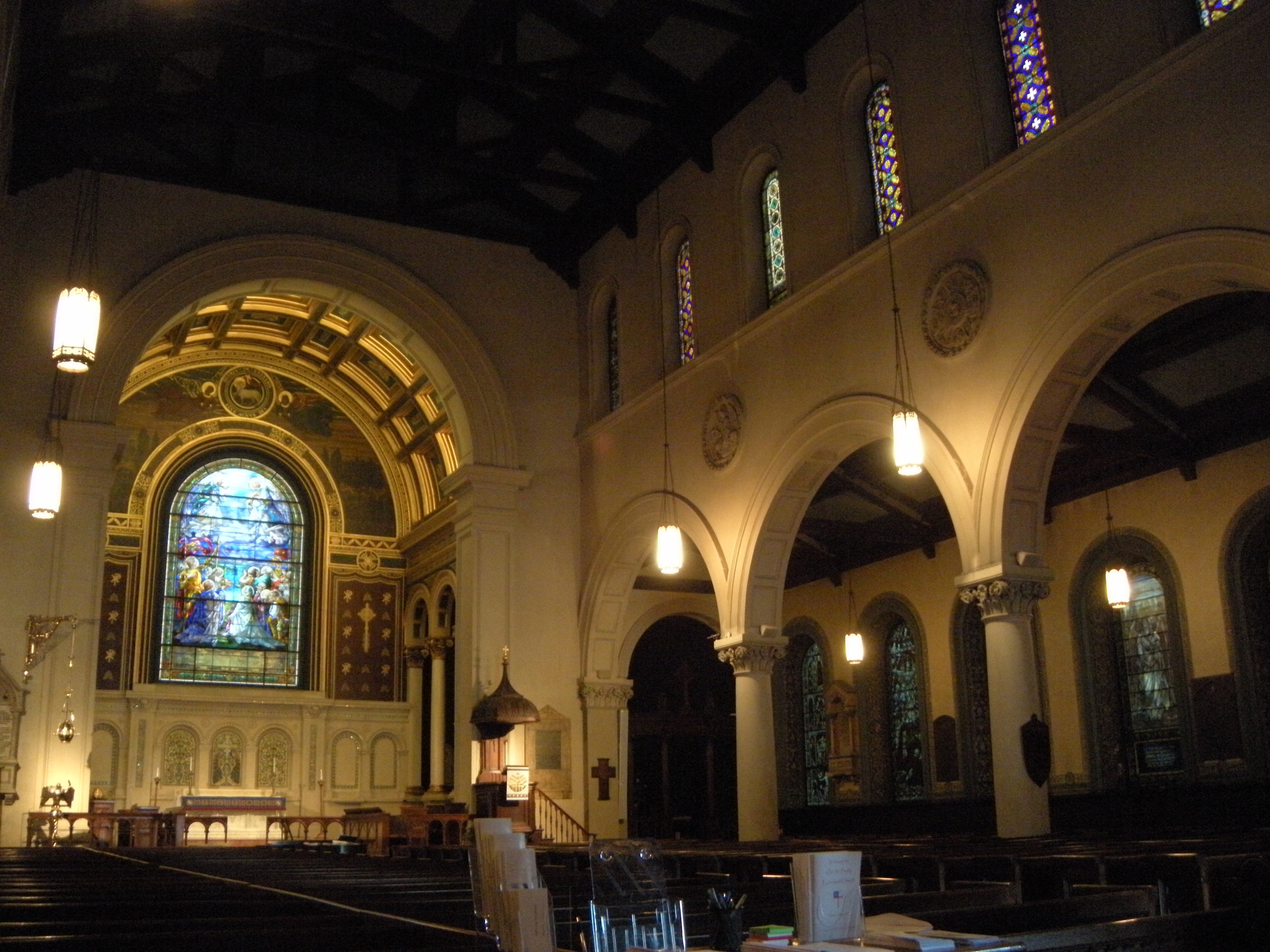
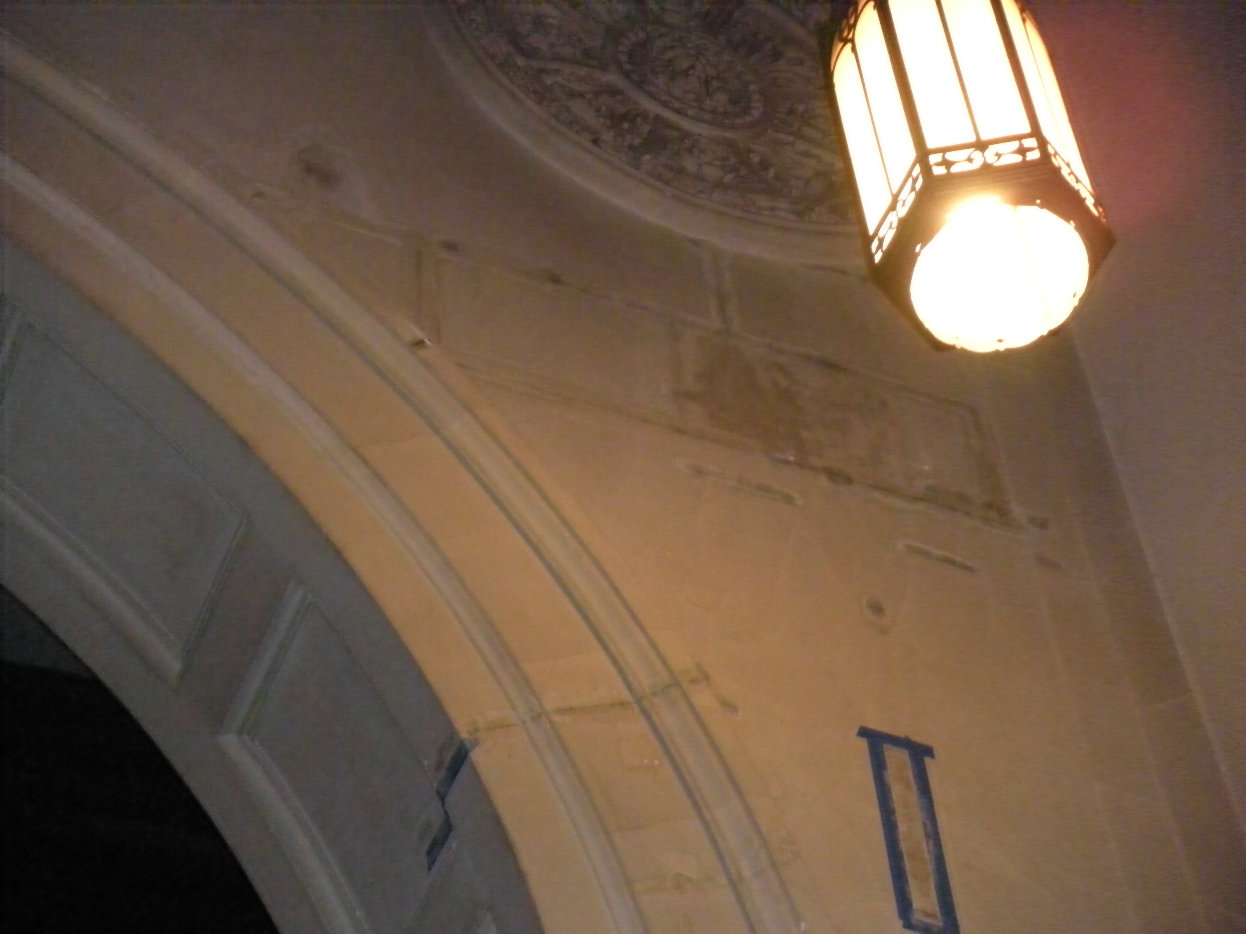
While there have been renovations over the years – especially around the early 1900s and in the ’50s and ’60s – members of the congregation wanted to ensure any changes to the ceiling and the other interior surfaces respected the historical integrity of the building.
“There were a lot of different views on what the right thing to do was with a church of this history and architectural significance,” said Lauren Myatt, principal at Murphy & Dittenhafer Architects, which took on the project more than three years ago.
Preserving historical integrity
Selecting a paint scheme was no small undertaking.
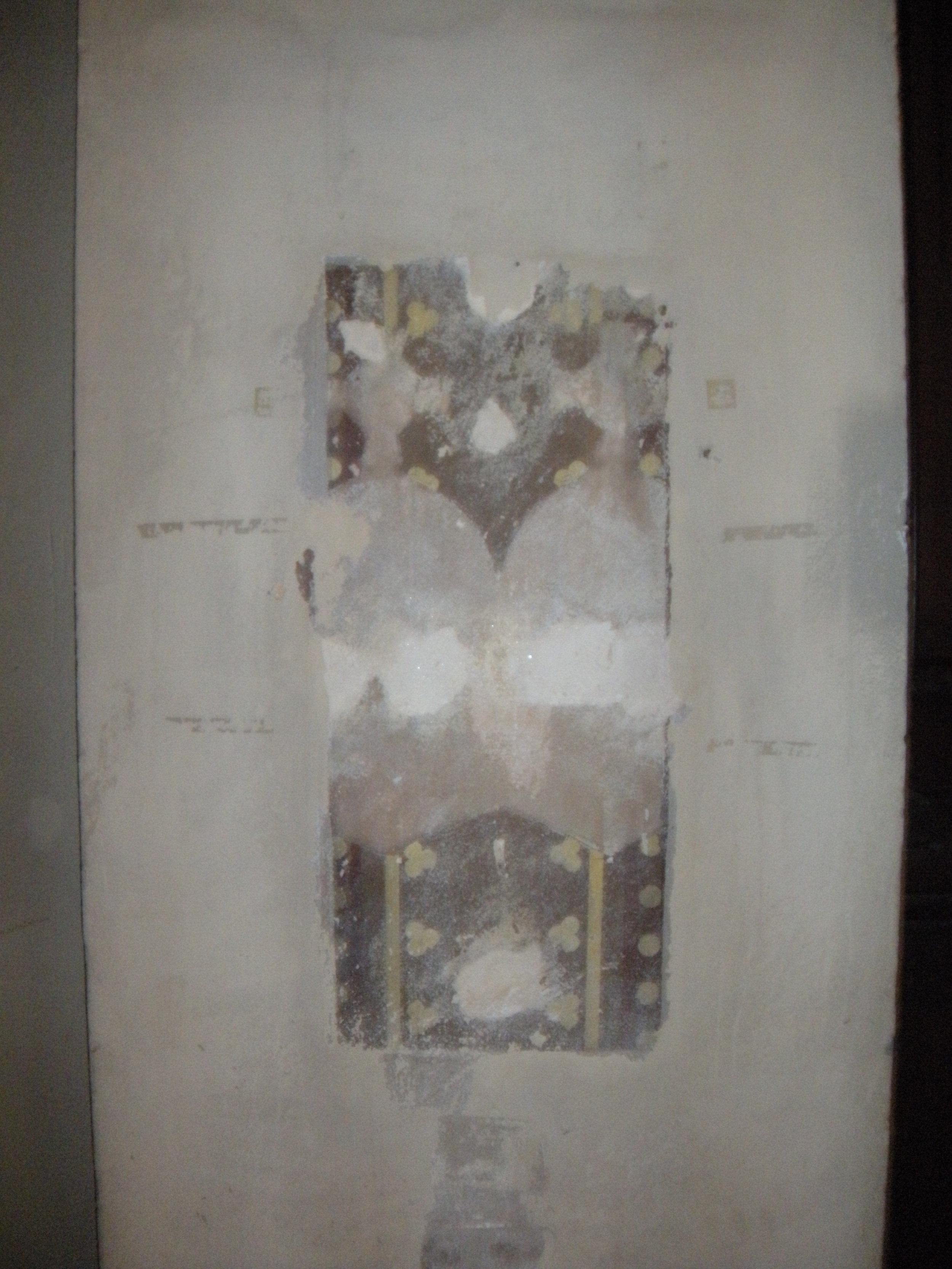
The team from Murphy & Dittenhafer started by conducting a thorough historical analysis of the building. A specialist took samples of paint from different eras of the building, which were used to create a design that married the paint schemes from the 1850s and the turn of the century.
Their research also found it was popular in the mid-1800s for churches to have stars on their ceilings – including other churches designed by the original architect Richard Upjohn. While they were not able to pinpoint exact evidence of stars on the ceilings of Old St. Paul’s, the team at Murphy & Dittenhafer and the Church endorsed the concept of executing what appeared to be Upjohn’s original design intentions for the ceiling of Old St. Paul’s.
Working with a small design committee from the church, as well as interacting with members of the congregation through focus groups, Myatt and her colleagues fleshed out a scheme: Santa Monica blue, very similar to the original 1856 wood ceiling color, dotted with new gold stars of several sizes arranged in a random type pattern, which members of the congregation could purchase for their loved ones.
The space would be further enhanced with new energy-efficient task and accent lighting.
Once the congregation signed off on M&D’s proposed design, it was time to get down to business. Or, rather, up to business.
Painting the 60-foot-high ceilings required the installation of an elaborate scaffolding system with a “dance” floor almost at the height of the ceiling to give workers access to their canvas – a complicated effort that M&D’s Myatt coordinated with the painting and lighting construction scope.
Work began in late May 2013 and was completed in early September of that year to take advantage of the church’s slower summer months.
A renewed interest in church
After a decade of indecision, feedback from the congregation has been positive, Myatt said. The church has seen an increase in the number of people interested in getting married in the sanctuary and is finding the need to repurpose underused spaces to accommodate additional congregants.
In fact, Old St. Paul’s is currently working with Murphy & Dittenhafer to complete more renovations.
Since April, the firm has been reconfiguring and renovating the back of the sanctuary to provide more space for fellowship in addition to repurposing space in the lower level of the church to be used for religious education.
And, just as with the ceiling project, the church’s storied past is top of mind.
“We are doing things that are sensitive to historic character – particularly as it relates to the sanctuary space,” Myatt said. “We’re selecting finishes that are appropriate to the history and age of the building but are also durable materials and have the right aesthetic.”
The goal is to work with the church’s character, while also balancing the current needs of the congregation and the current ways the building is being used.
Improve the experience, incorporate functionality
To improve retention at the end of services, the last four rows of pews are being removed to create a larger area for congregants to gather. In researching how to approach flooring in this area, Myatt’s team found the church originally used Minton tile produced in England. They’ve decided to incorporate the Minton tile in a border along with a complementing, more cost-effective waxed quarry tile.
“The cost is not small when you’re talking about really specialized items like that,” Myatt said. “We worked very hard to find a tile floor finish that worked very nicely with historic Minton tile.”
Increased interest in the church, has led to the need for additional classroom space. The team from Murphy & Dittenhafer Architects is taking a less historic approach to the new classroom space – creating a room that’s colorful, warm and inviting for children, while also replacing single-paned windows with more energy efficient storefront windows and installing a new HVAC system to make the area comfortable year-round.
They expect to wrap up work on the new classroom and sanctuary gathering space by the end of September. But that won’t spell the end of Murphy & Dittenhafer Architects’ work with Old St. Paul’s. The firm is drawing up plans to build an ADA-compliant exterior ramp and will complete renovations to the church’s rectory, which was constructed in 1791.
And, as with all the work they’ve done in the church so far, history will never be far from mind.
Myatt, for one, is happy to peel back the church’s rich roots, while helping tell the story of its future.


