The Spring Garden Township Dental Center needed more space to expand operations, including a bigger office, an updated waiting room, and an ADA-accessible bathroom and entrance.


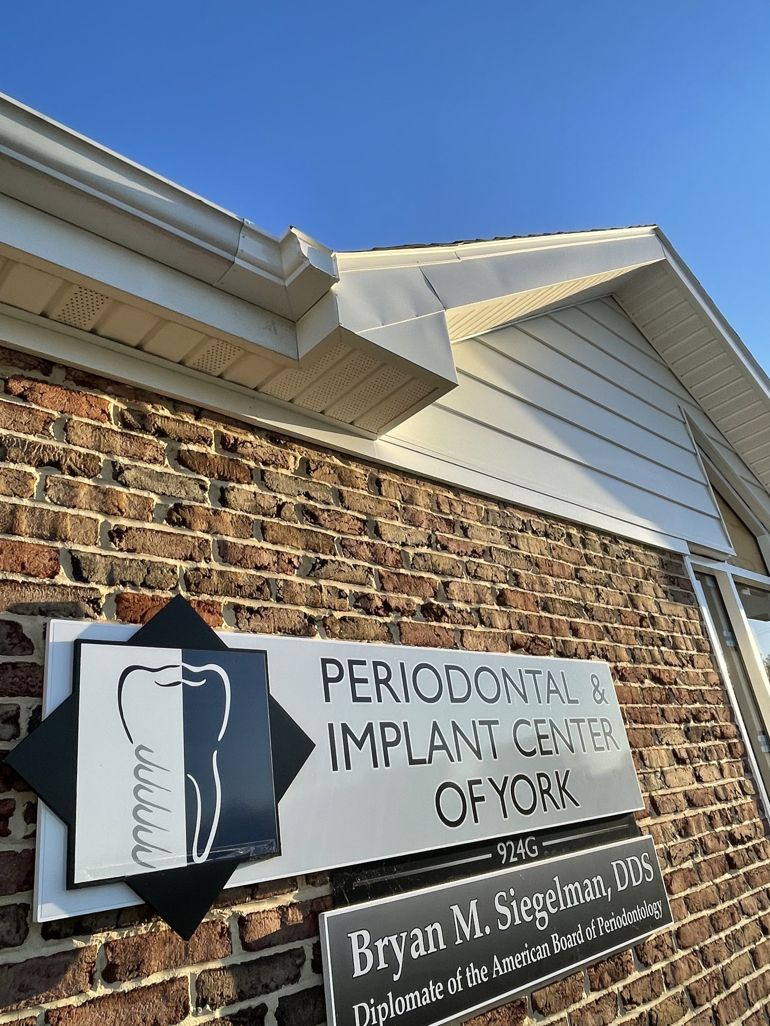
The office of Dr. Bryan Siegelman and the Periodontal & Implant Center of York has served patients out of the 1,600-square-foot Spring Garden Township, York County, building for years. But as the practice has grown, so has its needs as a business.
In addition to more space to serve an increasing client base, the office required an update that would better suit the needs of staff.
“There’s a family-feel to this office and the people who work there,” says Patrick Ness, Associate AIA with Murphy & Dittenhafer Architects. “Many of the staff have been there a long time, and they know their patients so well.”
More, modern space
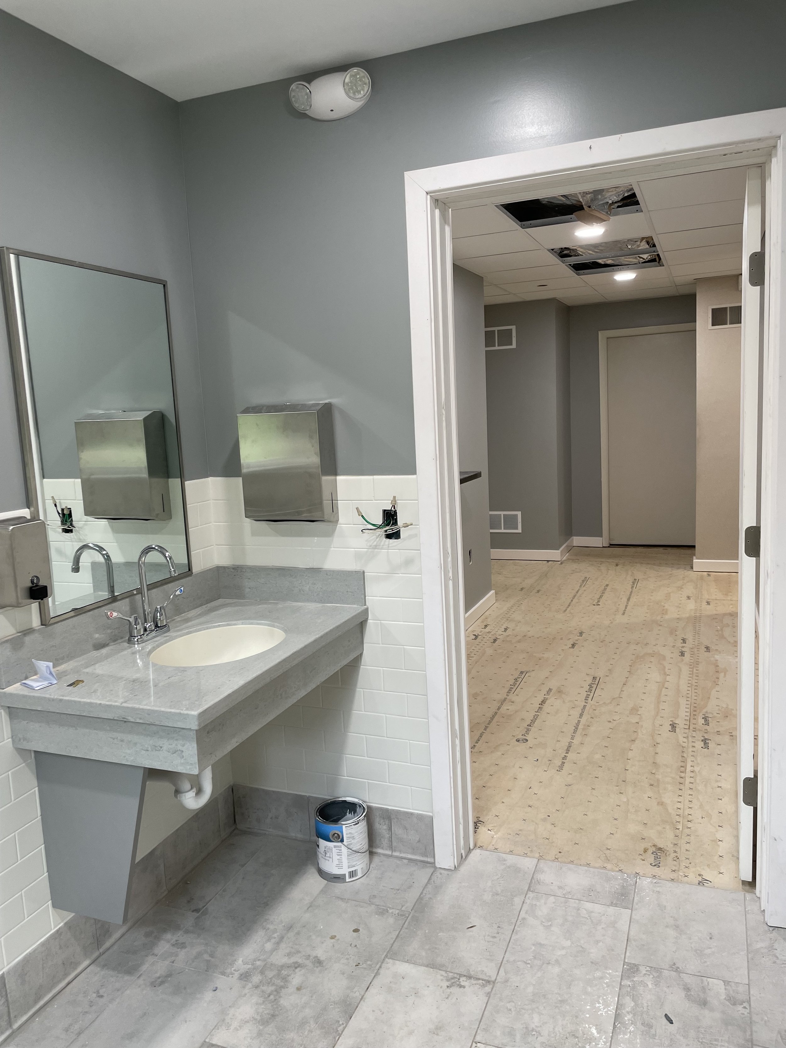
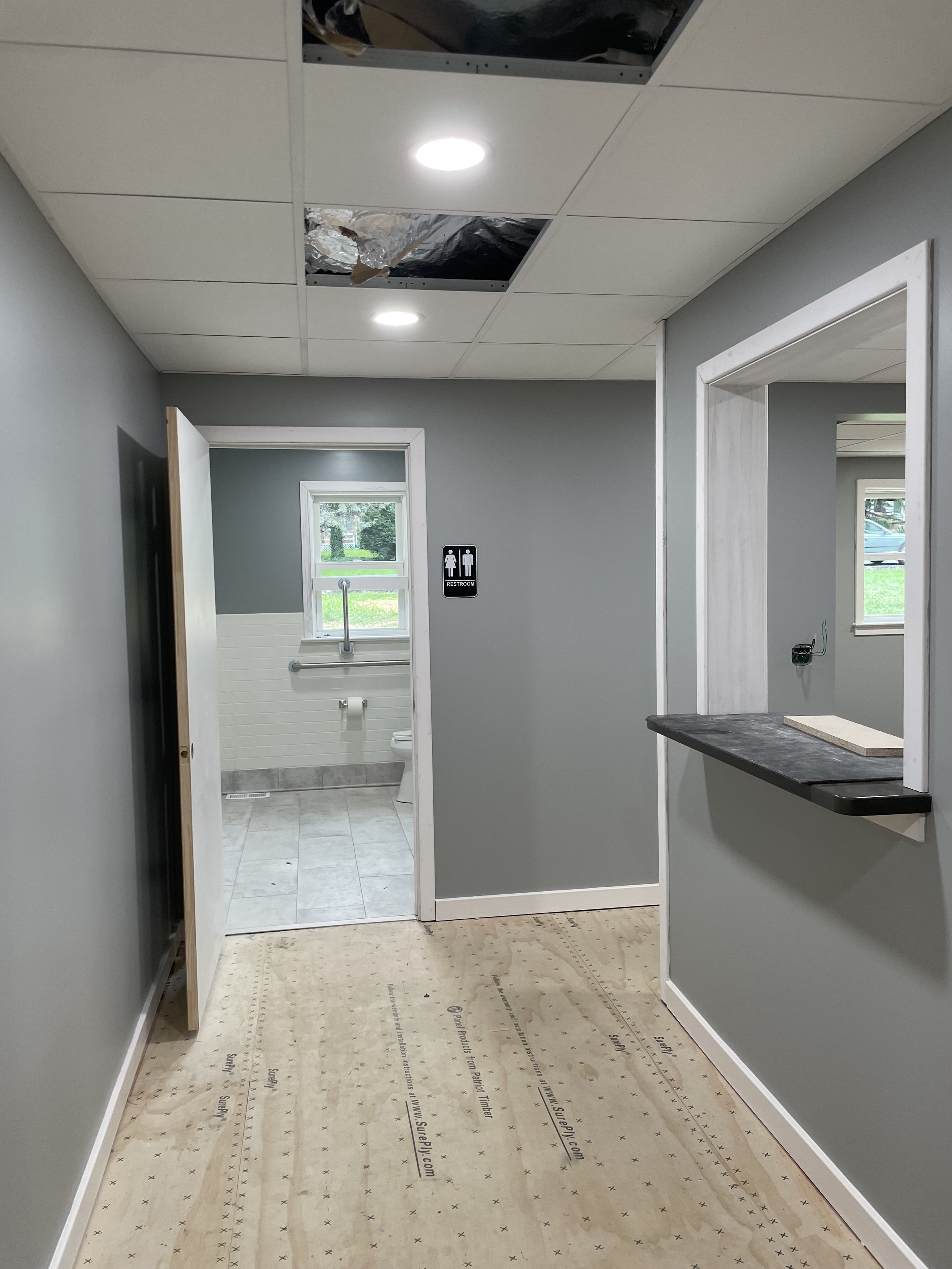
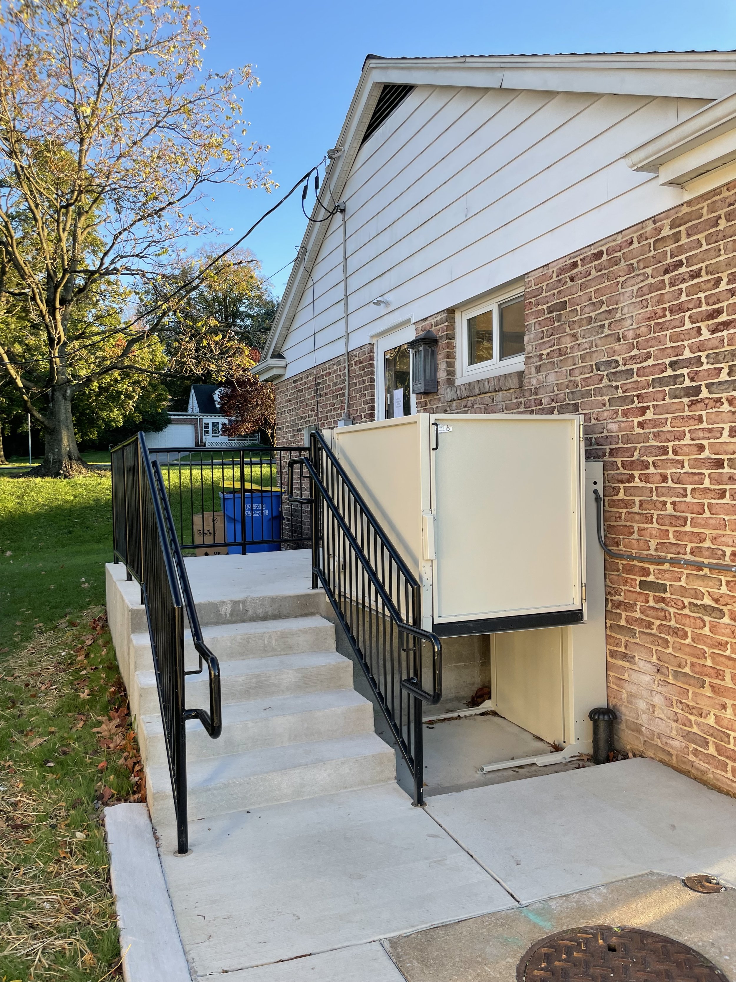
The commission designed by Murphy & Dittenhafer Architects added about 400 square feet to the brick office building. A bigger office, a consulting room, and ADA-accessible features, including an entrance and bathroom, made a considerable contribution to the modern, updated feel of the space.
M&D also was able to make the entrance to the building clearer, rather than having guests walk around to the side of the building to go inside. A secondary gable on the roof also broke up a lackluster roofline and added some interest to the façade. Two outdoor stairs and a wheelchair lift rounded out the exterior work.
Like us on Facebook!
The waiting room design unveiled a sleeker feel. Thanks to a big, storefront window, an elevated ceiling, an pendant lights, the once dark waiting room now feels brighter and grander.
That natural daylight also feeds into the office area, where staff previously had only one source of daylight. Now, their space is easier to work in and has a brighter, cheery atmosphere.
‘A fresh design’
“Our client really recognized the improvement that could be made on the operations side by creating a better building,” Ness says. “We wanted to provide as much value as we could with the budget they had available to them for this design.”
Some of that meant making sure the tight parameters of the building, close to its neighboring offices, were in compliance with zoning. The complex stormwater system had to be taken into consideration so as not to add cost to the commission.
“It was important that we had a fresh design that didn’t feel like it was forced into the limitations we had with spacing,” Ness says. “I believe we achieved that. Everything works together to deliver what the client needs, while being mindful of all the outside considerations. It’s been great to see it come together.”
At Murphy & Dittenhafer Architects, we feel lucky to have such awesome employees who create meaningful and impressive work. Meet the four team members we welcomed in 2024.
The ribbon-cutting ceremony at the new Department of Legislative Services (DLS) office building in Annapolis honored a truly iconic point in time for the state of Maryland.
As Murphy & Dittenhafer architects approaches 25 years in our building, we can’t help but look at how far the space has come.
Murphy & Dittenhafer Architects took on the Architecture, Interior Design, & Overall Project Management for the new Bedford Elementary School, and the outcome is impactful.
The memorial’s groundbreaking took place in June, and the dedication is set to take place on November 11, 2024, or Veterans Day.
President of Murphy & Dittenhafer Architects, Frank Dittenhafer II, spoke about the company’s contribution to York-area revitalization at the Pennsylvania Downtown Center’s Premier Revitalization Conference in June 2024. Here are the highlights.
The Pullo Center welcomed a range of student musicians in its 1,016-seat theater with full production capabilities.
“Interior designs being integral from the beginning of a project capitalize on things that make it special in the long run.”
Digital animations help Murphy & Dittenhafer Architects and clients see designs in a new light.
Frank Dittenhafer and his firm work alongside the nonprofit to fulfill the local landscape from various perspectives.
From Farquhar Park to south of the Codorus Creek, Murphy & Dittenhafer Architects help revamp York’s Penn Street.
Designs for LaVale Library, Intergenerational Center, and Beth Tfiloh Sanctuary show the value of third places.
The Annapolis Department of Legislative Services Building is under construction, reflecting the state capital’s Georgian aesthetic with modern amenities.
For the past two years, the co-founder and president of Murphy & Dittenhafer Architects has led the university’s College of Arts and Architecture Alumni Society.
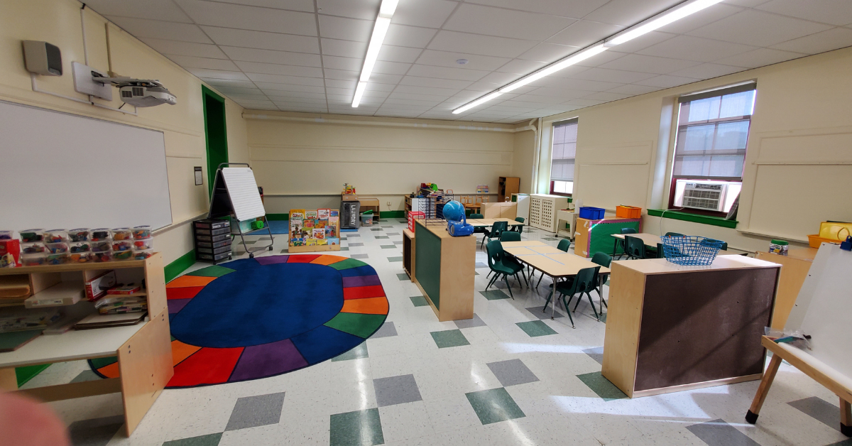
The firm recently worked with St. Vincent de Paul of Baltimore to renovate an old elementary school for a Head Start pre-k program.
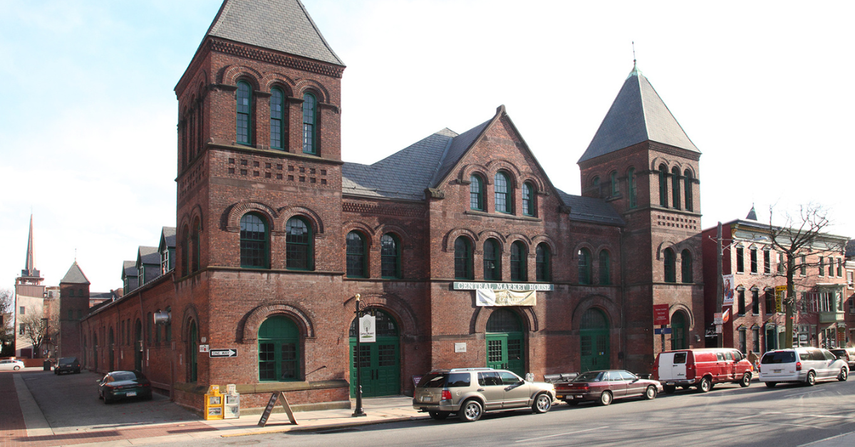
The market house, an 1888 Romanesque Revival brick structure designed by local Architect John A. Dempwolf, long has stood out as one of York’s premier examples of Architecture. Architect Frank Dittenhafer is passing the legacy of serving on its board to Architectural Designer Harper Brockway.
At Murphy & Dittenhafer Architects, there is a deep-rooted belief in the power of combining history and adaptive reuse with creativity.
University of Maryland Global Campus explores modernizing its administration building, which serves staffers and students enrolled in virtual classes.
The Wilkens and Essex precincts of Baltimore County are receiving solutions-based ideas for renovating or reconstructing their police stations.
The firm has earned the designation annually since 2016 in recognition of its commitment to supporting newer professionals in the field.
Murphy & Dittenhafer Architects recently completed the Design Development phase for a 20,000-square-foot building for Crispus Attucks York. Construction should begin in August.
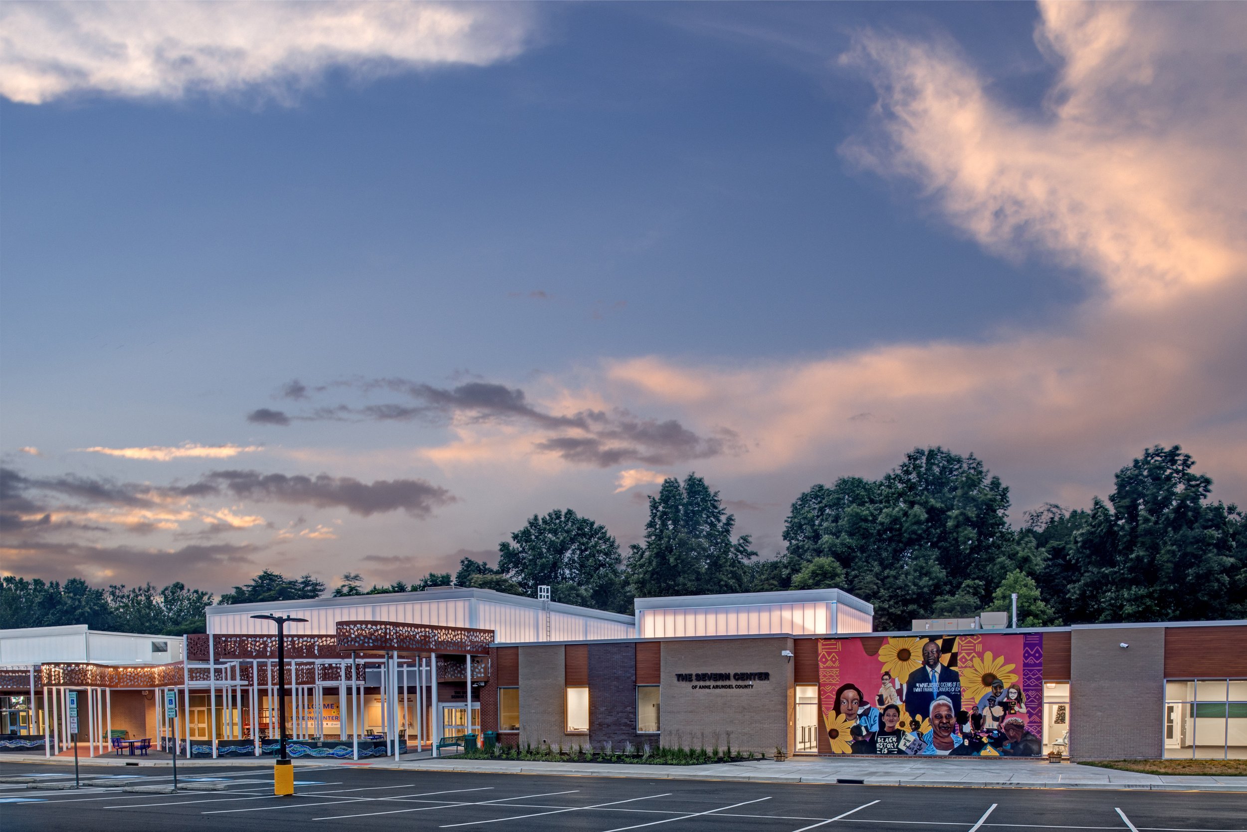
The facility in Anne Arundel County, Maryland, is re-envisioning its focus with the help of Murphy & Dittenhafer Architects.
Murphy & Dittenhafer Architects received numerous awards from AIA Pennsylvania, AIA Central Pennsylvania, AIA Baltimore, and ABC Keystone.
Since 2019, the firm has designed a number of protected entryways for Anne Arundel County Public Schools.
A business lunch at an iconic building sparked an awakening whose effects continue to ripple down the city thoroughfare.













Harford Community College’s expanded new construction Chesapeake Welcome Center is a lesson in Architectural identity