Downtown Inc’s new ‘historically edgy’ slogan resonates with Murphy & Dittenhafer Architects’ work in York, from its long-standing interest in and involvement with finding new uses for older and historic buildings in York City.
You don’t often hear “historically” and “edgy” used together.
When Frank Dittenhafer, II, FAIA, LEED AP, President of Murphy & Dittenhafer Architects, heard “historically edgy” was the new promotional slogan for York’s Downtown Inc, his reaction was, “Great, about time.”
That’s because Dittenhafer says his firm has a long-standing interest in and involvement with finding new uses for older and historic buildings in York City.
“It’s not just preservation and re-use, but here we are in the 21st century, reflecting what’s new,” Dittenhafer says. “The two can co-exist in an exciting, rich manner with no conflict, creating an engaging environment.”
Adaptive re-use mingles history with today
The firm’s team always talk about working with a building, not against it, when designing new spaces in an existing structure.
“M&D approaches each project involving historic buildings with adaptive re-use in mind,” says Architect Patrick Ness. “We try to marry a new program and building use with the existing architecture and character, to create fresh and dynamic, or edgy, spaces we hope people want to live or work in or visit over and over.”
Like us on Facebook!
Lisa Clemens, Murphy & Dittenhafer Interiors' senior interior designer, says in any project, particularly an existing building, “we let the building speak to us.”
“Buildings from yesteryear aren’t built the way we live today,” she says. “This always puts something different on the design because it’s unexpected.”
Adds Architect Rebecca McCormick: “Bringing something unexpected from older buildings fits the ‘edgy’ part. In apartment buildings, we’re looking to do something modern and clean, yet keep exposed masonry walls or exposed beams to counterbalance the ‘new and clean’ parts.”

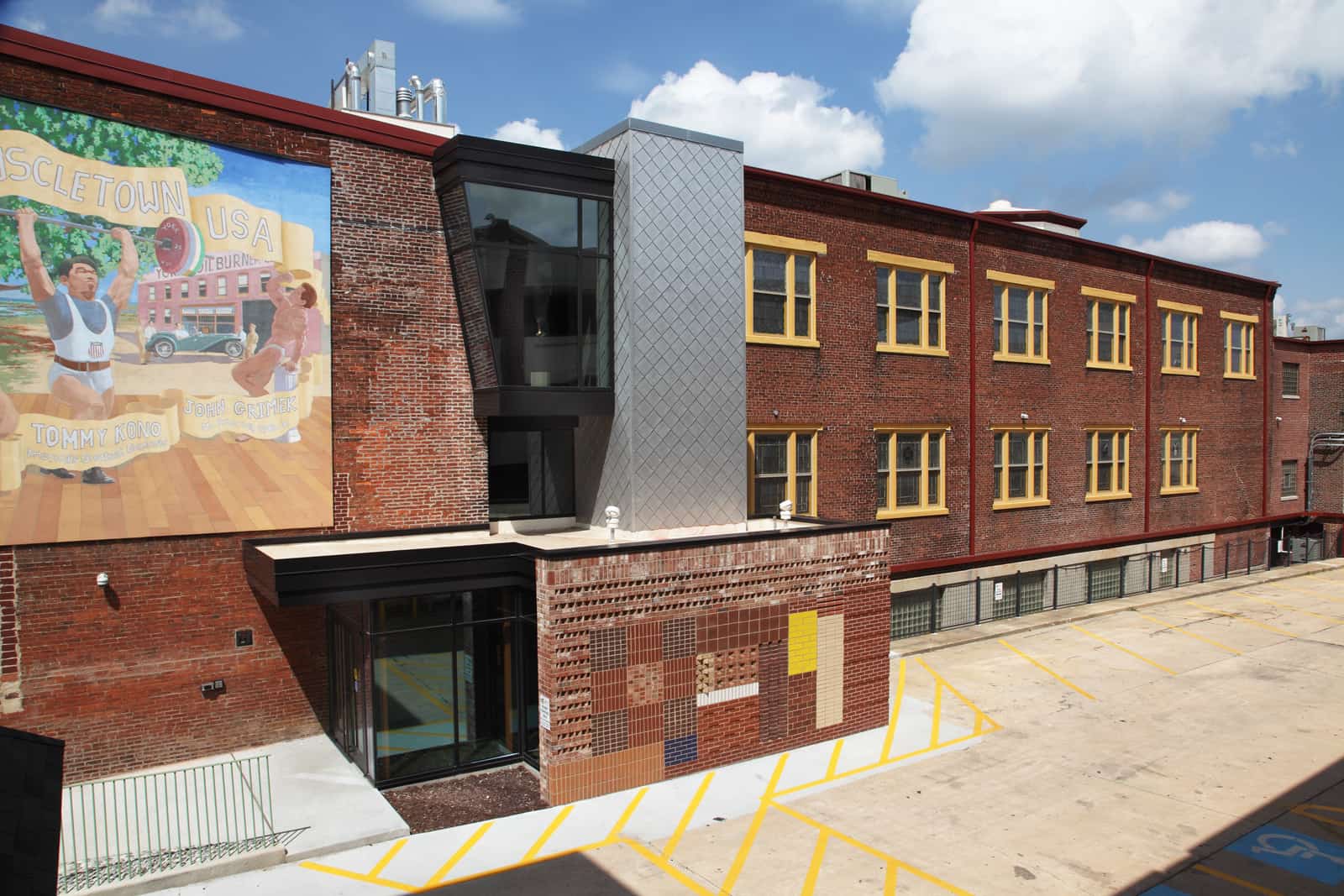
Examples abound
Dittenhafer cites the Byrnes Health Education Center, the former Stetler Dodge Dealership, as one early example.
Byrnes Health Education Center
“We were left with an ‘auto palace’ from the 1920s,” he says. “We collaborated with people who had a similar view that an exciting new renovation approach to the to the facility was needed. Progressive, new, edgy, overlaid with the great architectural heritage of the building to engage school kids.”
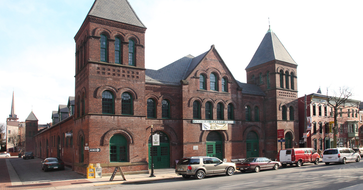
Ness says the Marketview Arts Building across from York’s historic Central Market comes to mind.
“It’s an adaptive reuse of an old brick row house,” he says. “Being located in York’s Historic Market District, it was very important to maintain the street front’s existing façade, but this created an opportunity to design a metal and glass entry slicing into the side of the brick building that expresses the new, lively programs inside.”
Those programs include artist studios, gallery spaces, and York College art classrooms.
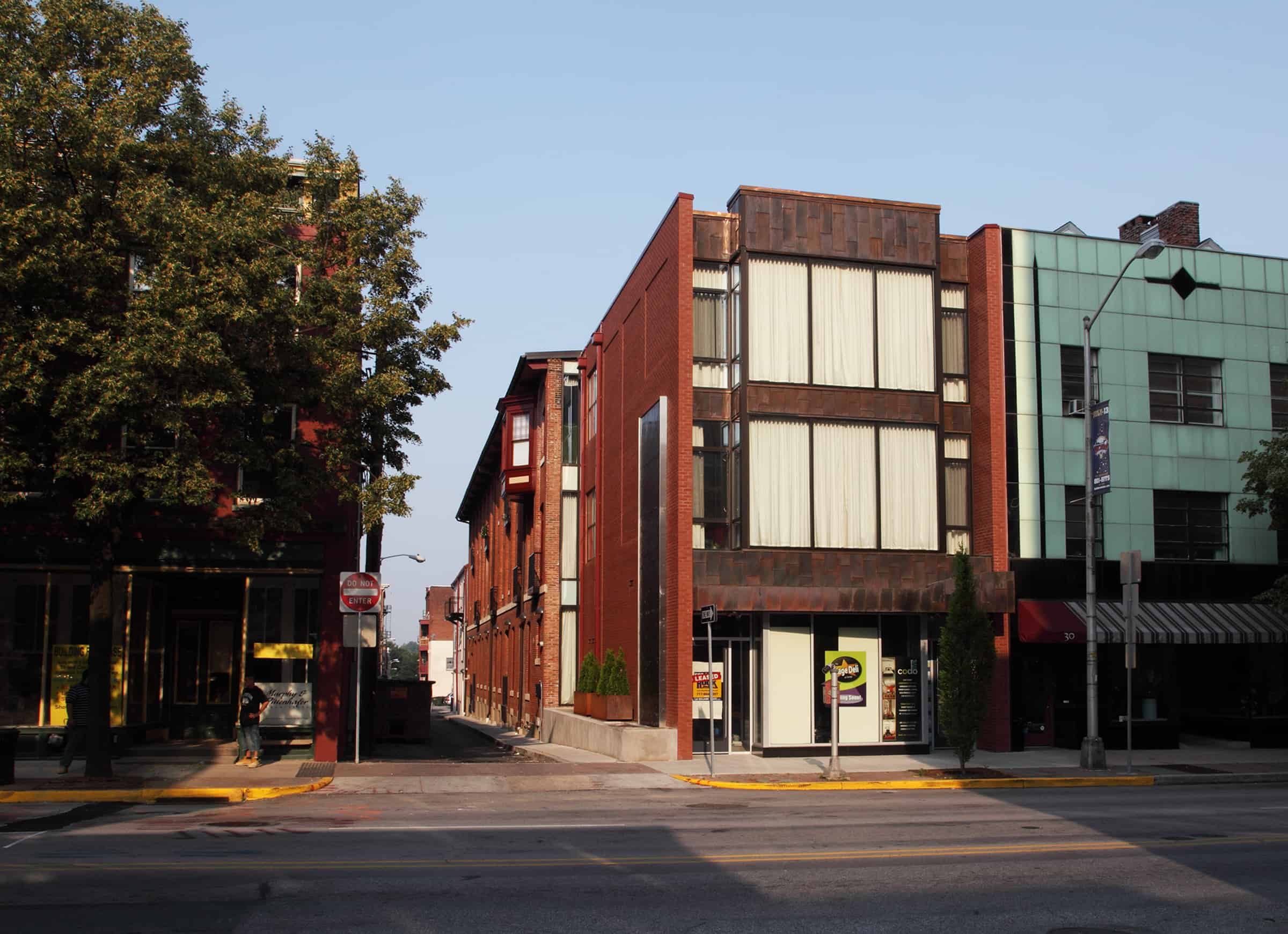
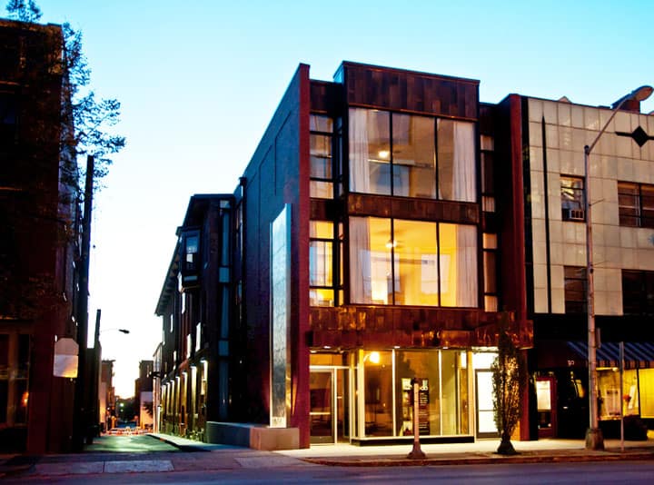
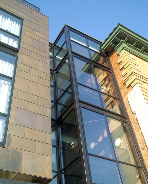


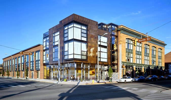
The CODO 241 and 28 projects, new apartments in historical buildings combined with new construction, also fit the bill, Dittenhafer says, with the mix of existing features with new ones, such as copper panels and large glass windows.
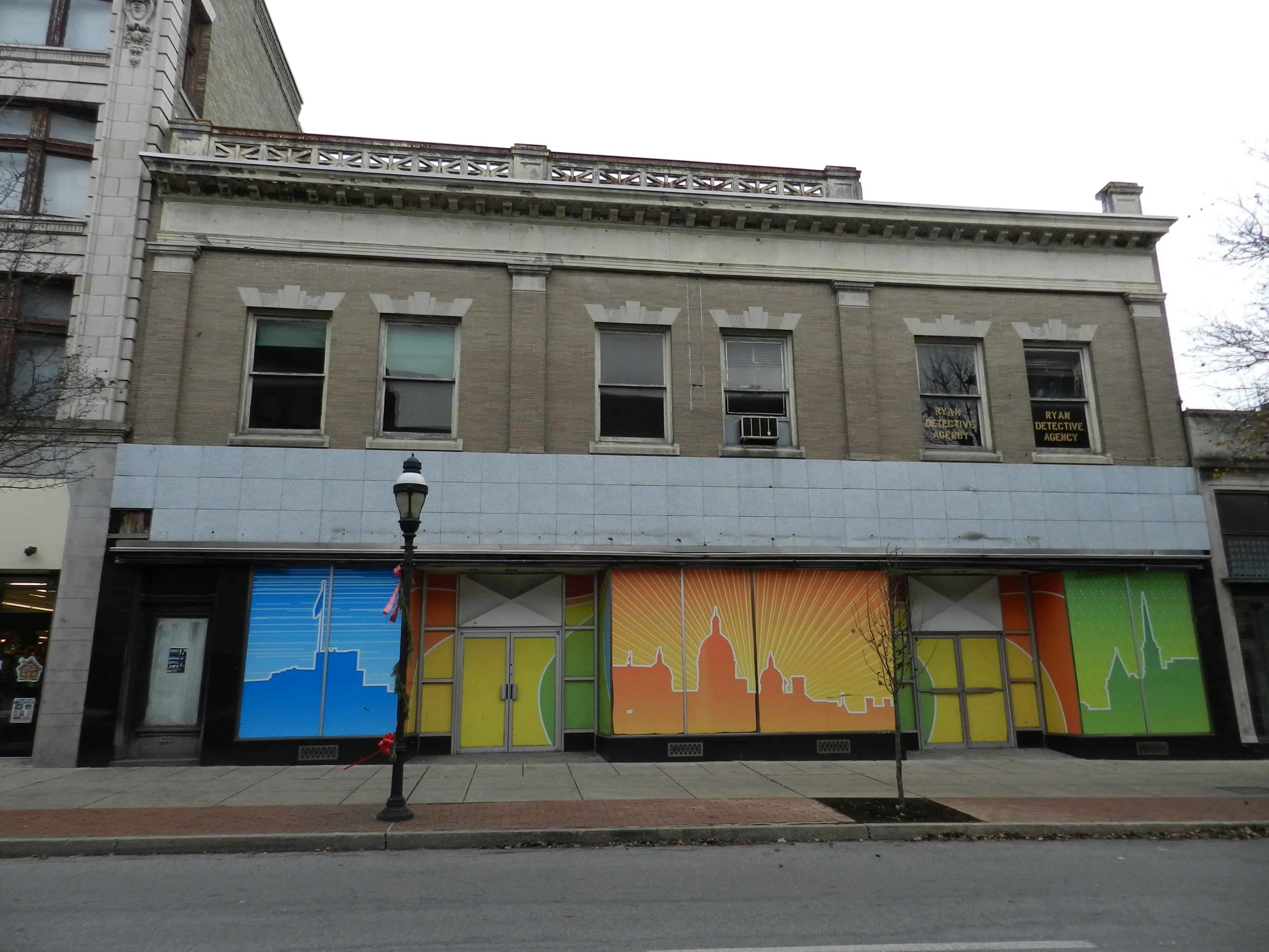
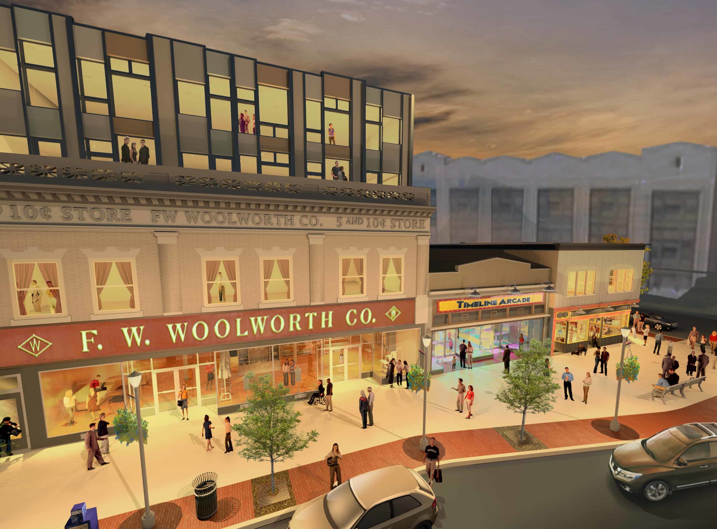
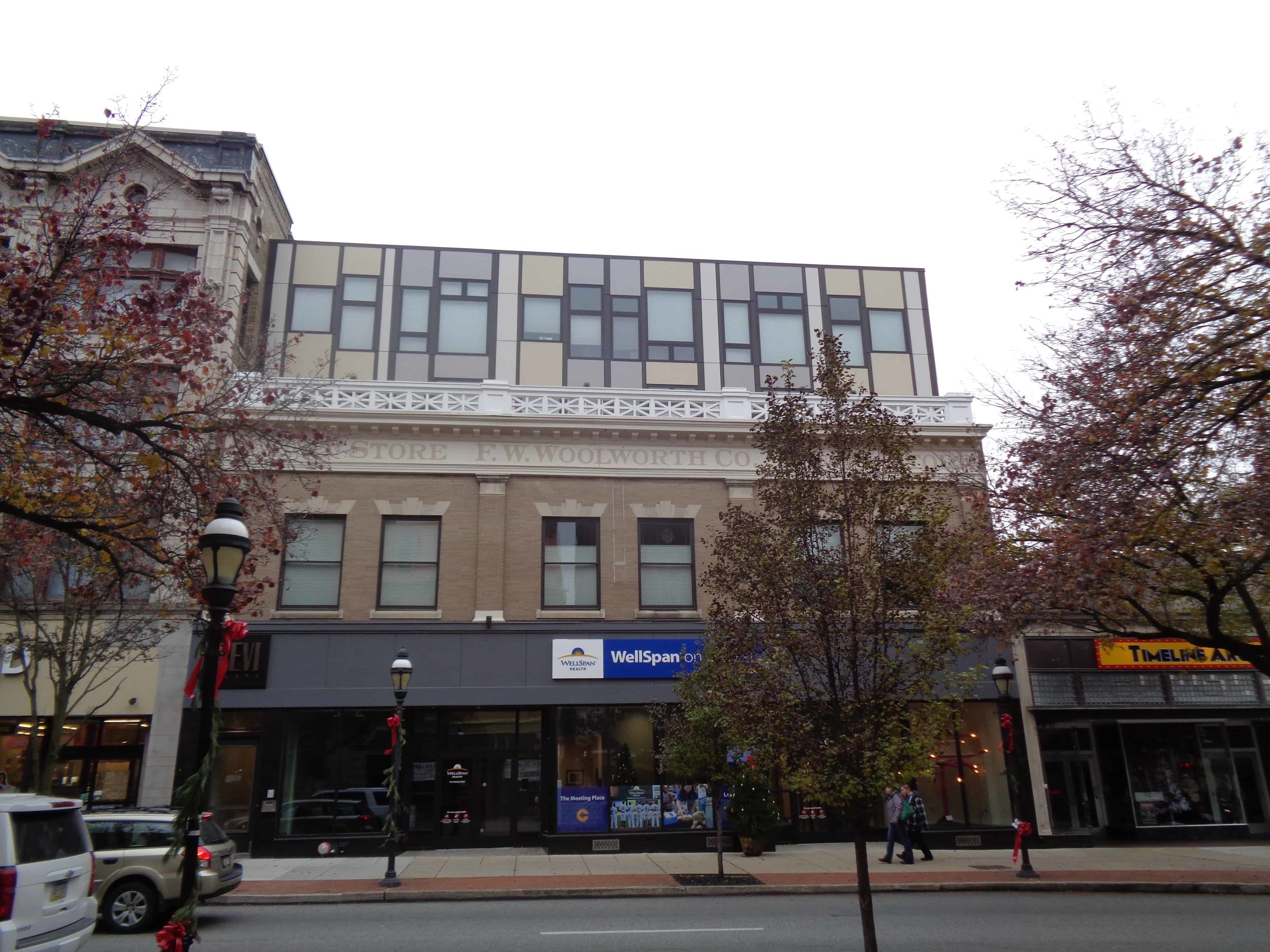
The former Woolworth Building also fits this mold.
“We kept the history of the building but found a counterbalance of old and new, and created something unexpected from the shell of the historic building,” McCormick says.
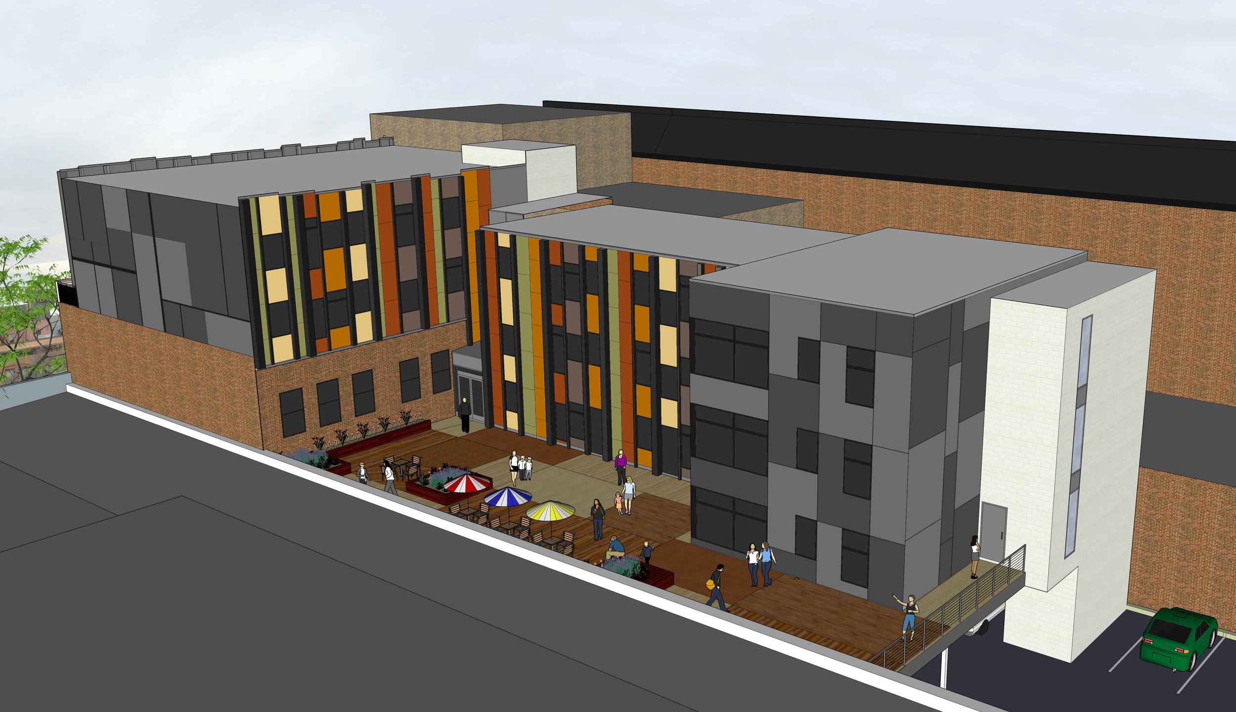
The work included putting commercial space on the street level and renovating the second floor for new living spaces while adding two stories to fit the context of the neighborhood with taller buildings.
Part of York’s revitalization
“A lot of the reason we chose York is the richness of the history and potential for new growth,” McCormick says of her family’s recent relocation from North Carolina. “I see these working together and feel we can play a small role.”
“York is very proud of its industrial heritage,” Clemens says. “In a lot of east coast towns, huge industrial buildings are just abandoned. Here, as they find new uses, we look for ways to celebrate that heritage and re-claim that space.”
Tying history to today is in Ness’s mind as he considers designs for downtown York.
“The character of a city is often defined by its history, its people and their interactions with one another and the built environment,” he says.
People often look to that history to have a deeper understanding of their community and to gain more meaning to the present and possibilities in the future.
“From a design sense,” he says, “the history of a place or building can inform and inspire, even create the basis for any new design.”
Dittenhafer loves the “historically edgy” brand for Downtown Inc.
“I like to think they stole it from us,” Dittenhafer kids. “But, really, it’s what we’ve been embodying for years.”













Harford Community College’s expanded new construction Chesapeake Welcome Center is a lesson in Architectural identity