Crumbling bricks and planters and a narrow plaza needed an update at the York YWCA.
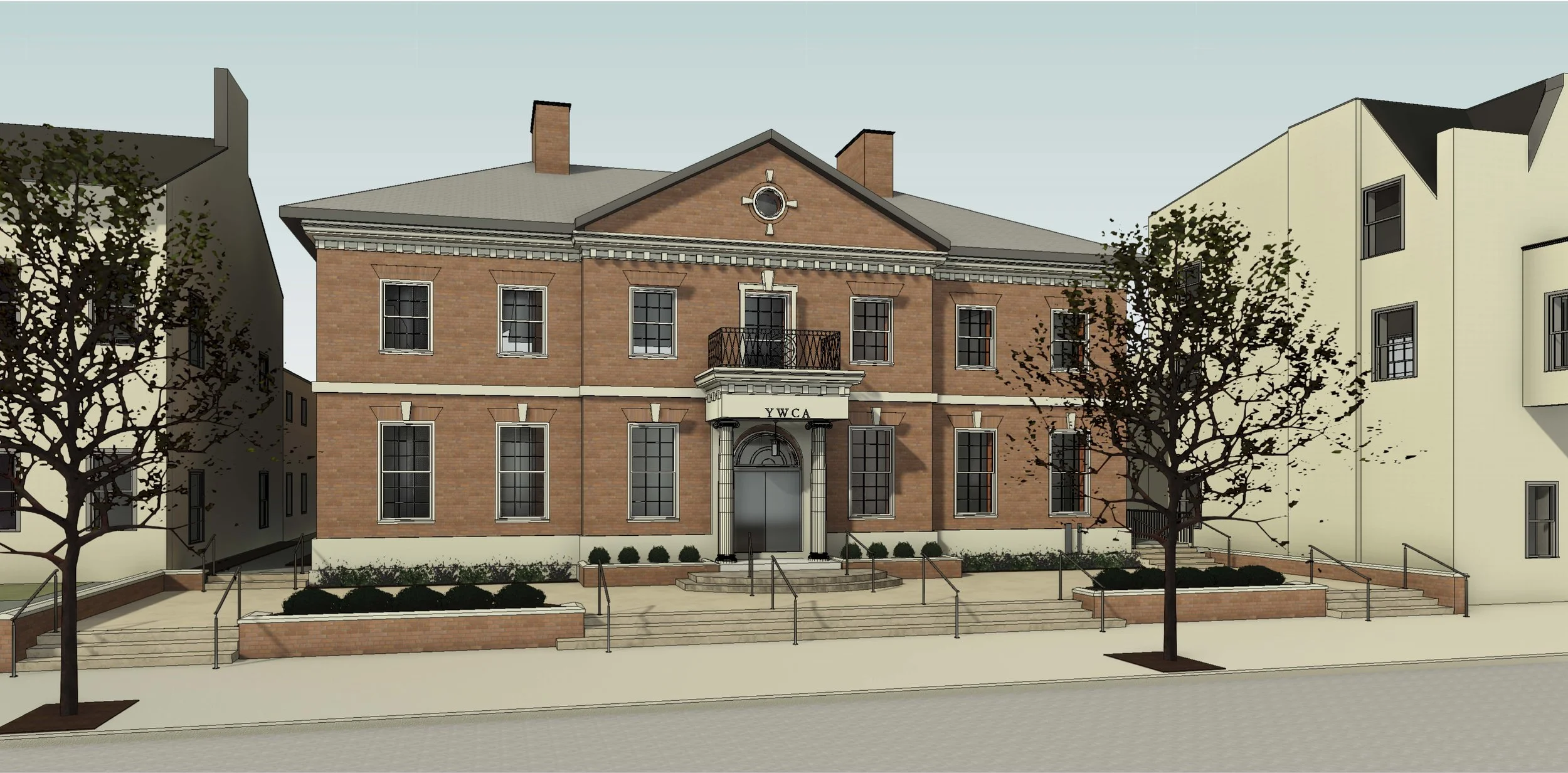

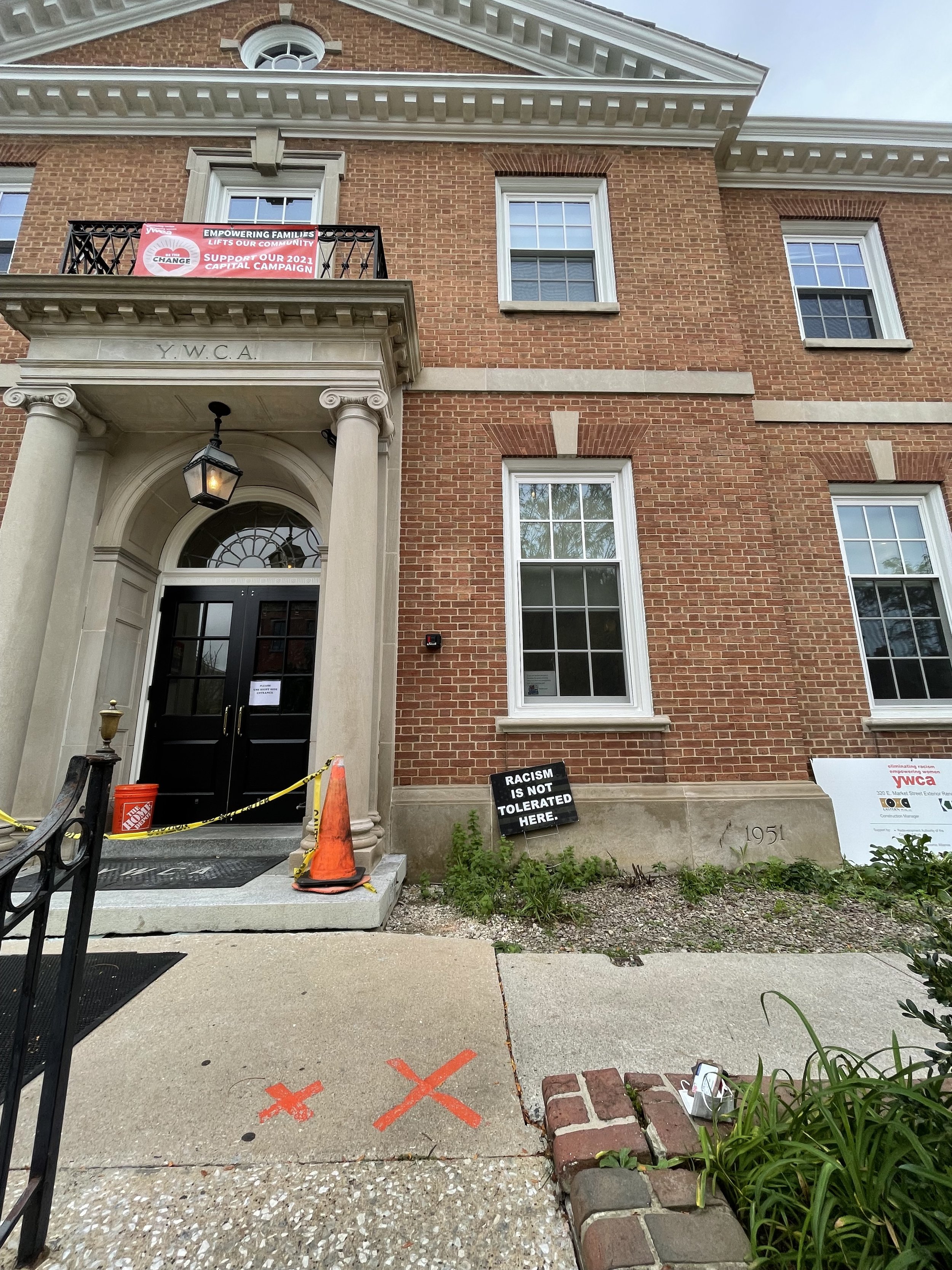
For decades, the York YWCA building at 320 E. Market Street has helped women and children get back on their feet after tragic circumstances. But after having women lining up outside its doors and children playing along its sidewalk for many years, the bricks are worn and planter walls are beginning to fall apart.
Throughout the past several months, though, Murphy & Dittenhafer Architects has been designing an updated vision for the front areas outside of the 120-year-old building.
Currently, seven stairs lead from the street level up to the main entrance of the Georgian brick building while a side entrance has an accessible ramp. During the COVID-19 pandemic, YWCA staff found that outdoor space was limited when it came to new distancing requirements.
“The minimal hardscape didn’t provide a good area for people to queue up when people had to spread out,” says Architectural Designer Patrick Ness, who served as the primary designer on the commission.
A space beyond the queue
M&D was tasked with the goal of making a new hardscaped plaza outside the front door bigger and more functional while also beautifying the space. Ness worked with the YWCA staff and Architectural Designer Harper Brockway through several design options.
The team considered an asymmetrical layout, varying heights of the plaza and new planters, and an array of materials for the space before settling on a clean, symmetrical, terraced design that fit well with the Georgian style of the existing building.
“We wanted to be sensitive to the nature of the actual building,” Ness says, “to not do something too out of the ordinary, something that flows with the building.”
Like us on Facebook!
One of the biggest struggles with the commission was balancing design with building code and zoning limitations. The team was limited by the number of impervious surfaces they were allowed to have without getting a variance. At the same time, they wanted a space that, while beautiful, would also be low maintenance. They also had to mitigate some drainage issues that had caused water to pool on the landing.
Partway through the schematic design phase, the team hit a snag. They received a site survey that was different from the initial information they had originally been working with. They would be losing three feet of terrace design space all along the entire neighboring property.
The M&D team responded by diving in and redesigning with a fervor, striving to keep as much terrace area as possible while not exceeding the size of the lot.
Multi-functional space
With a new plan approved, M&D ultimately settled on turning the current seven-step climb to the front entrance into three steps, a lower plaza, then a second set of steps up to the main building entrance.
“Seeing them really gravitate toward one design,” Ness says, “you know that you’ve made something that is going to be appreciated by the client.”
Ness looks forward to seeing the completed new upgrades later this year. He’s hopeful that the expanded hardscape areas will accommodate more than just a queue of people. Ness imagines the space being used for hanging out or even hosting small outdoor classes.
“It’s going to provide a safer area for kids and for people accessing the building,” he says. “It’s constructed in a way hopefully to last a long time.”
To round out our 40th-year celebrations, enjoy 10 more impactful and diverse Architecture projects designed by M&D. These projects, most of which have received design awards, confirm the variety in design (from scale to usage) that we continue to be involved in today.
Murphy & Dittenhafer Architects is working hard and collaborating with the community on an urban planning study for South George Street in York City.
“Historic preservation has always been a hallmark of ours for our 40-year history,” says M&D President Frank Dittenhafer II. These 10 projects exemplify our passion for this work.
It’s the 40th year of Murphy & Dittenhafer Architects, so Frank Dittenhafer II, President, is taking the time to highlight some of our most influential projects over the decades.
We’re celebrating 40 years of influence in Pennsylvania and Maryland. With that, we couldn’t help but reflect on some of the most impactful projects from our history.
Harford Community College’s expanded new construction Chesapeake Welcome Center is a lesson in Architectural identity
At Murphy & Dittenhafer Architects, we feel lucky to have such awesome employees who create meaningful and impressive work. Meet the four team members we welcomed in 2024.
The ribbon-cutting ceremony at the new Department of Legislative Services (DLS) office building in Annapolis honored a truly iconic point in time for the state of Maryland.
As Murphy & Dittenhafer architects approaches 25 years in our building, we can’t help but look at how far the space has come.
Murphy & Dittenhafer Architects took on the Architecture, Interior Design, & Overall Project Management for the new Bedford Elementary School, and the outcome is impactful.
The memorial’s groundbreaking took place in June, and the dedication is set to take place on November 11, 2024, or Veterans Day.
President of Murphy & Dittenhafer Architects, Frank Dittenhafer II, spoke about the company’s contribution to York-area revitalization at the Pennsylvania Downtown Center’s Premier Revitalization Conference in June 2024. Here are the highlights.
The Pullo Center welcomed a range of student musicians in its 1,016-seat theater with full production capabilities.
“Interior designs being integral from the beginning of a project capitalize on things that make it special in the long run.”
Digital animations help Murphy & Dittenhafer Architects and clients see designs in a new light.
Frank Dittenhafer and his firm work alongside the nonprofit to fulfill the local landscape from various perspectives.
From Farquhar Park to south of the Codorus Creek, Murphy & Dittenhafer Architects help revamp York’s Penn Street.
Designs for LaVale Library, Intergenerational Center, and Beth Tfiloh Sanctuary show the value of third places.
The Annapolis Department of Legislative Services Building is under construction, reflecting the state capital’s Georgian aesthetic with modern amenities.
For the past two years, the co-founder and president of Murphy & Dittenhafer Architects has led the university’s College of Arts and Architecture Alumni Society.
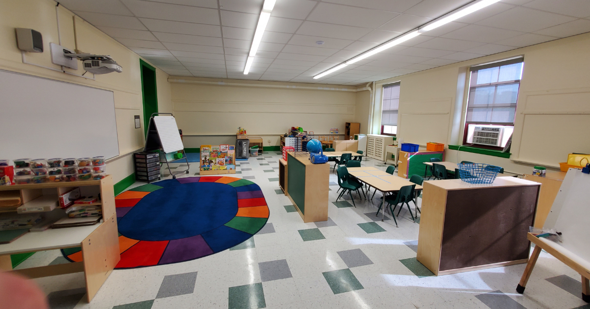
The firm recently worked with St. Vincent de Paul of Baltimore to renovate an old elementary school for a Head Start pre-k program.
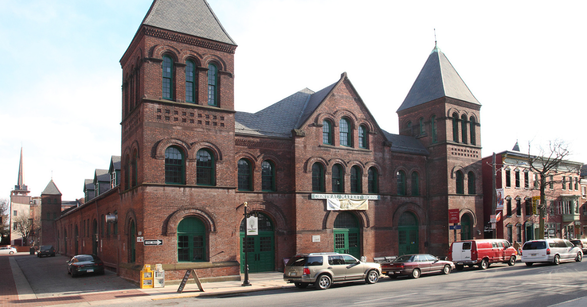
The market house, an 1888 Romanesque Revival brick structure designed by local Architect John A. Dempwolf, long has stood out as one of York’s premier examples of Architecture. Architect Frank Dittenhafer is passing the legacy of serving on its board to Architectural Designer Harper Brockway.
At Murphy & Dittenhafer Architects, there is a deep-rooted belief in the power of combining history and adaptive reuse with creativity.
University of Maryland Global Campus explores modernizing its administration building, which serves staffers and students enrolled in virtual classes.
The Wilkens and Essex precincts of Baltimore County are receiving solutions-based ideas for renovating or reconstructing their police stations.




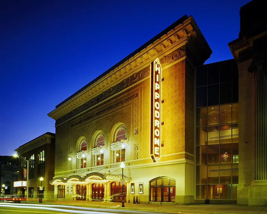
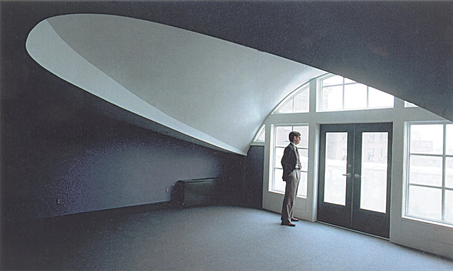












Here’s 10 unbuilt projects with designs we adore for all kinds of reasons.