
M&D used this limited budget approach when expanding their own building at 228 West Market Street in York – with an annex now known as “c o d.” They use this expansion/renovation to show clients what they can do without spending a lot.
Murphy & Dittenhafer Architects is focused on giving clients a great return — even on a modest investment.

When Murphy & Dittenhafer Architects work for a client regardless of budget, they do more than design a building — they build a relationship.
“Clients with modest budgets know they will get a total effort from our firm,” says Frank Dittenhafer, II, FAIA, LEED AP, President of Murphy & Dittenhafer Architects. “Clients know we are all in with what they are doing, we are invested.”
The firm’s goal is to come out with something that exceeds expectations, he says, “something that gives our client a great return on a modest investment.”
Listening, prioritizing, finding the sweet spot
“We make decisions by listening to our clients, recognizing what the priority pieces of the project will be, and getting excited about how these pieces will transform the facility into a better space,” says Lauren Myatt, architect with M&D.
By listening to the client about where the most heavily used or most popular spaces will be, M&D architects decide where to focus the funds and where to economize to realize the best bang for the client’s buck.
Higher education institutions often have big needs but smaller budgets. One example is the HACC York Campus.
“The main classroom building, the George Leader Building, is a former industrial building,” Dittenhafer says. “There was no student commons, no place for students to gather — just a hallway lined with chairs. To study or hang out, students had to leave campus.”
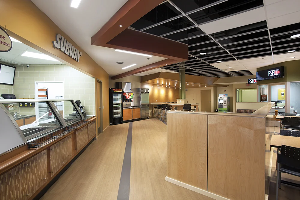
M&D was given the assignment to transform a vacant 3,500 square foot room in the former Call Center Building into a Student Commons - putting in different seating options while taking a corner and installing aluminum and glass panes to bring in natural light. They added a wall with a banquette and got rid of an old suspended tile ceiling with water stains, adding a new acoustical ceiling while leaving out some ceiling tiles to give a hint of space above it.
The project came in under budget and is now heavily used.
“We made it an interesting and engaging space for students, and it’s paying off for HACC,” Dittenhafer says.
Working with the building
Using much of the existing structure in a renovation project is another way M&D manages costs. One example is Sarah’s Hope transitional housing facility, owned by a non-profit organization, St. Vincent dePaul of Baltimore in the Sandtown-Winchester neighborhood of Baltimore.
“We kept the building’s load-bearing structures to keep down costs,” Myatt says. “We brought in new ceilings and lighting, making it feel less institutional, working with the existing structural elements of the building.”
Creatively finding different finishing materials is another way to spruce up a project.
“We’re talking about flooring, cabinets, counter tops, appliances,” says Todd Grove, architect with Murphy and Dittenhafer. “We work with developers and contractors to find the sweet spot in materials that are within budget but still look good.”
Myatt says M&D took this approach with the Sarah’s Hope project. The yellow glaze on the existing interior brick walls and a yellowish beige floor were both very durable building elements, so they kept them and adapted other finishes to complement these and elevate the project.
Using their own space
M&D used this limited budget approach when expanding their own building at 228 West Market Street in York – with an annex now known as “c o d.” They use this expansion/renovation to show clients what they can do without spending a lot.
“We modified the façade, kept a part and changed some,” Dittenhafer says. “We took down a water stained ceiling, put in a new roof and insulation. We left some wood decking and steel beams exposed.”
This created a flexible and collaborative work space.
Like us on Facebook!
To get to various areas, clients walk through galleries containing artwork – not a boring hallway.
“Our message is: When you have limited resources, work with the building. Image is important, but it must have utility,” Dittenhafer says. “This building is an ambassador for our creativity. Folks who come through here make comments about the artwork, exposed studs, curved walls. It’s a great selling point for our design services.”
Focusing on each client
While their own building is a great example, Murphy & Dittenhafer Arhcitects emphasize each project is unique.
“We have conversations early in the project to get everybody on the same page as to how far the funds will go and prioritize with the client up front to make the best use of funds on the most heavily used spaces and save money elsewhere,” Myatt says.
Those conversations are client-led.
“Listening is so critical,” Grove says. “We talk less and listen more.”
The end products give clients big results even on small budgets.
At Murphy & Dittenhafer Architects, we feel lucky to have such awesome employees who create meaningful and impressive work. Meet the four team members we welcomed in 2024.
The ribbon-cutting ceremony at the new Department of Legislative Services (DLS) office building in Annapolis honored a truly iconic point in time for the state of Maryland.
As Murphy & Dittenhafer architects approaches 25 years in our building, we can’t help but look at how far the space has come.
Murphy & Dittenhafer Architects took on the Architecture, Interior Design, & Overall Project Management for the new Bedford Elementary School, and the outcome is impactful.
The memorial’s groundbreaking took place in June, and the dedication is set to take place on November 11, 2024, or Veterans Day.
President of Murphy & Dittenhafer Architects, Frank Dittenhafer II, spoke about the company’s contribution to York-area revitalization at the Pennsylvania Downtown Center’s Premier Revitalization Conference in June 2024. Here are the highlights.
The Pullo Center welcomed a range of student musicians in its 1,016-seat theater with full production capabilities.
“Interior designs being integral from the beginning of a project capitalize on things that make it special in the long run.”
Digital animations help Murphy & Dittenhafer Architects and clients see designs in a new light.
Frank Dittenhafer and his firm work alongside the nonprofit to fulfill the local landscape from various perspectives.
From Farquhar Park to south of the Codorus Creek, Murphy & Dittenhafer Architects help revamp York’s Penn Street.
Designs for LaVale Library, Intergenerational Center, and Beth Tfiloh Sanctuary show the value of third places.
The Annapolis Department of Legislative Services Building is under construction, reflecting the state capital’s Georgian aesthetic with modern amenities.
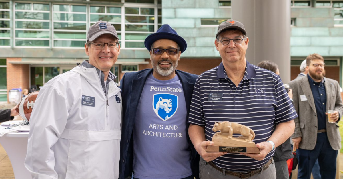
For the past two years, the co-founder and president of Murphy & Dittenhafer Architects has led the university’s College of Arts and Architecture Alumni Society.
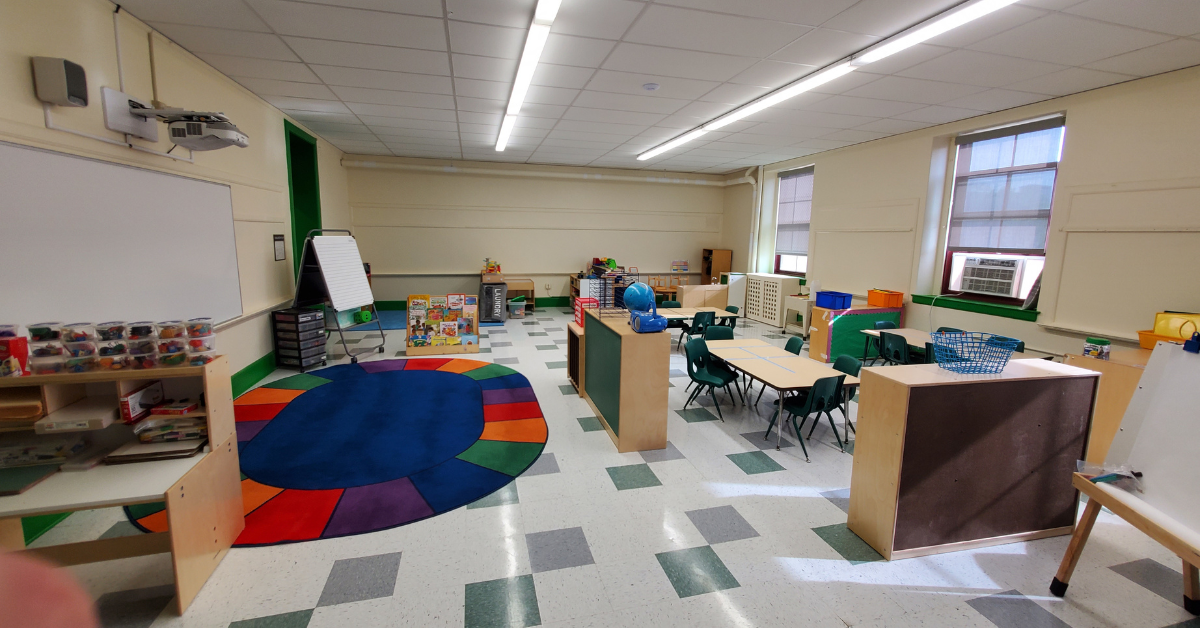
The firm recently worked with St. Vincent de Paul of Baltimore to renovate an old elementary school for a Head Start pre-k program.
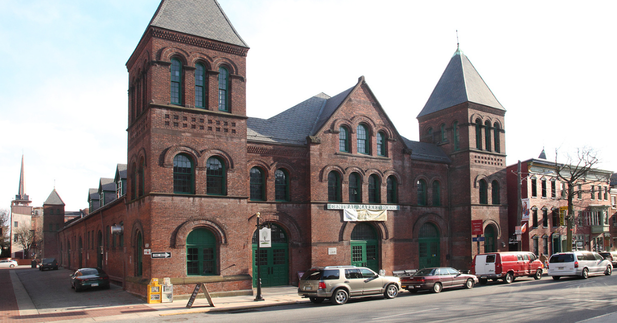
The market house, an 1888 Romanesque Revival brick structure designed by local Architect John A. Dempwolf, long has stood out as one of York’s premier examples of Architecture. Architect Frank Dittenhafer is passing the legacy of serving on its board to Architectural Designer Harper Brockway.
At Murphy & Dittenhafer Architects, there is a deep-rooted belief in the power of combining history and adaptive reuse with creativity.
University of Maryland Global Campus explores modernizing its administration building, which serves staffers and students enrolled in virtual classes.
The Wilkens and Essex precincts of Baltimore County are receiving solutions-based ideas for renovating or reconstructing their police stations.
The firm has earned the designation annually since 2016 in recognition of its commitment to supporting newer professionals in the field.
Murphy & Dittenhafer Architects recently completed the Design Development phase for a 20,000-square-foot building for Crispus Attucks York. Construction should begin in August.
The facility in Anne Arundel County, Maryland, is re-envisioning its focus with the help of Murphy & Dittenhafer Architects.
Murphy & Dittenhafer Architects received numerous awards from AIA Pennsylvania, AIA Central Pennsylvania, AIA Baltimore, and ABC Keystone.
Since 2019, the firm has designed a number of protected entryways for Anne Arundel County Public Schools.
A business lunch at an iconic building sparked an awakening whose effects continue to ripple down the city thoroughfare.















Harford Community College’s expanded new construction Chesapeake Welcome Center is a lesson in Architectural identity