
The space inside the former used furniture store has served not only the architectural firm and its Interiors division but the community, as well.
Pardon the pun, but you don’t have to fish to get Frank Dittenhafer talking about “c o d”.
Ask him how the first year (now almost 18 months) has gone with the space, located within Murphy & Dittenhafer Architects’ York office complex - adjacent to the former Hotel Codorus in a former used furniture store space, and his enthusiasm flows.
“It’s been wonderful,” he says. “I think things have even exceeded our expectations. It’s worked out very well to have ‘c o d’ as part of our facility and home and as an option for the many activities we’re involved in.”
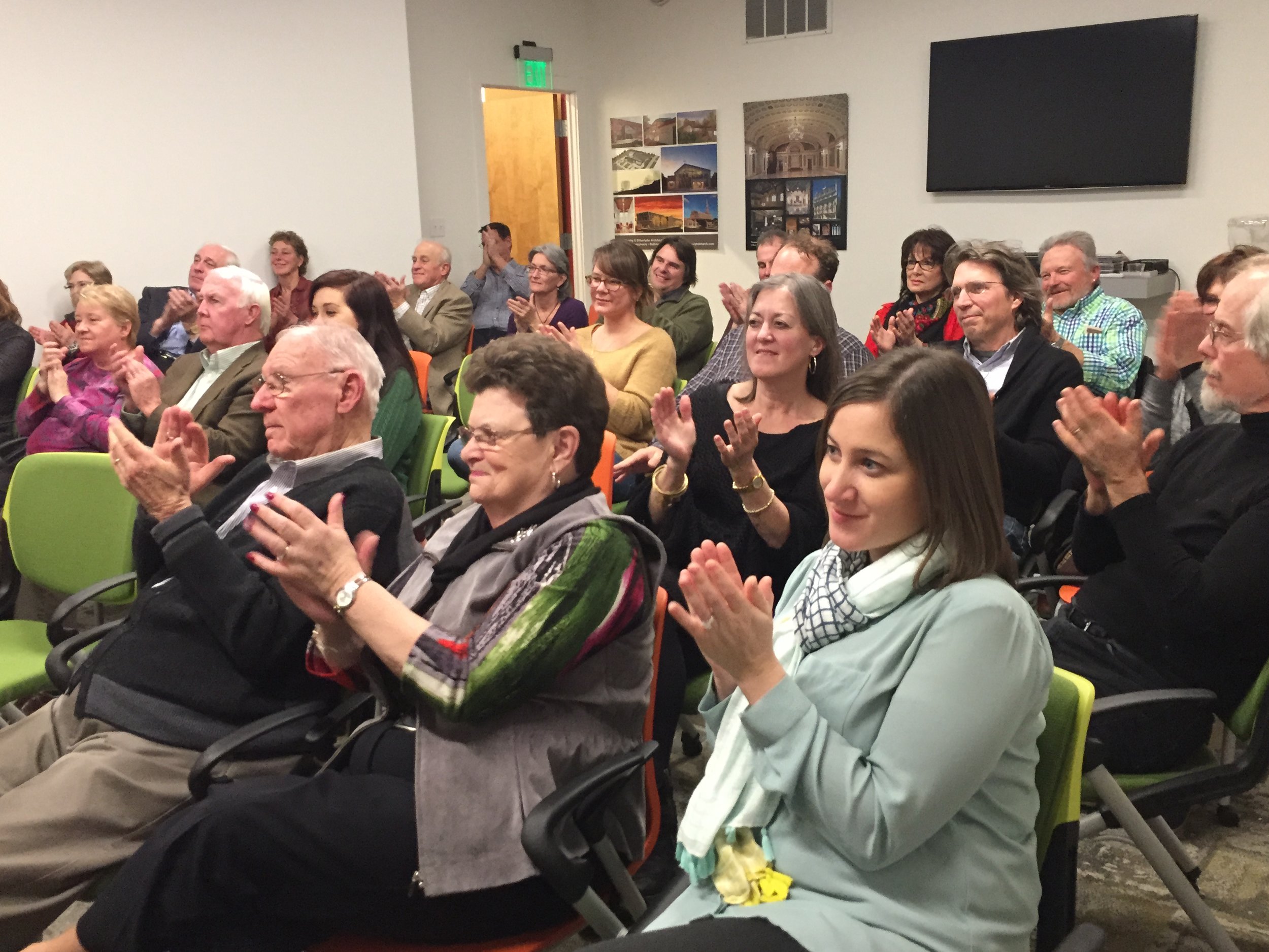
And “c o d” has become a home for not only the interior design arm of Murphy & Dittenhafer but for the York community and beyond. In its first year, “c o d” has played host to a variety of events, from luncheons to workshops to live music.
A home for design
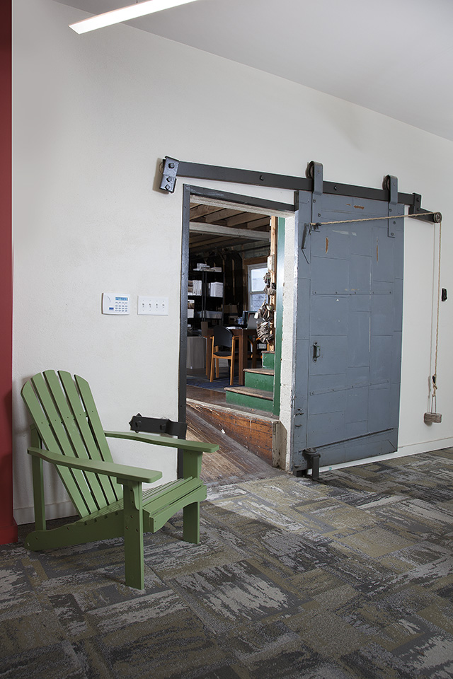
When Murphy & Dittenhafer Architects began renovating the building at 228 W. Market St. in 2015, they discovered a lot of interesting features – a unique concrete floor and old wood framing and decking on the 14-foot high ceilings – which gave the space an artistic vibe. That was even further enhanced when Frank and his wife, Sue Ann Kline, decided to share pieces of their Inuit and Canadian folk art collection.
All that has made an inspiring spot for the entire firm, but especially Murphy & Dittenhafer Interiors, now housed there. “Collaborative of Designers” is one of many possible meanings for “c o d”, and it certainly serves as such.
“It’s provided us a great, flexible room for collaboration between Murphy & Dittenhafer Architects and Interiors,” Dittenhafer says.
The space has also provided a collective space for the interior design department, which had been spread out in the main building.
“On that real basic level, for our people it has worked out great,” says Dittenhafer. “Our interiors department was sort of split on the third floor and an area for samples on the lower floor. Now, they’re together in this really nice studio environment, which has worked out wonderfully.”
Welcoming the community
From its June 9, 2016, ribbon-cutting and open house, “c o d” has quickly become a popular venue for special community events, Dittenhafer notes with pride – although he has no intention of competing with other downtown event venues for hosting functions.
“It’s given us this great opportunity to interact with the York community and the greater central Pennsylvania and Maryland communities,” he says.
Beyond the native art on its walls, “c o d” has proven to be a great spot for local artists to share their work as well. On its 90-foot-long, 14-foot-high curved wall, with exposed studs, York College of Pennsylvania has twice found the perfect canvas for the Art Walk it coordinates with local high schools. Students have come in to “c o d” to install exhibits on that wall and the public has been invited to enjoy their work.
Like us on Facebook!
Frank and Sue Ann also invited musicians they’d met on their travels to Nova Scotia for a local performance at “c o d”. The space also played host to the Women’s Giving Circle, which wanted to hold a luncheon in the WeCo district, as well as the City of York’s Landlord University, a series of workshops for residents involved in owning property or hoping to get involved.
“We wanted to keep “c o d” sort of open-ended and see what all could occur as a place, not just for our use, but how we could engage with the community in different ways at different times, as suggestions occurred,” Dittenhafer says.
And while “c o d” remains open for requests, Dittenhafer says plans in the near future include an installation of photographic reproductions of Murphy & Dittenhafer’s architectural work.
A visual hook
Aside from the name, what makes “c o d” so unique and appealing?
“I think the environment – the way we’ve designed it and the art installation – sets it up as not your typical venue, meeting space, environment, and in a way that people are curious and like to be in that space,” Dittenhafer says. “It has curb appeal; from the outside you can see the art on the inside. It has an interesting visual hook.”
From a functionality standpoint, the space’s flexibility helps it be multi-faceted. The tables are movable, and the curved wall keeps it from being “a pure box,” Dittenhafer says. It also includes all the pieces to support a great meeting space – audio/visual capabilities, kitchenette and restrooms.
“But beyond that,” he notes, “we intentionally branded it “c o d”, which you can interpret different ways, and left it up to everybody to come up with an interpretation. I think that very much is a metaphor for the building itself.”
At Murphy & Dittenhafer Architects, we feel lucky to have such awesome employees who create meaningful and impressive work. Meet the four team members we welcomed in 2024.
The ribbon-cutting ceremony at the new Department of Legislative Services (DLS) office building in Annapolis honored a truly iconic point in time for the state of Maryland.
As Murphy & Dittenhafer architects approaches 25 years in our building, we can’t help but look at how far the space has come.
Murphy & Dittenhafer Architects took on the Architecture, Interior Design, & Overall Project Management for the new Bedford Elementary School, and the outcome is impactful.
The memorial’s groundbreaking took place in June, and the dedication is set to take place on November 11, 2024, or Veterans Day.
President of Murphy & Dittenhafer Architects, Frank Dittenhafer II, spoke about the company’s contribution to York-area revitalization at the Pennsylvania Downtown Center’s Premier Revitalization Conference in June 2024. Here are the highlights.
The Pullo Center welcomed a range of student musicians in its 1,016-seat theater with full production capabilities.
“Interior designs being integral from the beginning of a project capitalize on things that make it special in the long run.”
Digital animations help Murphy & Dittenhafer Architects and clients see designs in a new light.
Frank Dittenhafer and his firm work alongside the nonprofit to fulfill the local landscape from various perspectives.
From Farquhar Park to south of the Codorus Creek, Murphy & Dittenhafer Architects help revamp York’s Penn Street.
Designs for LaVale Library, Intergenerational Center, and Beth Tfiloh Sanctuary show the value of third places.
The Annapolis Department of Legislative Services Building is under construction, reflecting the state capital’s Georgian aesthetic with modern amenities.
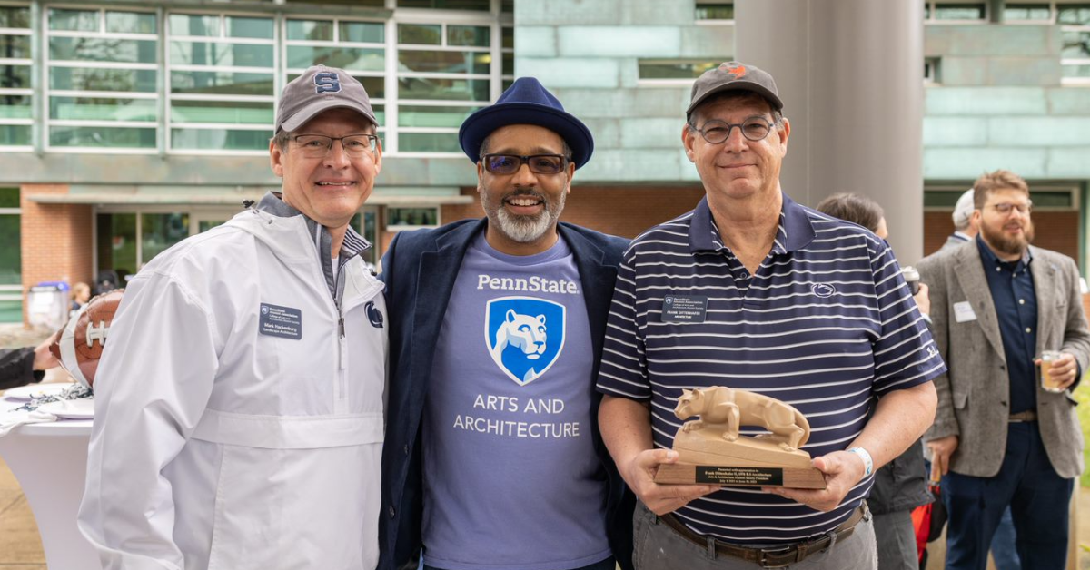
For the past two years, the co-founder and president of Murphy & Dittenhafer Architects has led the university’s College of Arts and Architecture Alumni Society.
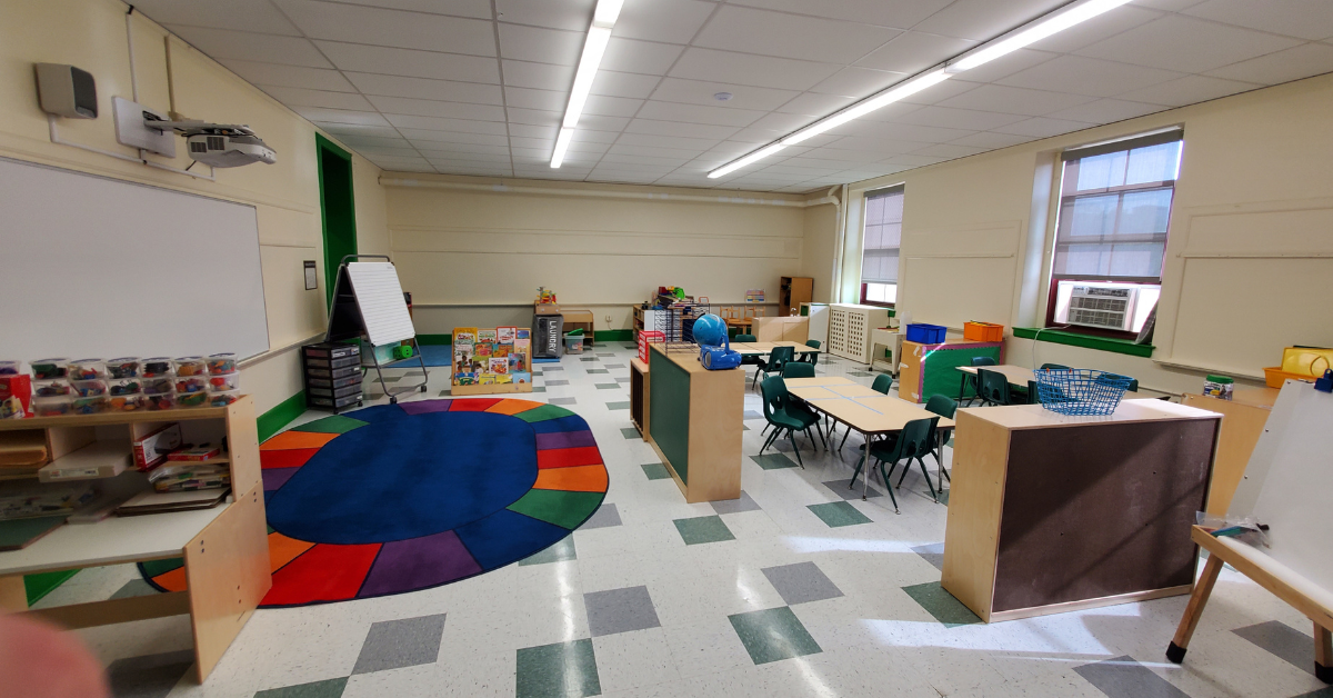
The firm recently worked with St. Vincent de Paul of Baltimore to renovate an old elementary school for a Head Start pre-k program.
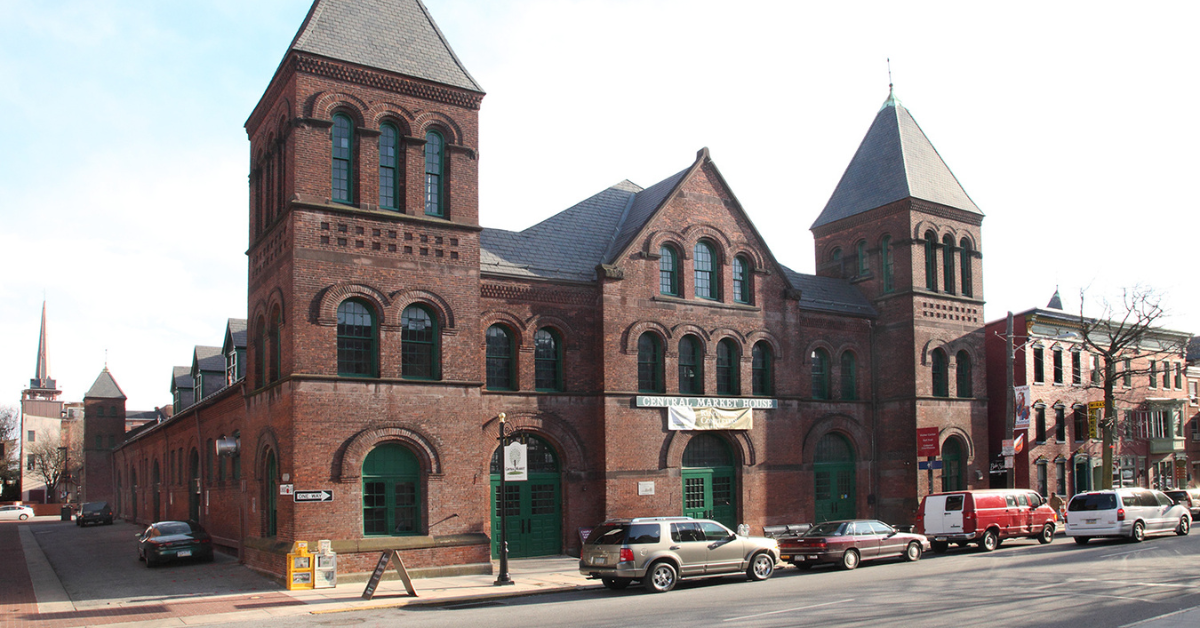
The market house, an 1888 Romanesque Revival brick structure designed by local Architect John A. Dempwolf, long has stood out as one of York’s premier examples of Architecture. Architect Frank Dittenhafer is passing the legacy of serving on its board to Architectural Designer Harper Brockway.
At Murphy & Dittenhafer Architects, there is a deep-rooted belief in the power of combining history and adaptive reuse with creativity.
University of Maryland Global Campus explores modernizing its administration building, which serves staffers and students enrolled in virtual classes.
The Wilkens and Essex precincts of Baltimore County are receiving solutions-based ideas for renovating or reconstructing their police stations.
The firm has earned the designation annually since 2016 in recognition of its commitment to supporting newer professionals in the field.
Murphy & Dittenhafer Architects recently completed the Design Development phase for a 20,000-square-foot building for Crispus Attucks York. Construction should begin in August.
The facility in Anne Arundel County, Maryland, is re-envisioning its focus with the help of Murphy & Dittenhafer Architects.
Murphy & Dittenhafer Architects received numerous awards from AIA Pennsylvania, AIA Central Pennsylvania, AIA Baltimore, and ABC Keystone.
Since 2019, the firm has designed a number of protected entryways for Anne Arundel County Public Schools.
A business lunch at an iconic building sparked an awakening whose effects continue to ripple down the city thoroughfare.


















Harford Community College’s expanded new construction Chesapeake Welcome Center is a lesson in Architectural identity