Elizabethtown College — Myer Hall dormitory
Elizabethtown College tasked Murphy & Dittenhafer Interiors with modernizing its Myer Hall dormitory building.
She spent her first two years of life in a house on the campus of Elizabethtown College, where her father worked. Her mom lived in the Myer Hall dormitory as a student 60 years ago. Her husband’s an alum. Nostalgic as Lisa Clemens is for Elizabethtown College, she knew it needed to make its housing more attractive for students in this century.
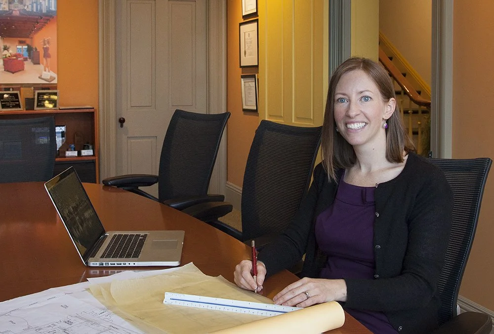
When the college called on Murphy & Dittenhafer Architects for help, Clemens, the Senior Interior Designer of the firm’s interiors division, Murphy & Dittenhafer Interiors, was up to the task.
“Students expect a completely different living experience than their parents,” she says. “My job was to bring this dorm from the 1950s to the 2020s.”
Elizabethtown College — Myer Hall dormitory
A good impression
College admissions is a competitive business. Students must find the academics they seek and be attracted to live on campus.
“I had to rethink the spaces you see when you walk into Myer Hall and make them more contemporary,” says Clemens, who also had to respect the tradition her mom felt six decades ago.
A tall order within an existing 70-year-old building, but Clemens started only this spring, and the school needed the job done when students enrolled this fall.
“I’ve worked with Elizabethtown College before. We have a good rapport,” she says. “I was able to quickly get a sense of where they wanted to go.”
Her connection to Elizabethtown helped, says Frank Dittenhafer, II, FAIA, LEED AP, president of the firm.
“It was critical for Lisa to be immersed in the project,” Dittenhafer says. “We try to do this on every project we can.”
Elizabethtown College — Myer Hall dormitory
Removing walls, updating space
Students entering Myer Hall were greeted by a wide-open space with typical lounge furniture and not much happening, walled off from exterior rooms for studying, playing pool, or meeting with an RA.
“Students now study with laptops and iPads, and they want to do gaming,” Clemens says. “Flexibility is key. Students want spaces to be together and social. They also want places to go off and hole up in a corner or spaces to study in small groups.”
Like us on Facebook!
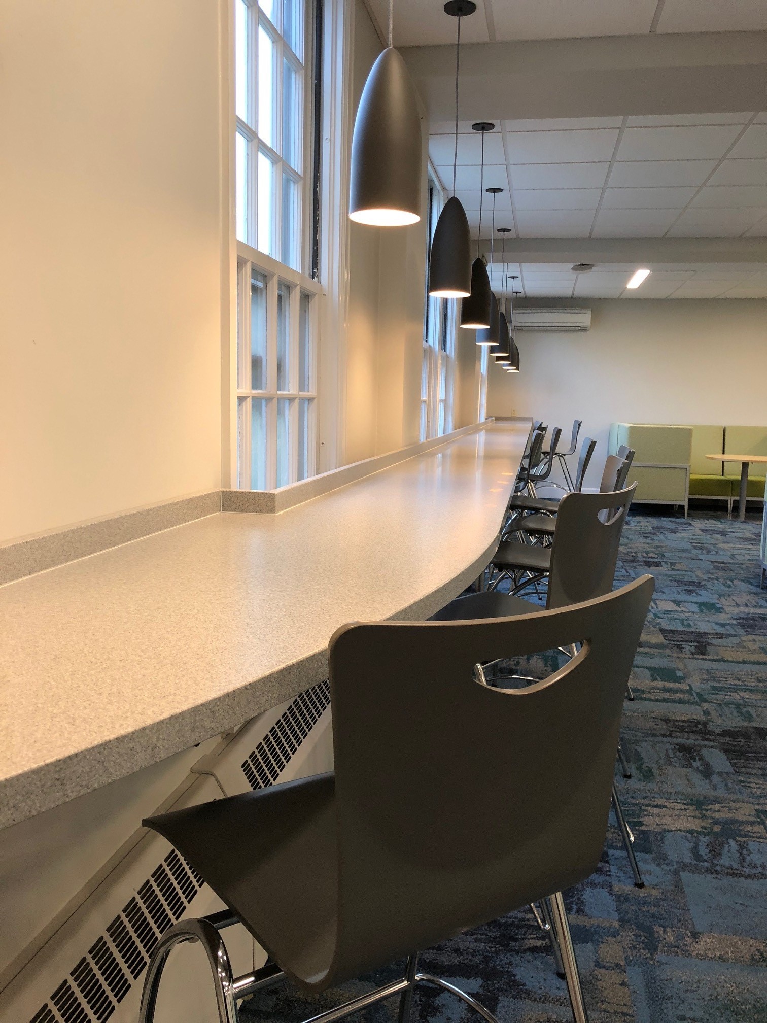
Clemens re-did the lounge, putting a bar-height surface with stools along one 30-foot long window, taking advantage of natural light, with plenty of plugs for electronics.
Some of the furniture, sofas and chairs, have partial sidewalls attached to them, creating what are called freestanding privacy lounges.
“These give students a sense of privacy for studying but still allow them to be part of this bigger place where things are happening,” Clemens says. “We’ve created a coffee-shop like atmosphere. Students are together but can choose to be interacting or not.”
Elizabethtown College — Myer Hall dormitory
Gaming, private spaces kept
Students still need quiet, private spaces. A study room was kept along the exterior, with natural light from windows looking onto a redesigned courtyard, a table for up to six students, and a white board, one of which is also in the main lounge.
Rooms facing the courtyard range from the quiet study room to the gaming room — including a pool table — as well as a communal printing room and a kitchen/vending area for getting drinks and snacks.
M&D re-did lighting, replacing solely ceiling fluorescents with up-lighting, pendants and sconces, while keeping some ceiling lights.
“This gives you needed task lighting, but is more hospitable and less institutional,” Clemens says.
Elizabethtown College — Myer Hall dormitory
Connecting with the outside
Having spent her first two years of life running around this campus, connecting to the outside made sense to Clemens.
The exterior rooms look onto the redesigned courtyard, which M&D stretched string or ball lights across. There are trees and a re-pointed brick planting area.
“We put in park benches, bar height tables, and lower café tables, with seating. It’s not all on the same level but is thoughtfully laid, not just randomly placed,” Clemens says. “The courtyard is more of a gathering place now, too. It energizes the inside rooms because you can see it from several interior spaces.”
Elizabethtown College — Myer Hall dormitory
Super excited students
On campus earlier this year, Clemens showed her drawings for the design to some students.
“I learned what was important to them, and they were super excited,” Clemens says. “We listened to the school but also to the students, who will be using this space.”
“It was invaluable to connect with students because this project is directly about student life,” Dittenhafer says.
Her deep, personal connection to Elizabethtown makes this work fun and interesting, but Clemens stresses she feels privileged to work with every client.
“At the end of the day,” she says, “I want to hand them over a space they love.”












Harford Community College’s expanded new construction Chesapeake Welcome Center is a lesson in Architectural identity